

The Masque of The Red Death – Edgar Allan Poe


Analysing book covers
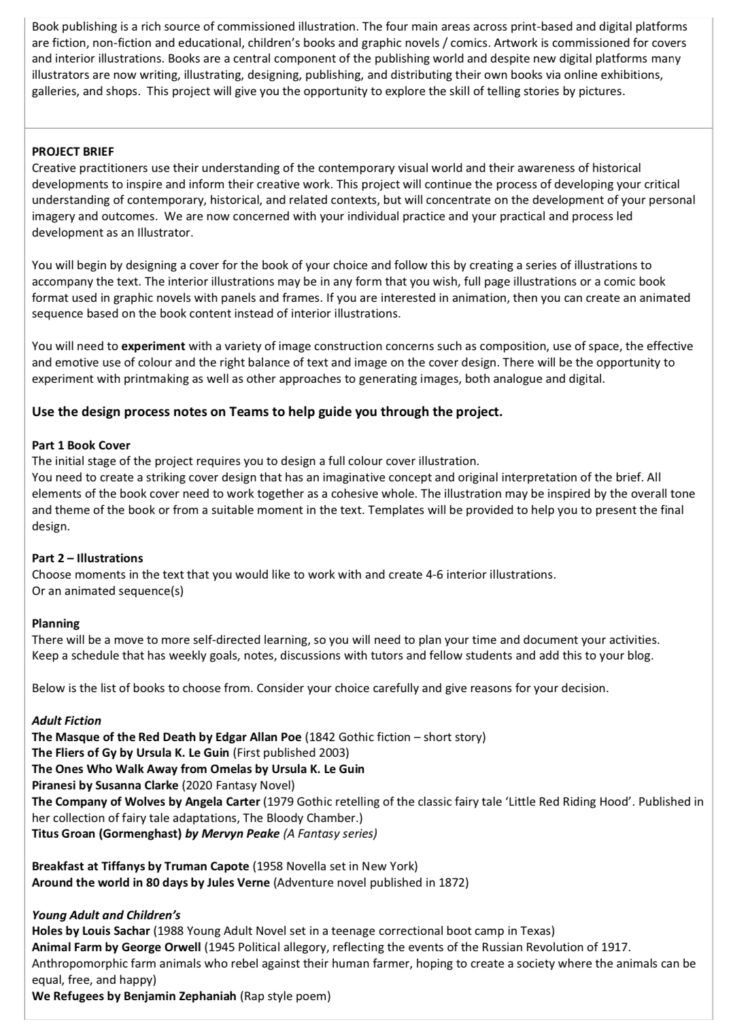
Artist Research
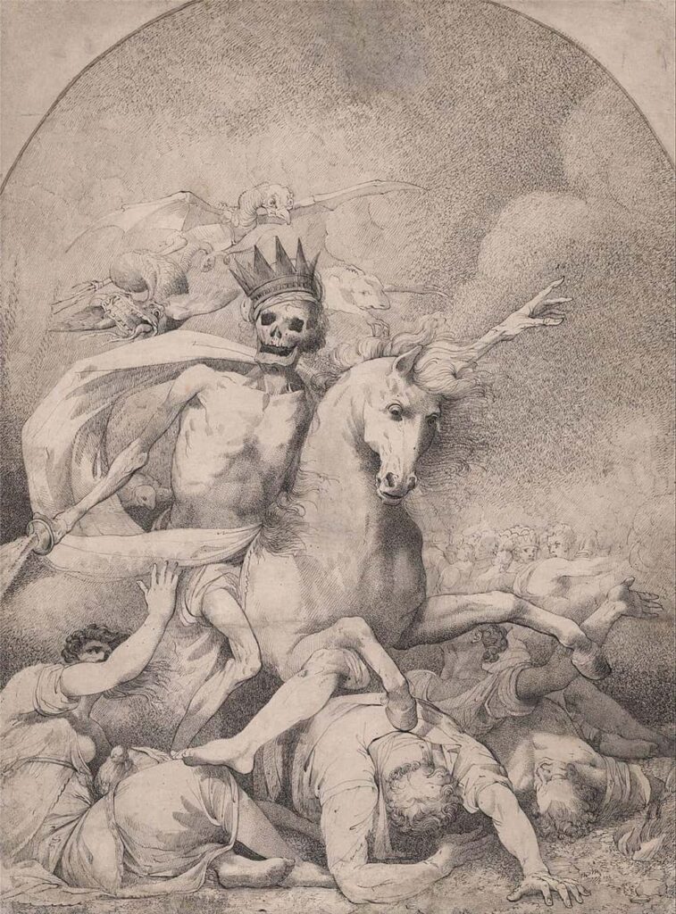
‘Death on a Pale Horse’ By Hamilton Mortimer, c. 1775
For this project I wanted to look at the way other artists had depicted the idea of death as well as the mediums they used.
Mortimers painting is a good example of this as it represents what is quite commonly seen as a depiction of death. A skeleton weilding a weapon, usually riding a horse. The time period of the piece is also important as ‘Masque Of The Red Death’ was released in 1842, depicting a similar description showing how the personification of death hasn’t changed much over time.
I really enjoy his use of faint markings to ultimately build quite a dark image. He doesn’t rely on tonal imagery in order to generate the creepy atmosphere the piece produces, instead keeping the quality of the work quite light, making the piece quite striking. I think it is an interesting technique to juxtapose what you would typical expect from gothic artwork.
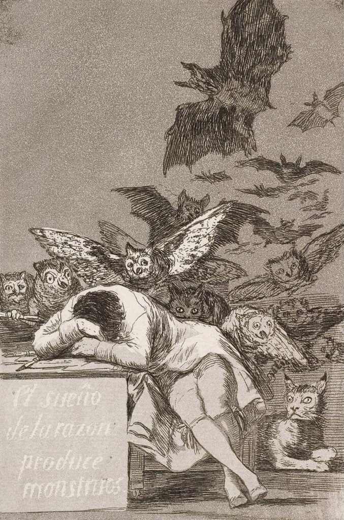
‘The Sleep of Reason Produces Monsters’ By Francisco Goya, 1799
Here is an etching depicting Spanish artist Goya’s view of society at the time, a motif also used within ‘TMOTRD’ . I think it is important to look into the politics behind gothic art as it has a large effect on the overall feeling of the piece. ‘TMOTRD’ has very strong political ties so it is obvious to look at pieces with the same political messaging.
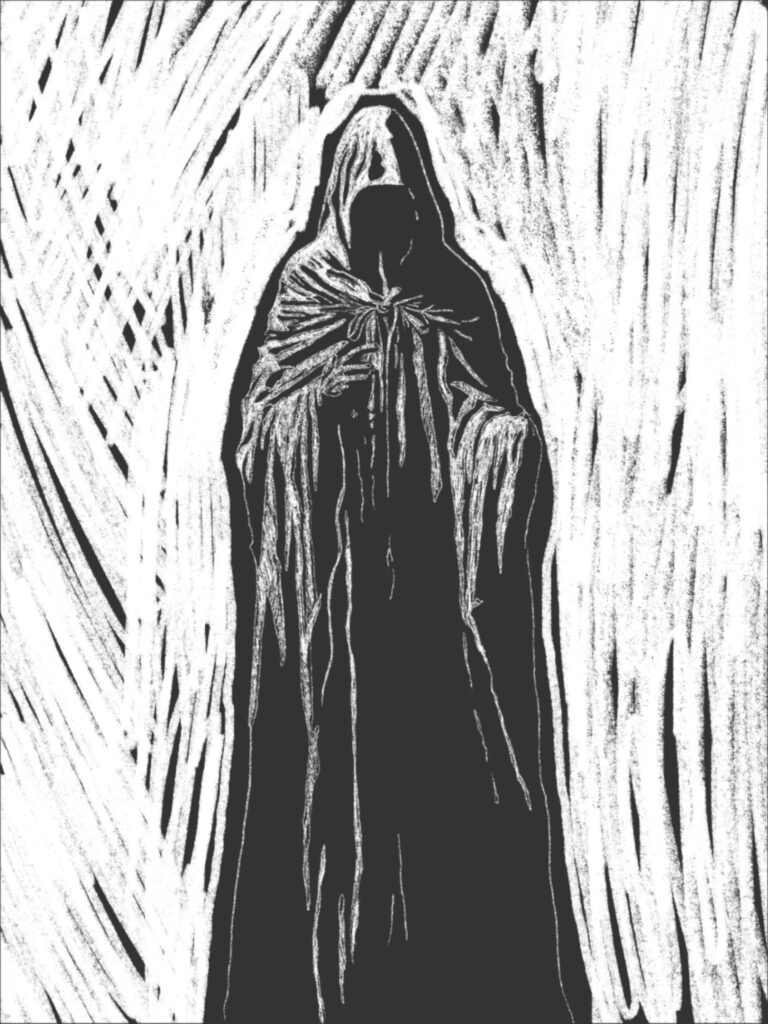
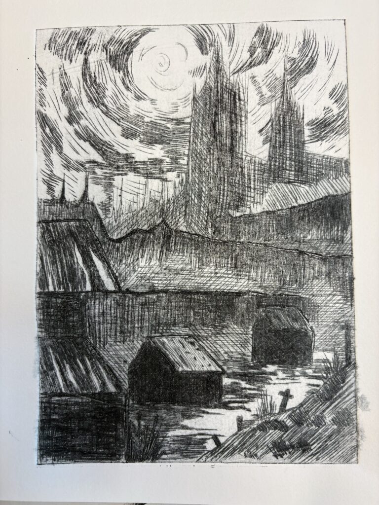
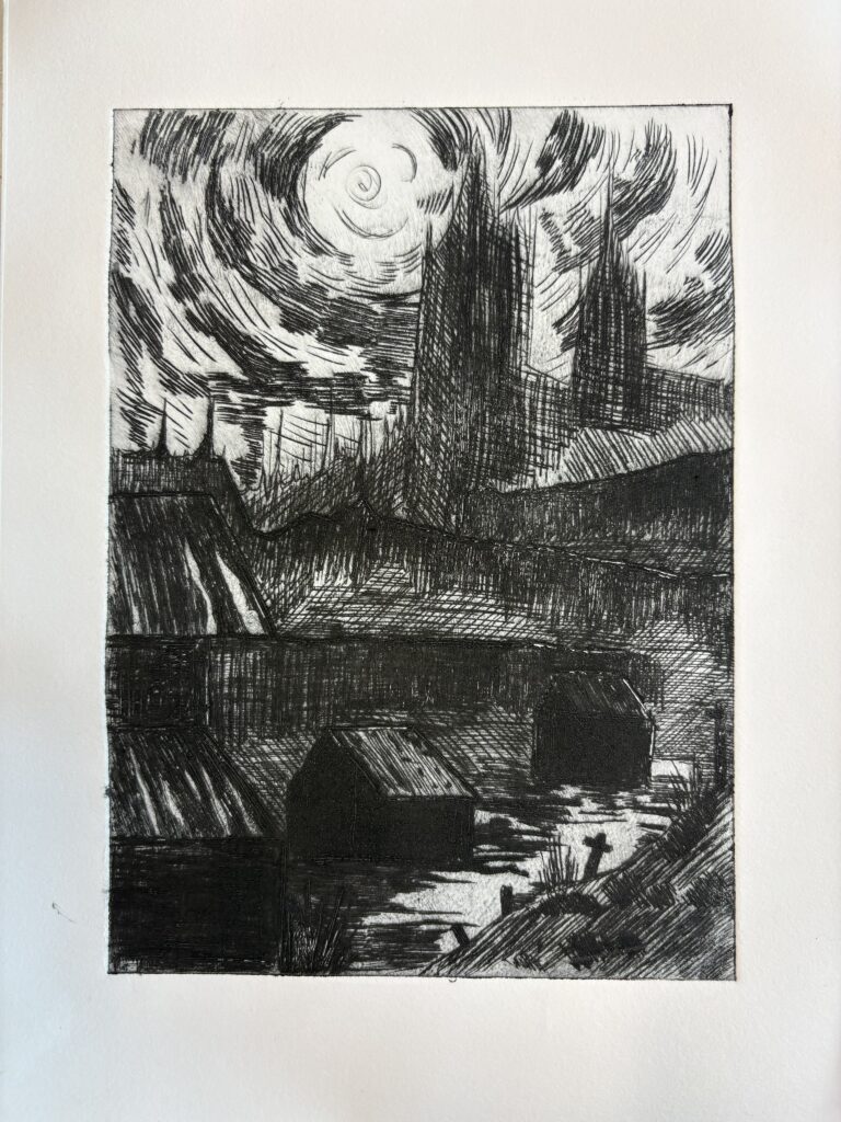
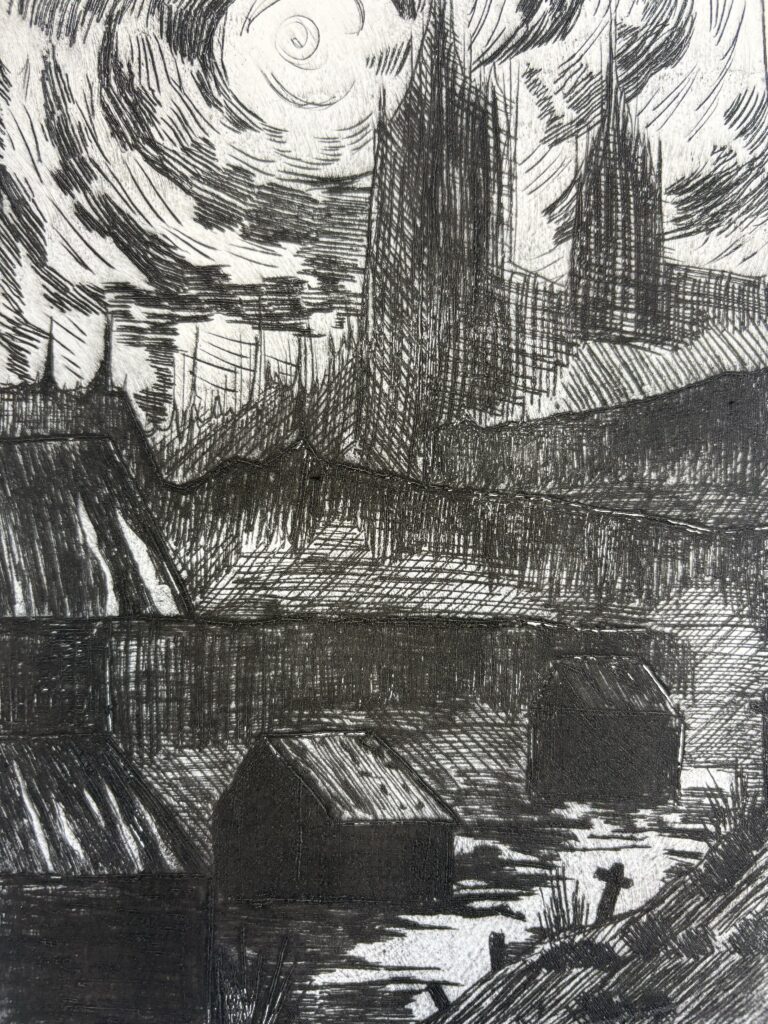
I really enjoy the use of etching as a gothic art technique, as the build up of small scratchings creates a moody and purposeful effect that pairs well with the artists messaging. I think for this project, I would very much like to explore the use of etching to generate a book cover.

‘The Death and conflagration, central part of the triptych Disaster’ By Albert Chmielowski, 1870
I wanted to look at a completely different use of materials with the addition of some colour. In my own work I don’t usually like to use colour, however for the Parade Project it is something I started using so it may be interesting to further explore this technique for the project, especially as it has a much darker colour pallete.

Drawing from the way other people have depicted the Red Death.
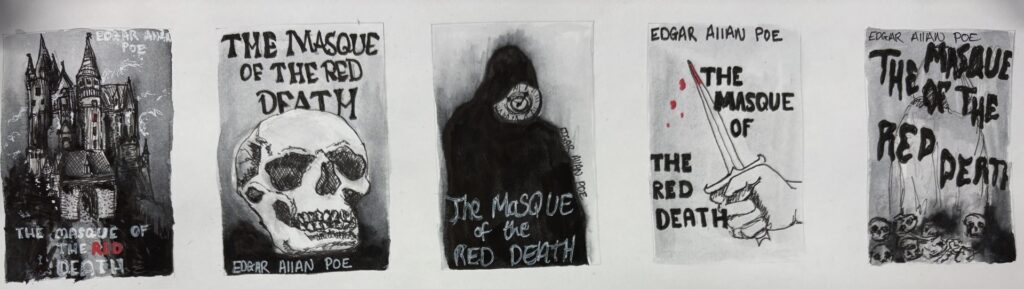

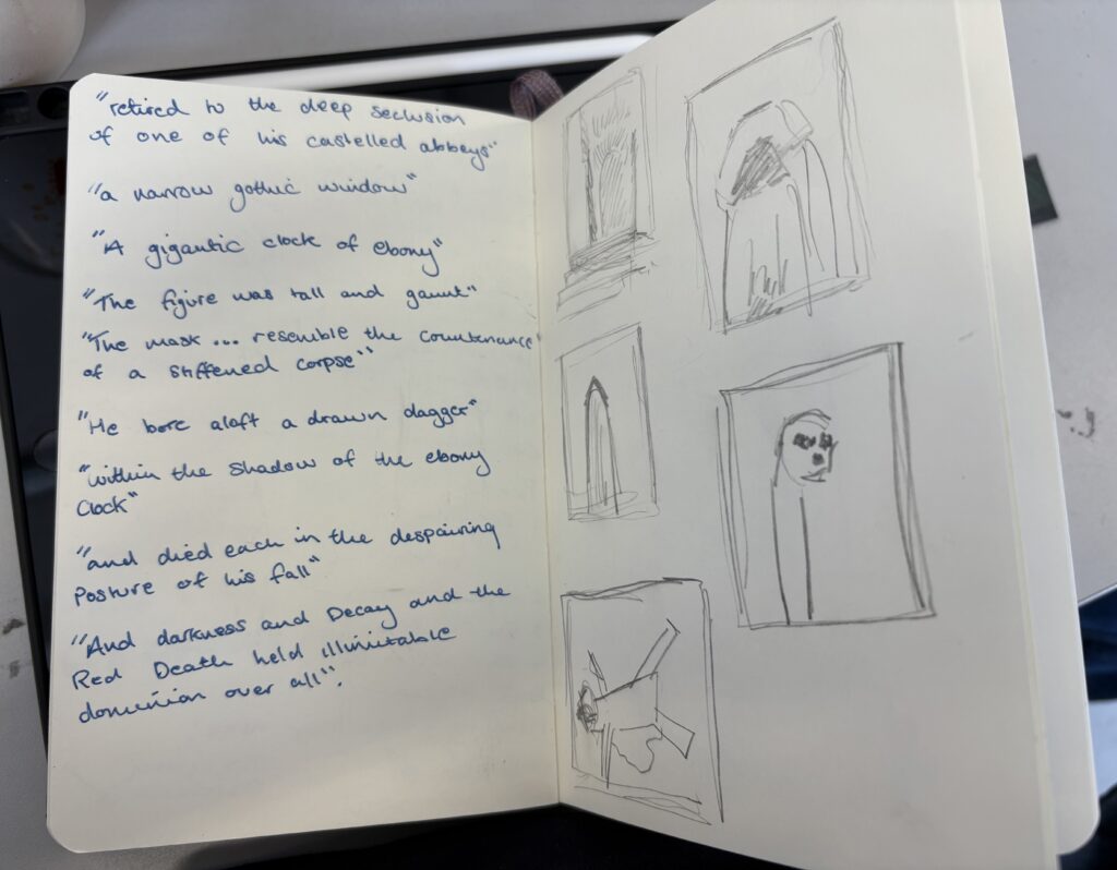
Further developing my quick thumbnails into something more detailed.

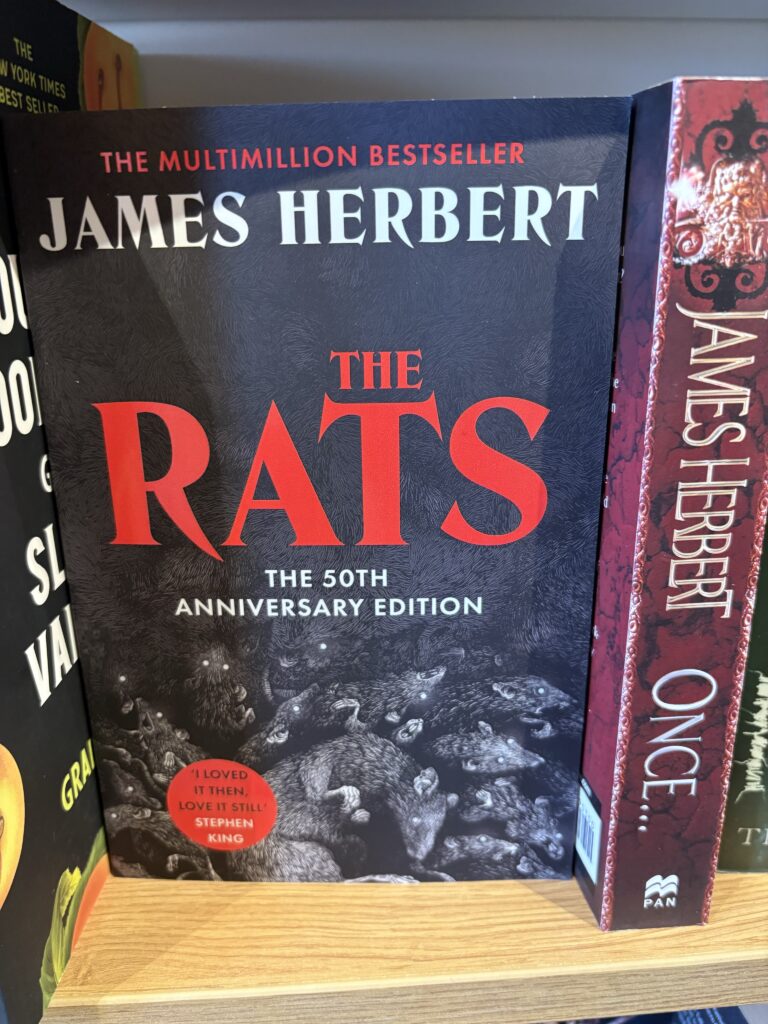

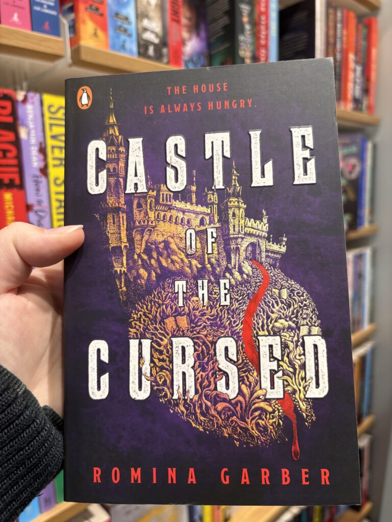
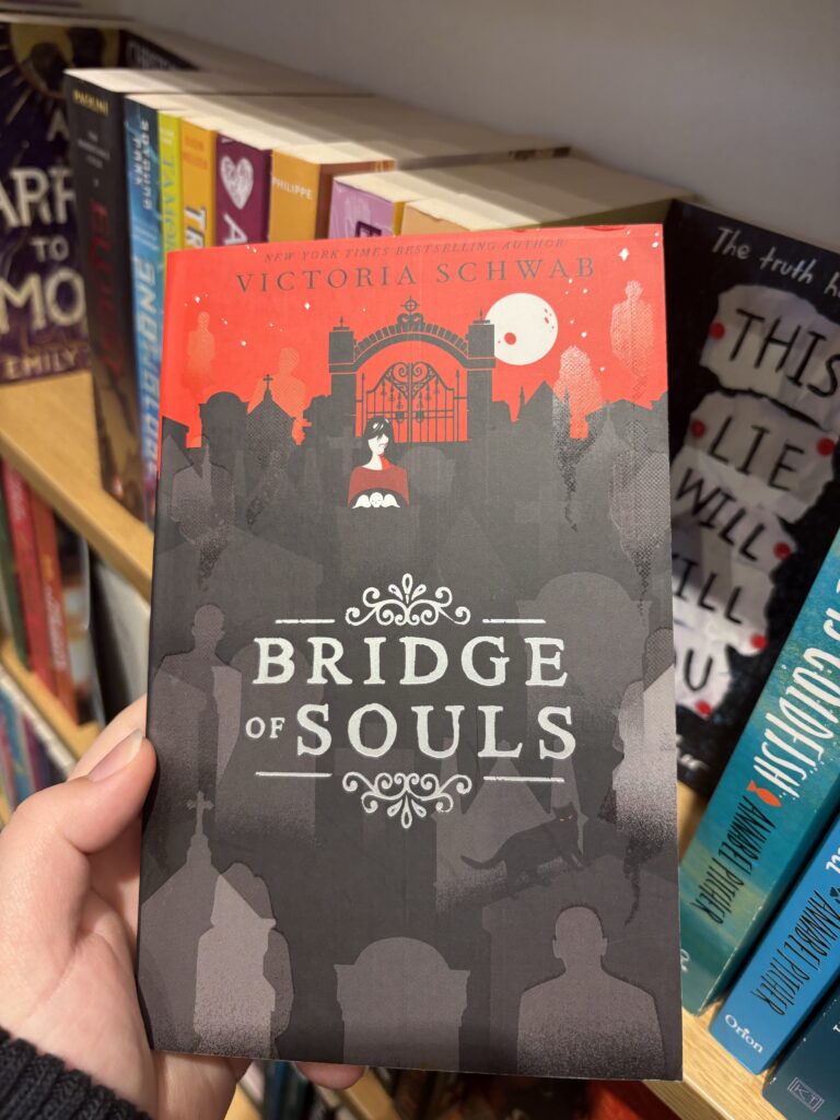

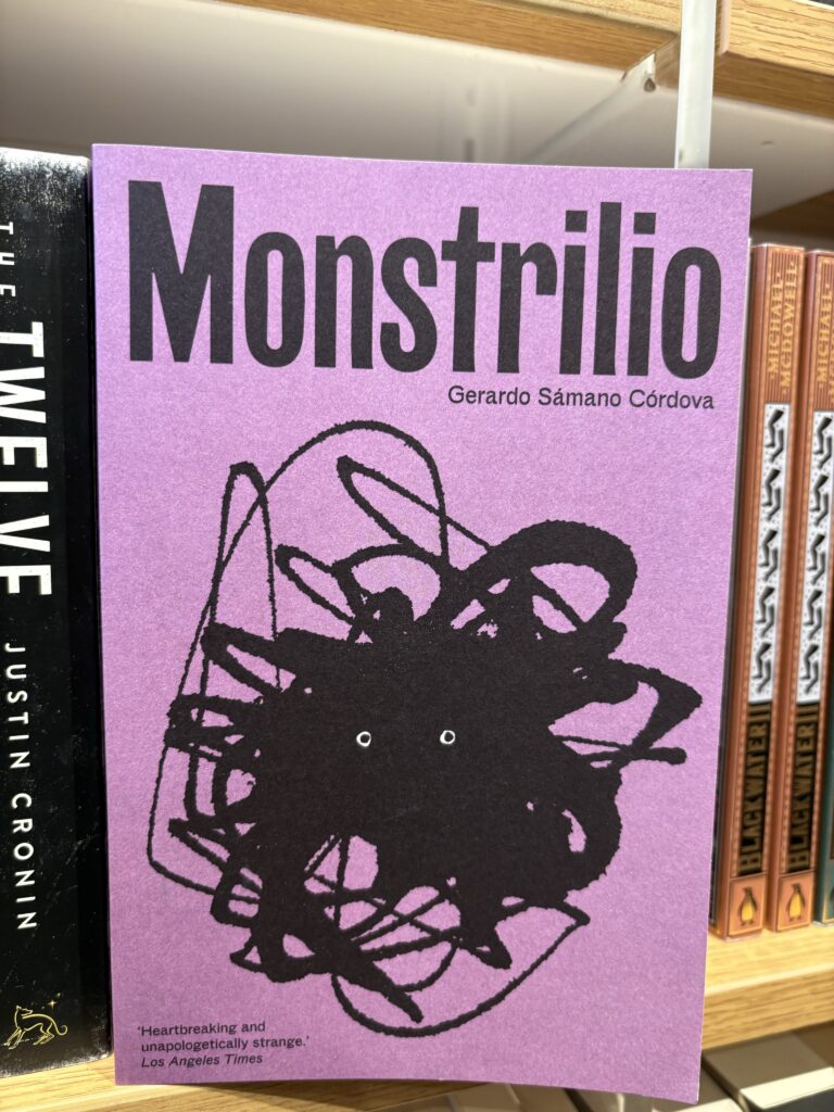
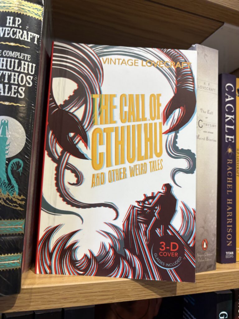


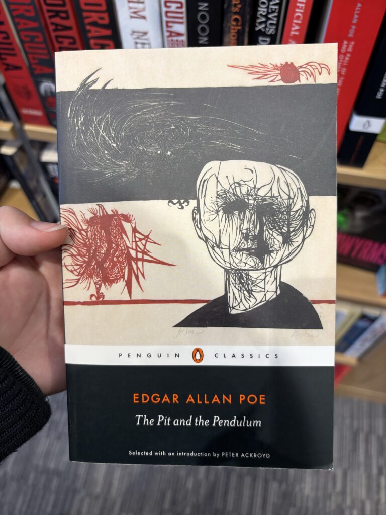


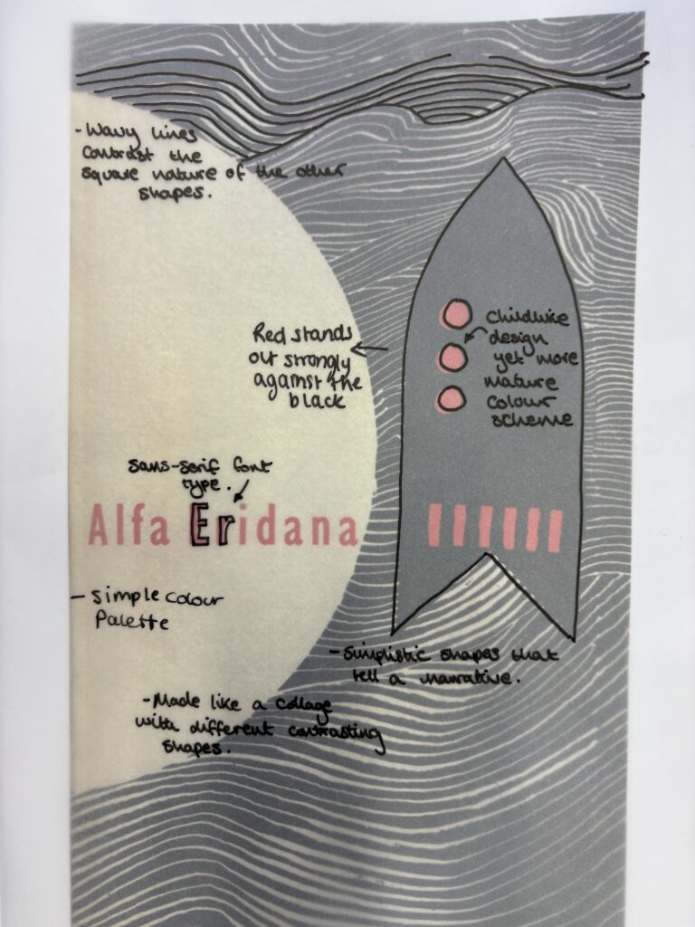
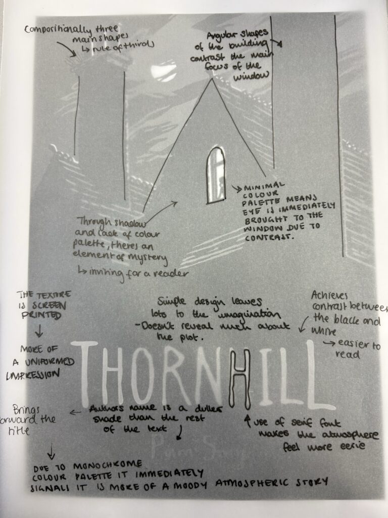
In order to gain inspiration for this project I went to Waterstones in order to look at what other illustrators have made. I stayed around the horror and crime section, photographing the ones I might draw inspiration from. It also helped to look at the way people have laid out the text on top of their images. My favourite covers are the ones with more line drawings as I think it sets the tone of the narrative.
I particularly like this book cover for the overall atmosphere it creates. It appears the illustration has been made using etching or detail ink drawing, but i really enjoy the hatching linework. The idea of inverting the colours to have the linework be in white, allows the illustration to blend flawlessly into the title creating a shadowed effect, which also allows for the book title to stand out against the dark background. The cover doesn’t reveal too much information of the story, instead being a very literal depiction of the tile, generating an air of mystery inspiring the reader to want to engage with the storyline.
Overall, I think this cover is one of the best examples I found during my visit to Waterstones and it definitely has lost of qualities I would like to steal for my own book cover.
I picked this cover out as it shows a more graphic take on the gothic cover genre. The design appears quite simple at first, but with the buildings melting into trees, and the way the design is positioned to take up 2/3s of the entire cover work really effectively. I would like to explore the difference in effect using more block shapes would have on the atmosphere of a book because in this case, the pairing of the square shapes and serif font, create an interesting contrast that really bringings the cover together.
Practicing book cover ideas
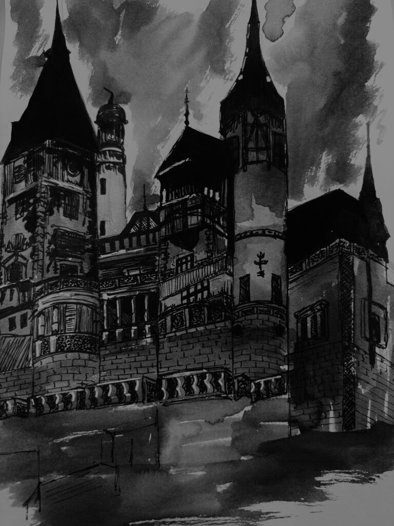
From my research into book covers, I wanted to explore a more scratchy art style using an ink pen and a cross-hatching method to create the effect I wanted.

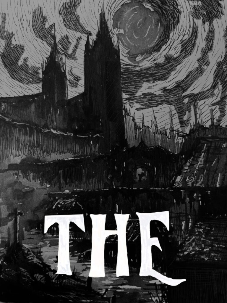
Testing the cover with white text
Mono-printing

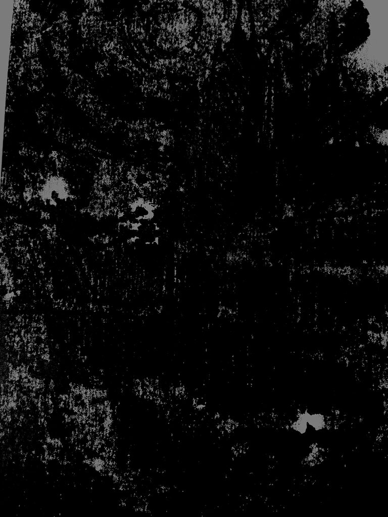

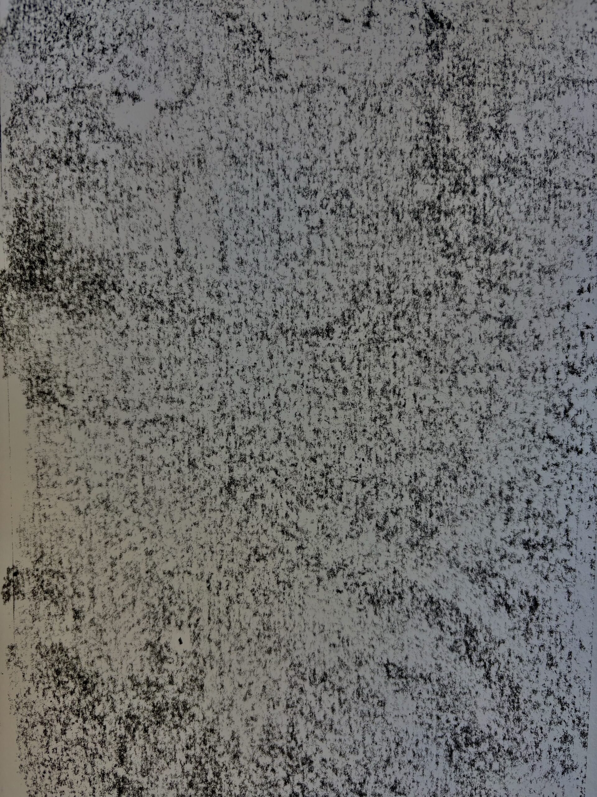

Lino print

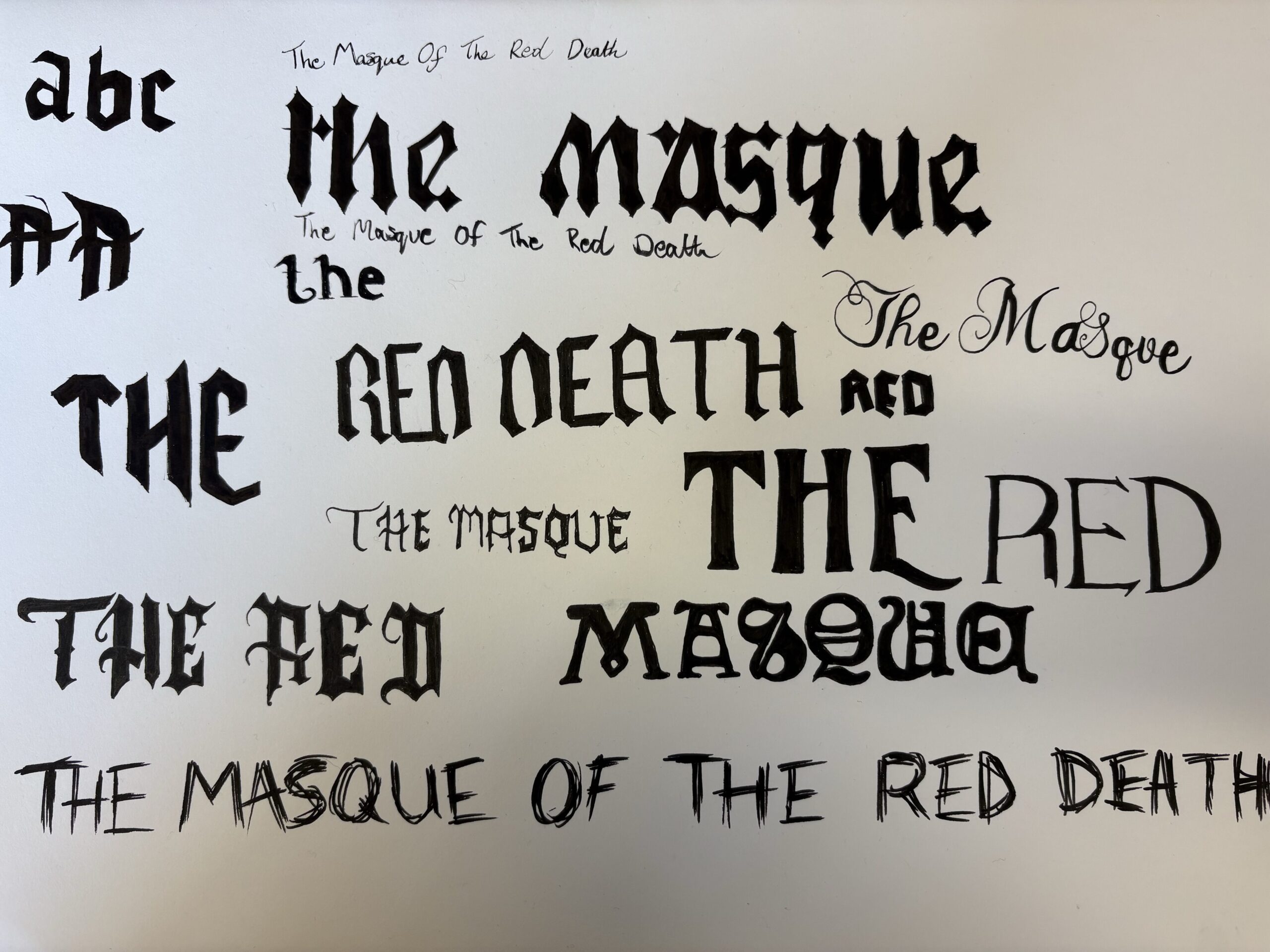
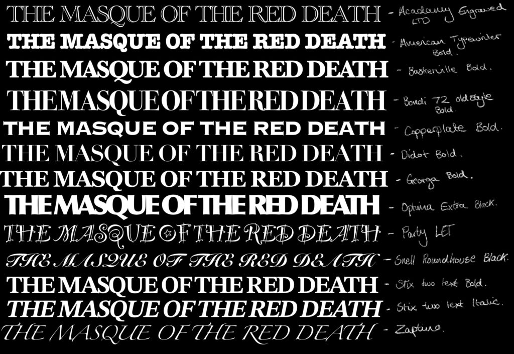
Typography
Digital Mockups
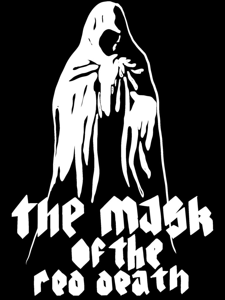
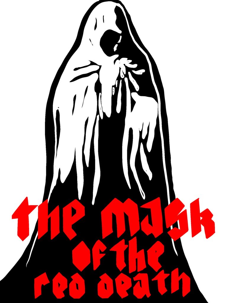

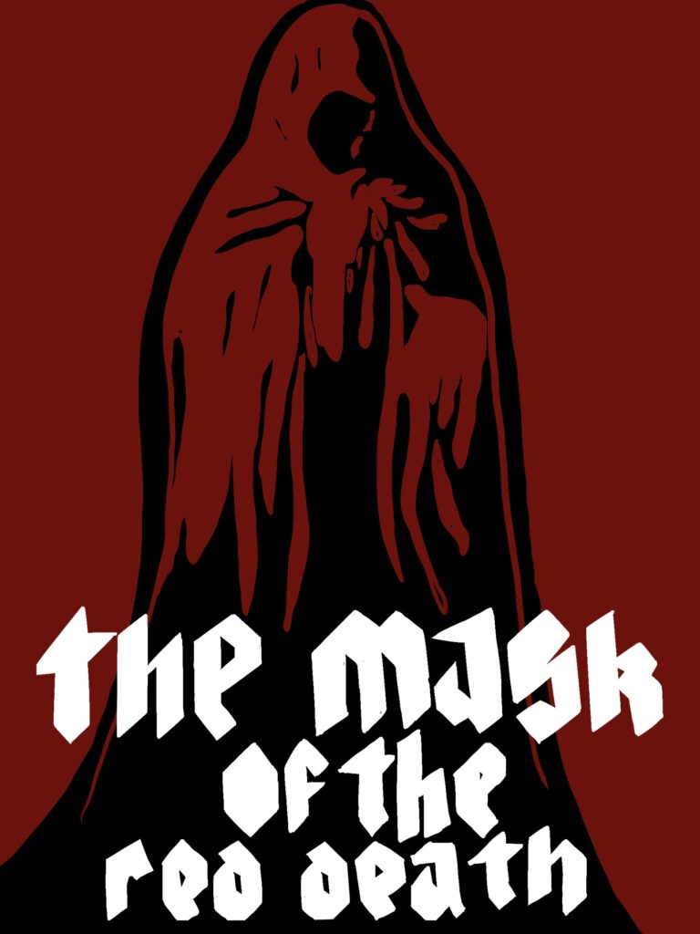


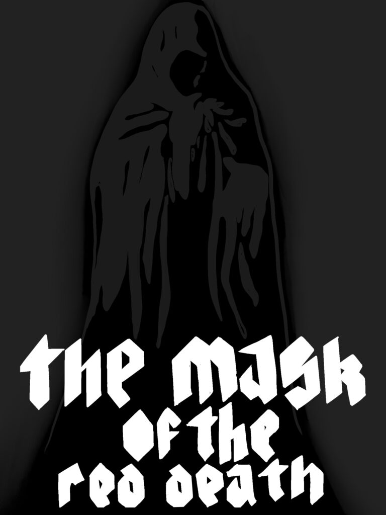

Digital mock-ups of what the Lino print could look like.
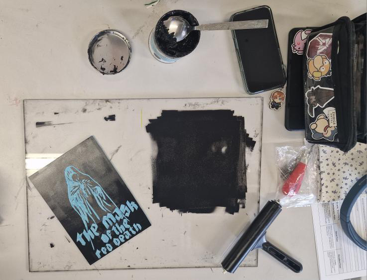


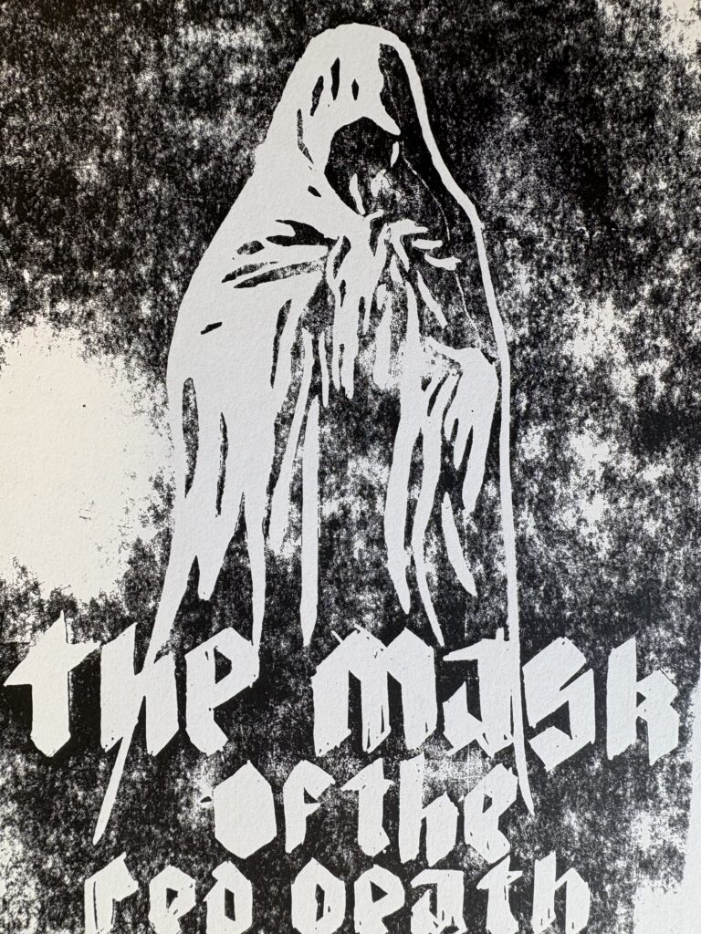


Etching
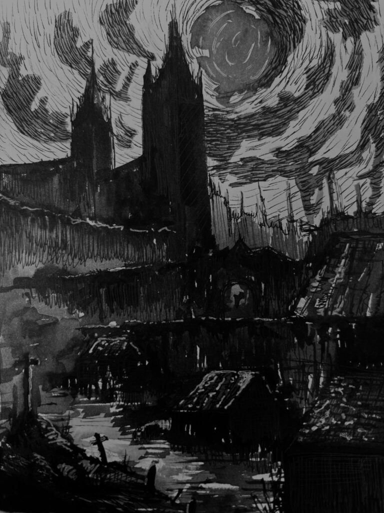



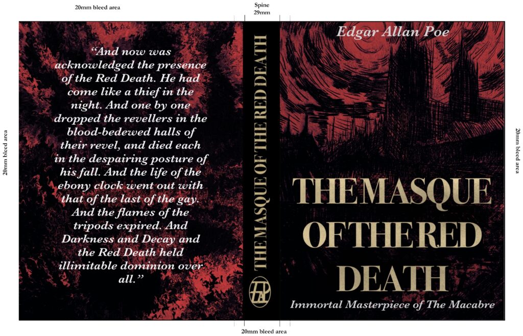
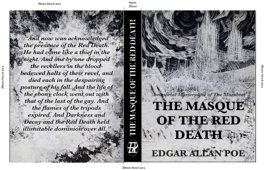
I wanted to see how my pieces fit together into an actual book cover so I could evaluate which parts work and those who don’t. Looking back at the ones I enjoyed before, I decided to copy the layout to add to my own design. I chose two strictly different ones but used the same image to see how different each effect would be.


Based on these two designs I really enjoy the second one and I think with a few tweaks it could be a really strong contender for my final design.
Book Binding
As an exercise in the studio we binded our own books, just to see how it is done. It was quite a challenging process, however I do think it is a good skill to have learnt, and I think in the future it would be interesting to try this process again.
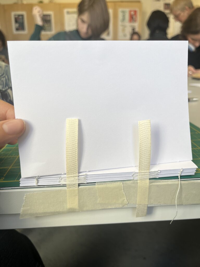

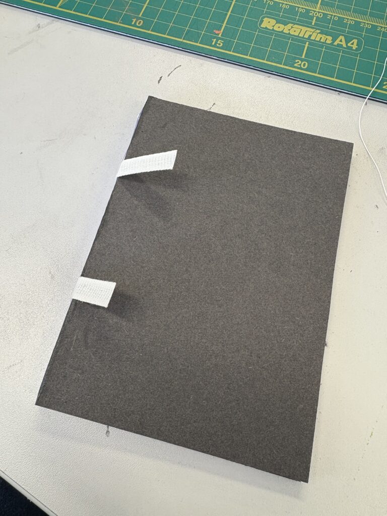


working on page illustrations
Throughout this process I have had an issue with deciding between having the cover be the monster or the environment. I am stuck between these ideas, with the book being named after the killer it makes sense to have him on the cover, however I do worry that this idea may be too predictable, and instead it is better to hide the creature? I think the answer is to make two versions of the cover and decide from there. In order to do that I need to make a finalised design of the monster.
Artist Research

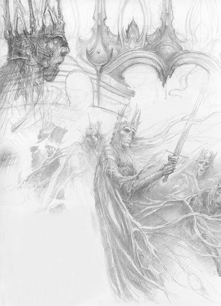

Alan Lee
I wanted to look at Lee’s concept drawings for the villains in LOTR as they resemble skeletons the same way the Masque of the red death is depicted. I like the torn look of the characters and want to implement this into my design for the creature.

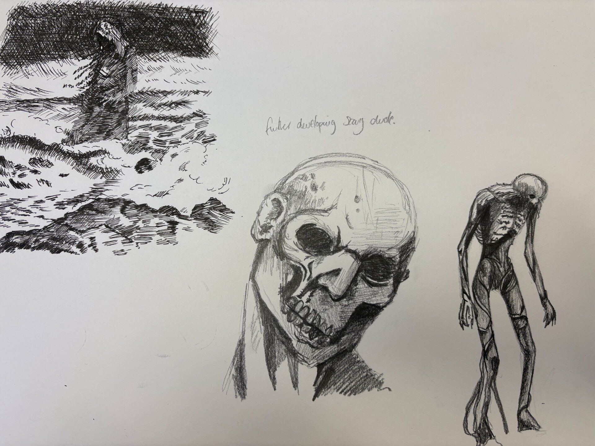

Trying to finalise some ideas
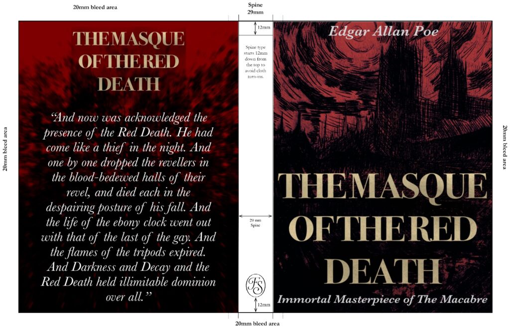
final designs
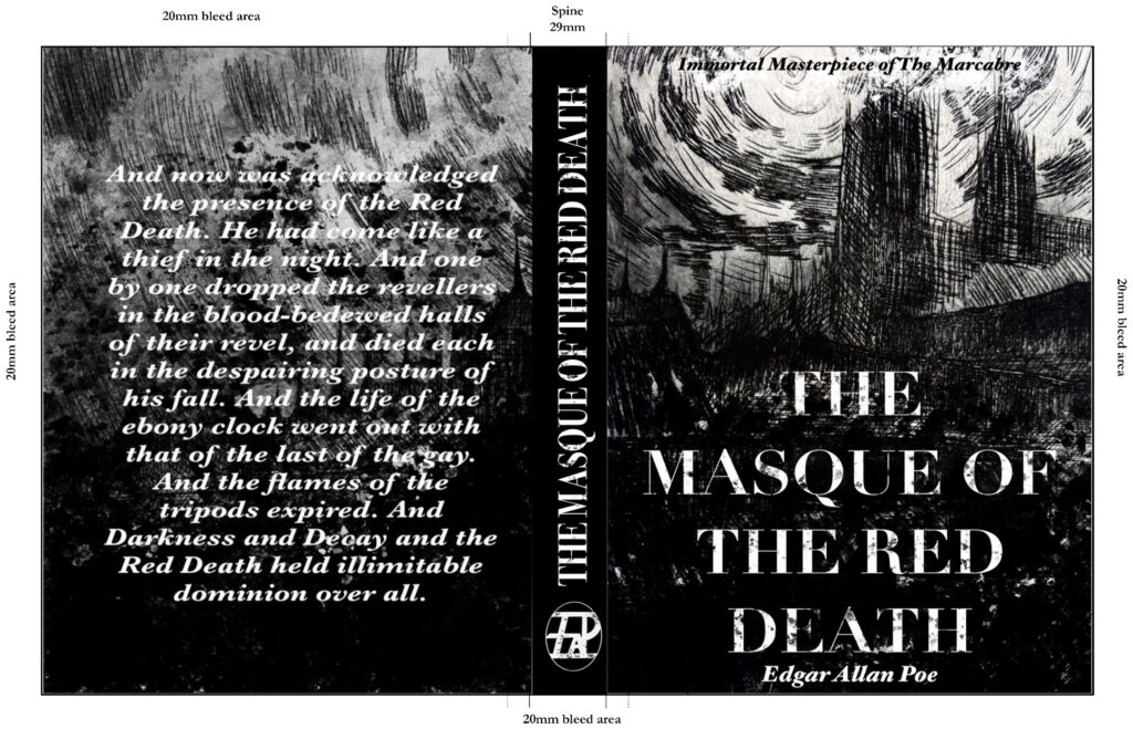

Page illustration
Influences
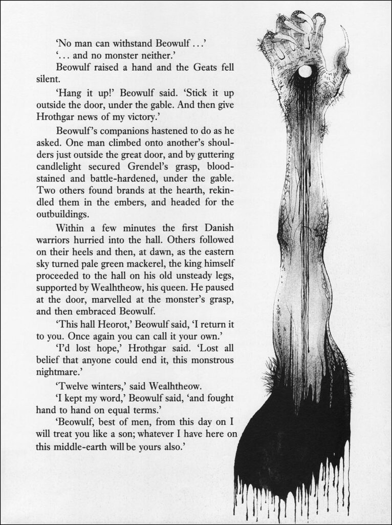


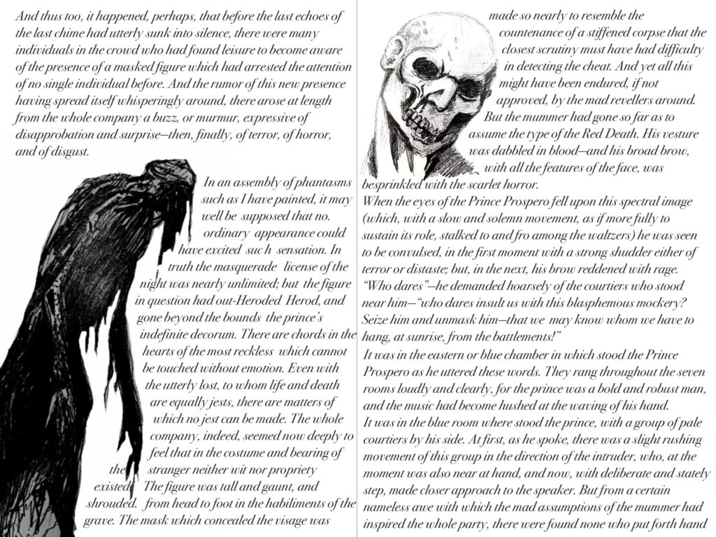
I like the idea of having images placed around the text to bring alive Edgar Allan Poe’s words. I drew my images based on exactly what was written in the narrative.

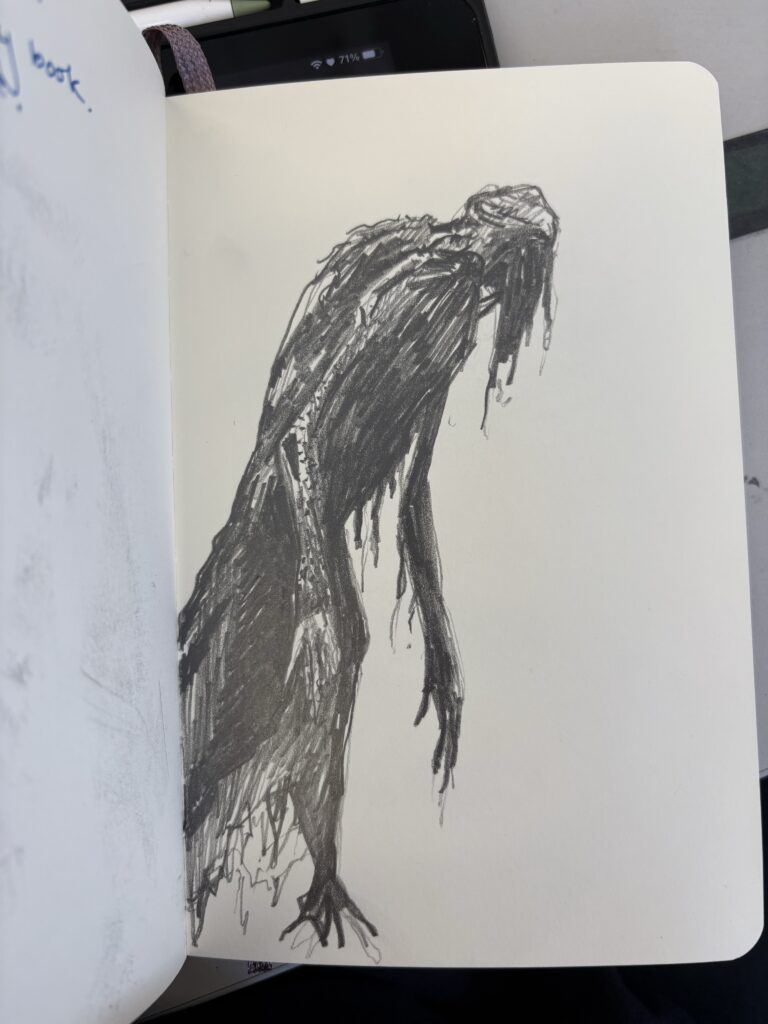
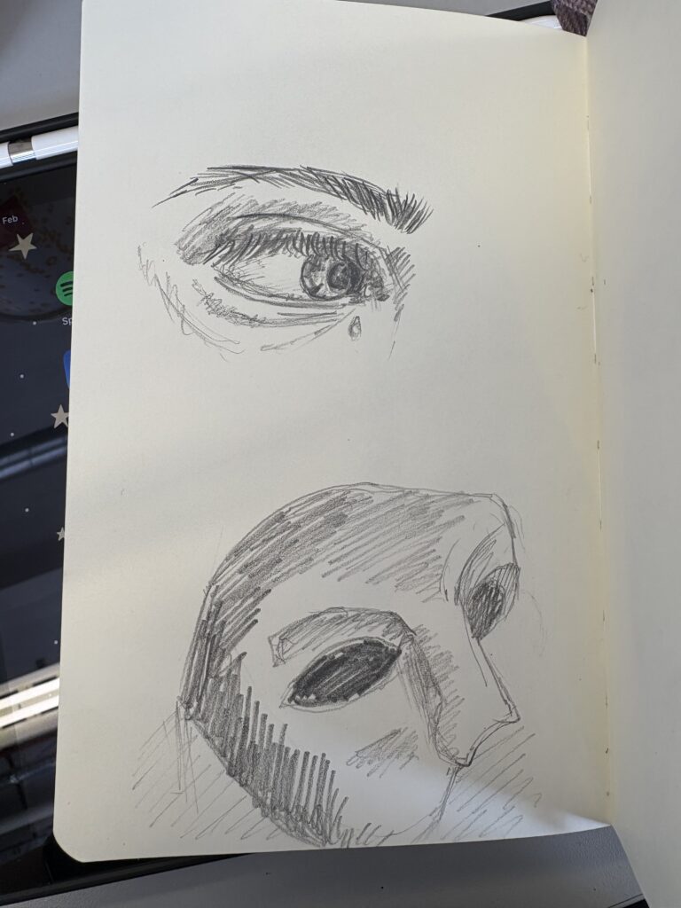
the finished book



evaluation
I am really proud of the outcome of this project, I love how the pages and cover come together, and I am really pleased to have a finished outcome. I learnt a lot about which mediums I enjoy using, such as ink and paint pens, as well as explored the opportunity to work with etching. I love my etching piece on its owns as well as it as a cover, and I definitely think it helped me achieve the effect I wanted.
For this project I think I learnt the importance of researching different artists and works, as for this project I was gradually loosing interest until I went back and really analysed some of the book covers I had looked at. This helped me to establish how the layout of my book was going to work as well as the colour palette i wanted to work with. Overall, I think my book is a very strong piece of work and I do think it captures the essence of Edgar Allan Poe’s ‘The Red Death’.