
Project Proposal


Where’s Bear?



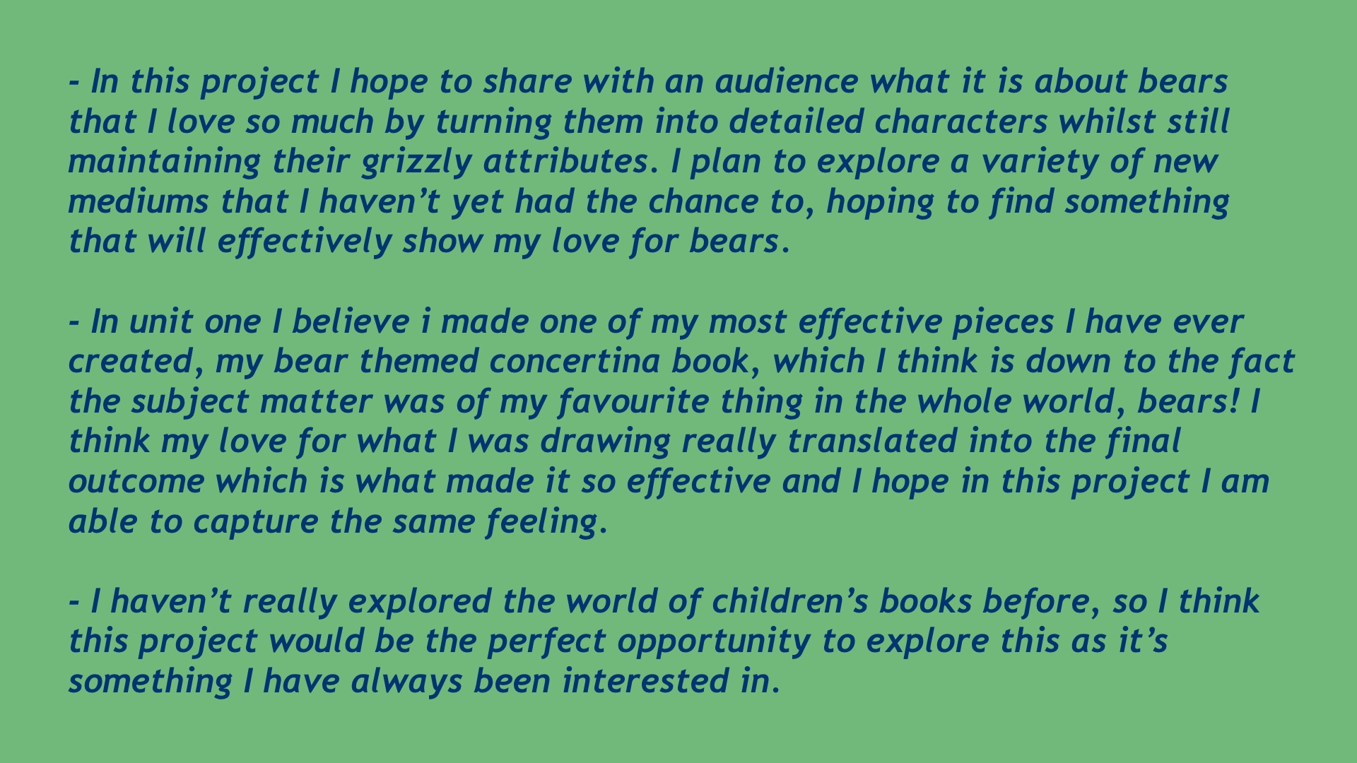


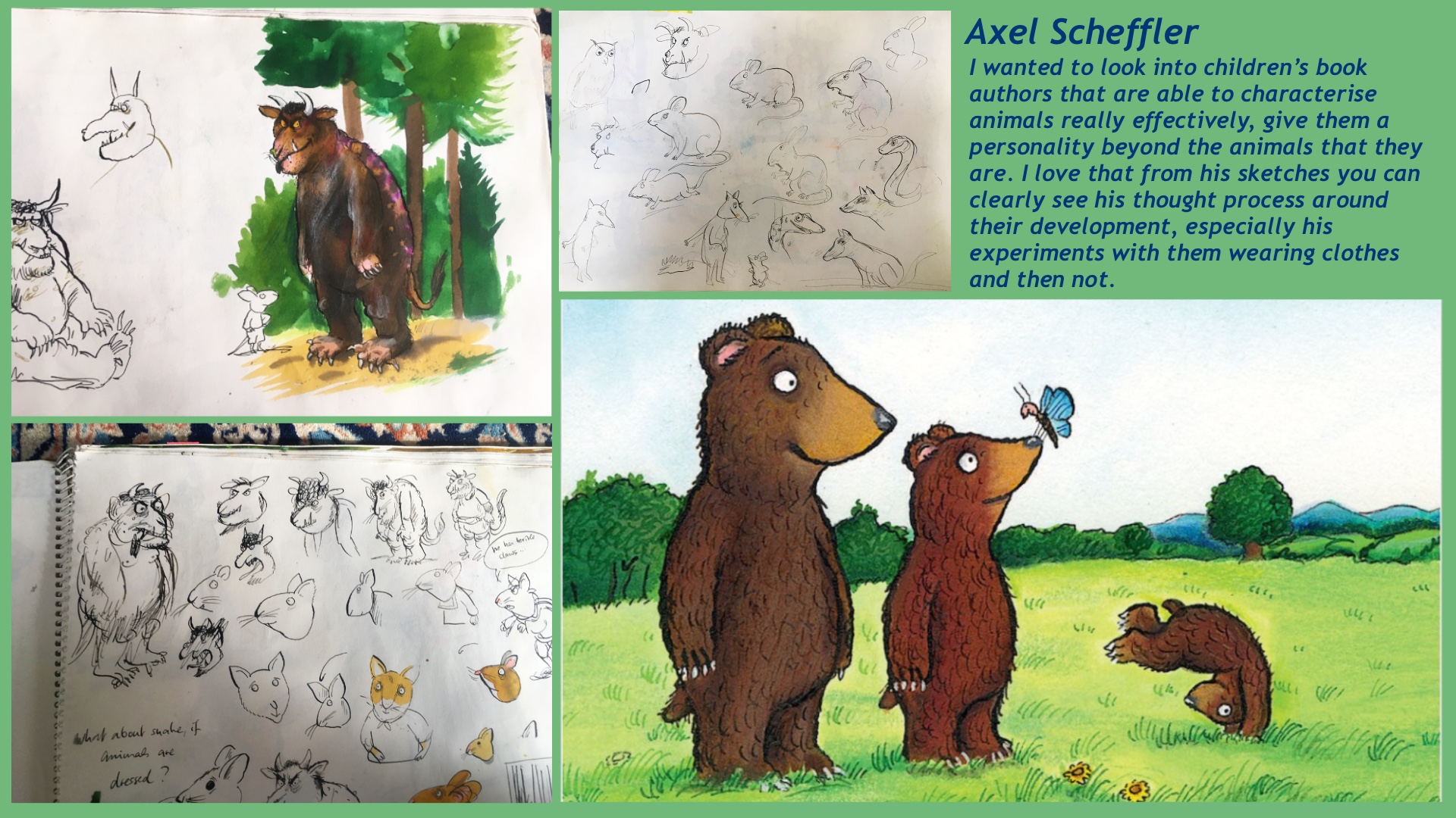
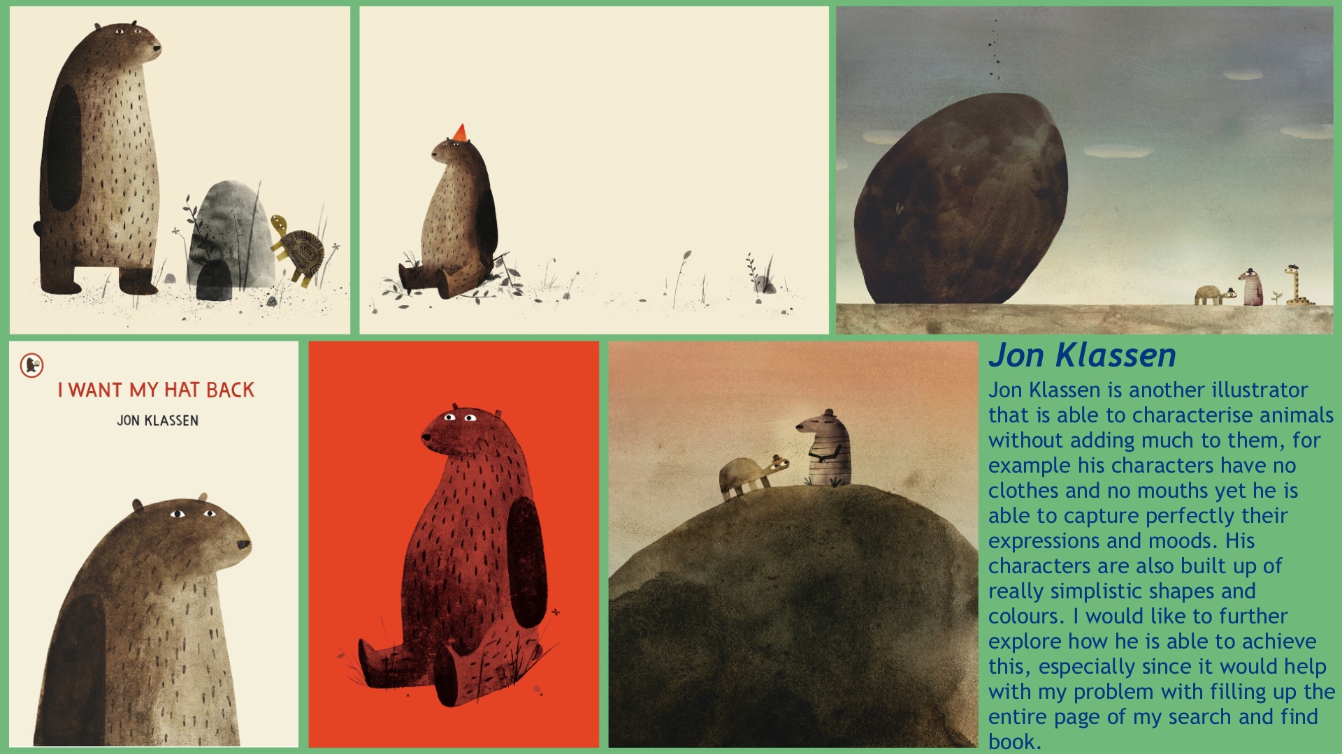
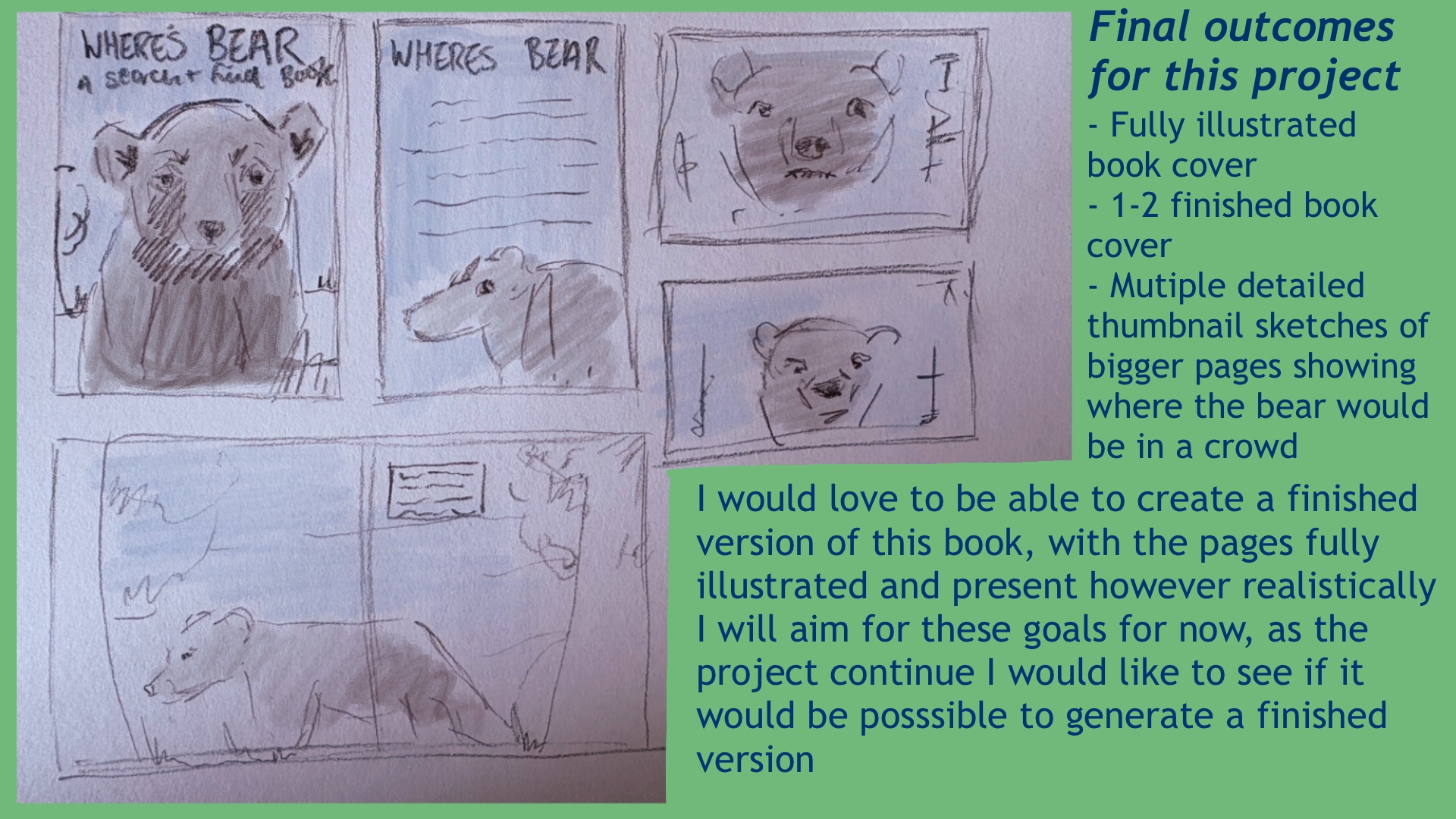
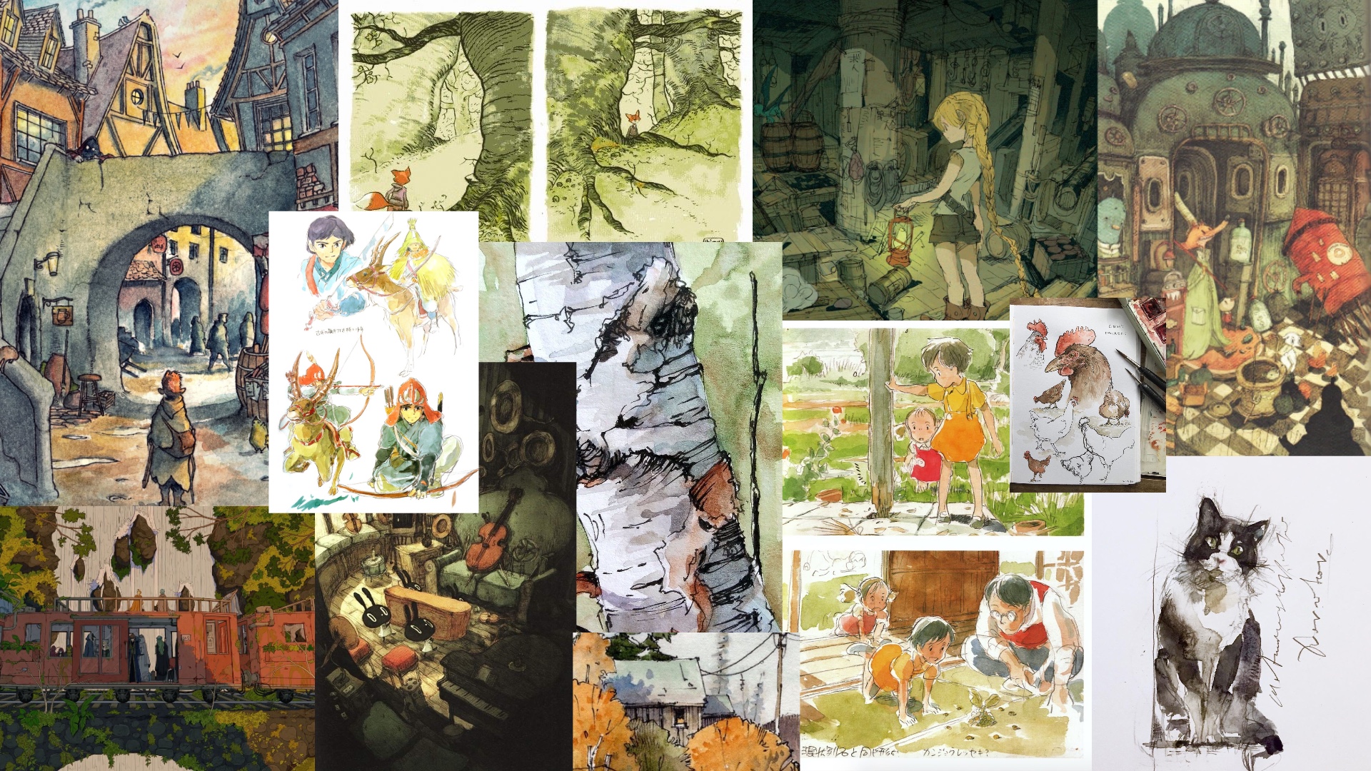


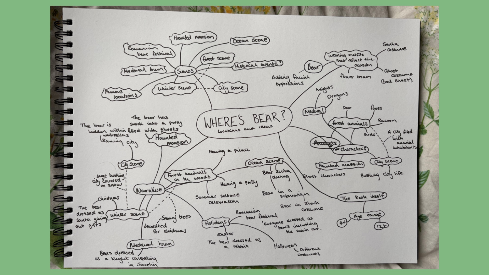
For my presentation I wanted to show my initial thought process so that I could try and create an overall plan for the outcome of this project. By doing initial research, I was able to bring together my thoughts, allowing me to understand which parts of my idea I need to prioritise first as well as forcing me to be more realistic about what I can create in the time we have.
Further Artist Analysis
- Ernest Howard Shepard
- Beatrix Potter
- Axel Scheffler
- Jon Klassen
Most of these artists all have a style that includes a strong black outline paired with pale colour , mostly watercolour to fill in the characters. Most of the designs themselves are quite simplistic shapes, shapes that capture the attention of children, and become memorable to audiences. I want my pages to have the same visual feeling that these artists have, especially from their more famous creations. I wanted to see how if I would be able to create the same effect using digital colour, which is perhaps a method that would allow me to colour a large amount of space in a short amount of time. This would allow me to complete the original image physically which I feel a lot more comfortable doing, then colouring it digitally as its an area I feel less confident in.
Digitising Ernest Howard Shepard/ Beatrix Potters working methods


I also looked at making a version with more block colours, as I can use the drop tool on Procreate to be able to colour the pieces faster than if I was doing it by hand. This technique will probably be quite useful when colouring more complicated search-and-find scenes. I haven’t really used much colour before, so by looking at the techniques of other artists and digitising these methods I feel a lot more confident that I will be able to produce this idea.


Target Audience
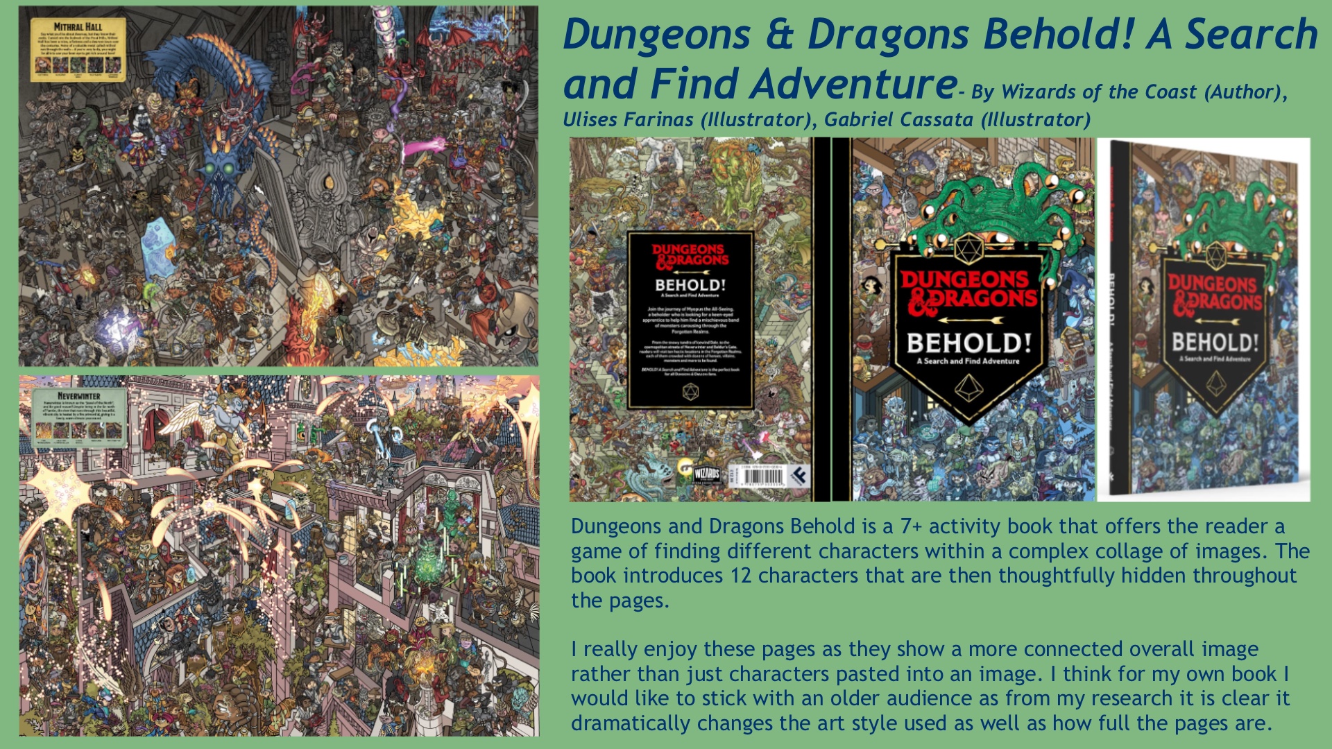
The importance of Search-and-find books and visual perception
I wanted to look into why these sorts of books are so important for children, and a lot of it comes down to improve children’s visual skills: https://www.kathybrodie.com/viewpoint/wheres-wally-and-why-its-important/
The where’s Wally books are aimed at audiences 4-12 years, so for this project I will keep the same audience type. My book is open to all demographics and psychographic, with a focus on BC2 explorers.
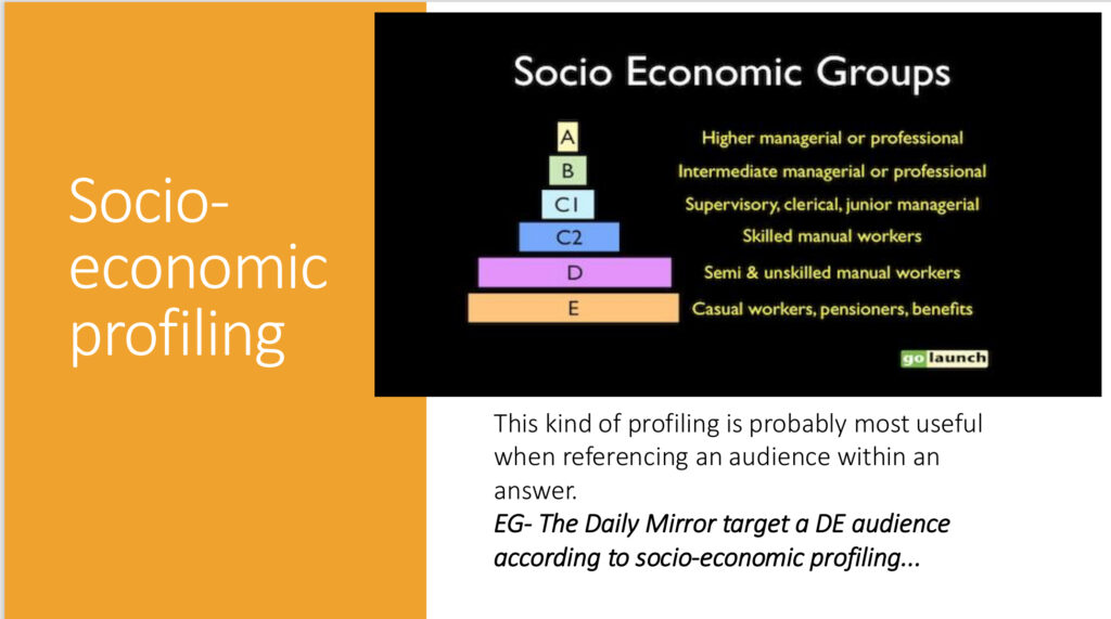
My target audience will be children from 4-12, which will influence my pages to depict topics that will appeal to this age range, for example dinosaurs and space! Things that I myself will have been interested in seeing illustrated at that age.
Rough Weekly Planner
I wanted to make a more in depth weekly planner that includes the weekends, and schedules time for me to get things done after my job. I understand this plan may change over time, but its definitely helpful to have a starting point.

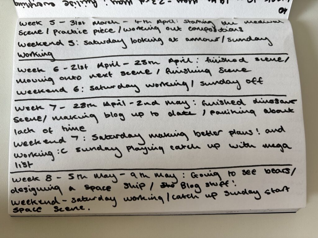
Having a plan really influenced me to consider the order I wanted this project to be presented in, starting with designing a really strong character that can be used throughout my search-and-find pages.
Creating the bear character
Analysing Bear Characters in media
To start this project I will start by generating the perfect bear character that I can use throughout my Search-and-find book, that children will be actively able to pick out of a crowd! In order to create a successful and unique bear character I have to have an understanding of other popular bear characters, looking into the elements of these characters that are effective as well as characteristics that I would personally like to utilise.
Bear character reference:https://www.reddit.com/r/cartoons/comments/17g6nud/who_is_your_favorite_cartoon_bear/
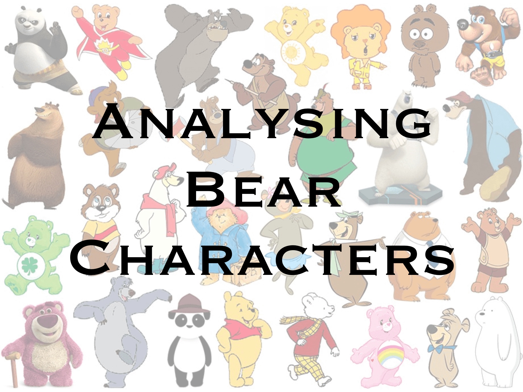

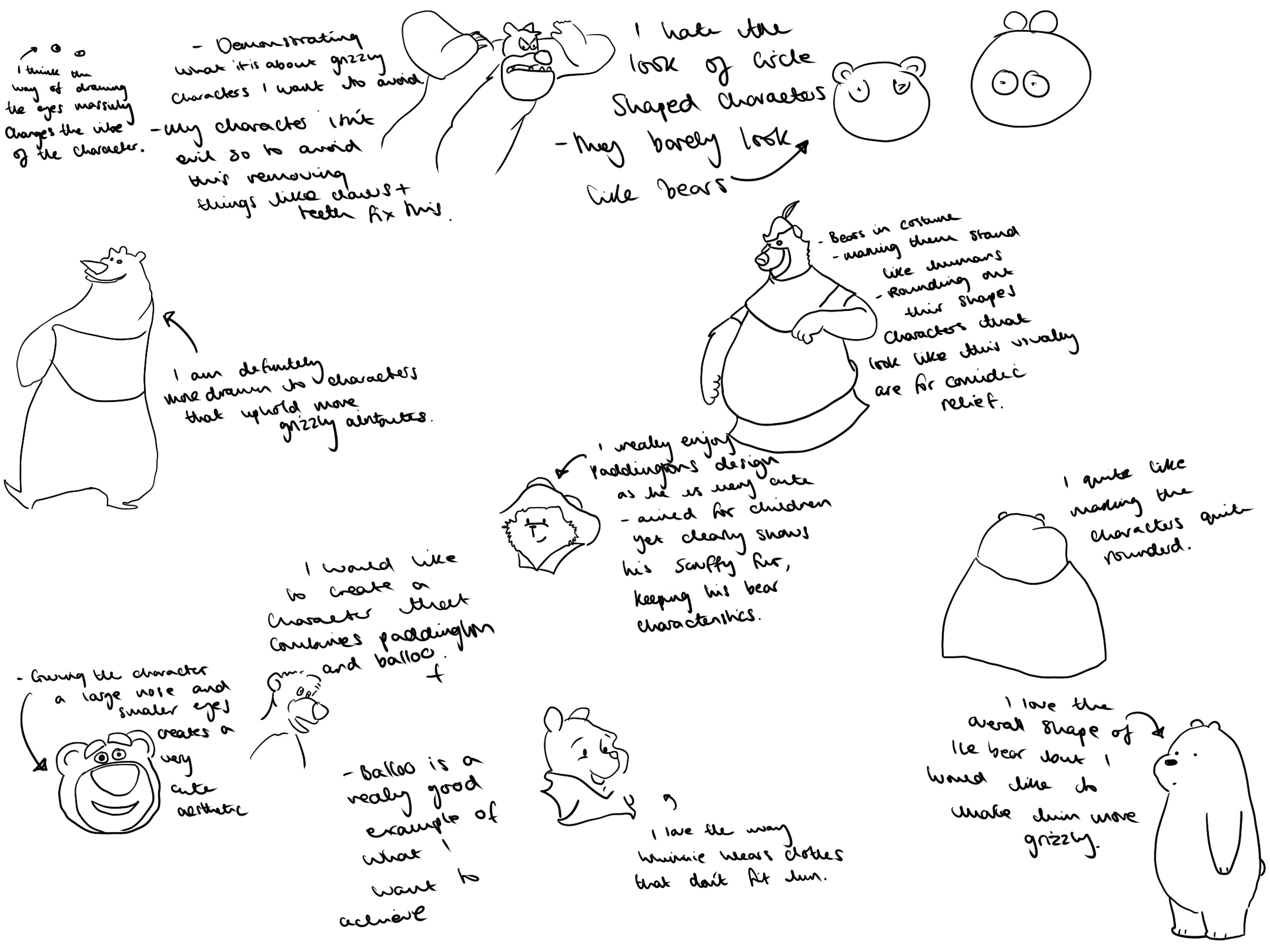

After analysing some famous bears, I wanted to sketch some of my favourites just to get a physical feel of how they are made. They are most made up of circles generating the bumbling bear trope you see throughout media.
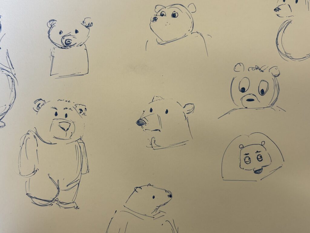
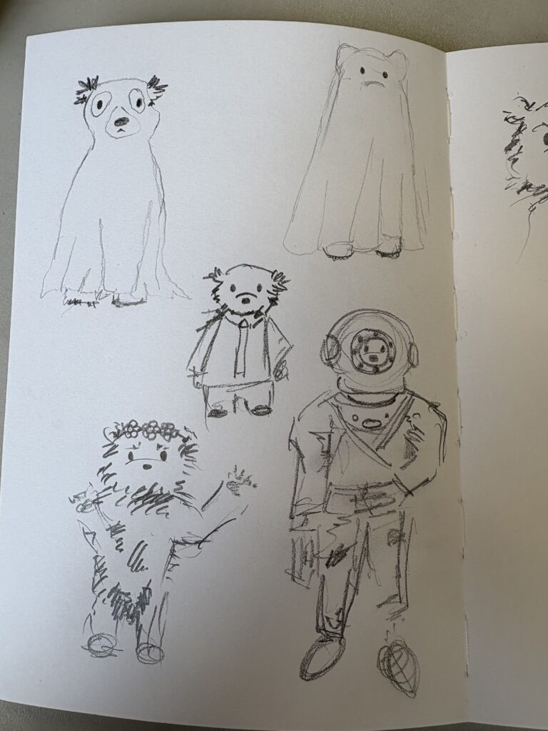
I did some quick sketches to see the types of face shapes I wanted to use, I don’t particularly like any of these designs, so I think I need to complete further research into the bear designs I really like, comparing what I believe works and what doesn’t.
Completing these draft sketches influenced me to look more specifically at illustrators who use bears for their characters, such as Peggy Fortnum
Artist Research

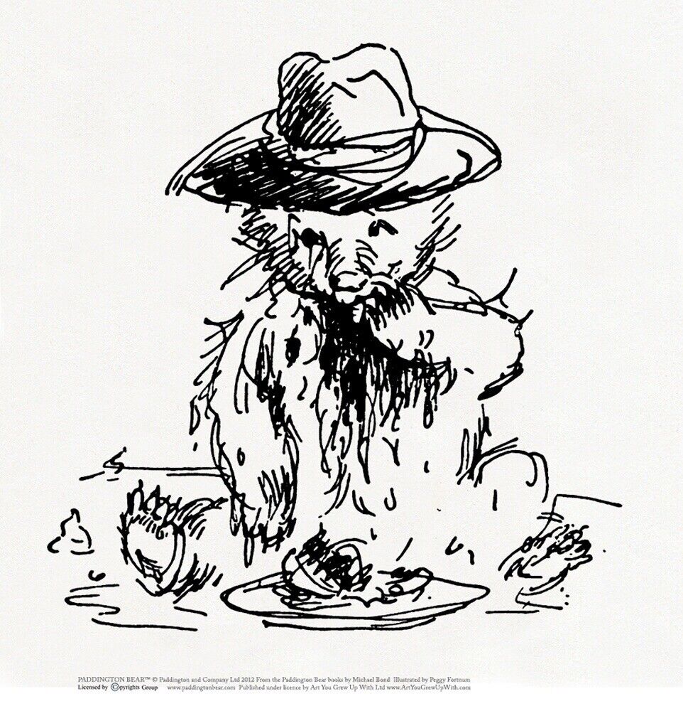
Paddington – Peggy Fortnum
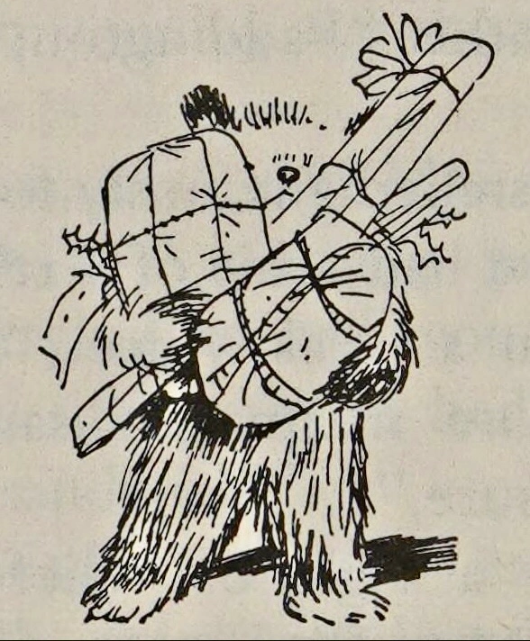
Peggy Fortnum liked to work with pen and ink most often described as a ‘loose style’. She massively favoured working in black and white, with all coloured paddington renditions being done by other artists. Her drawings look deceptively simple and sparse but do in fact carry just enough detail for the reader to use the drawings and text together to create this loveable character.
I think Paddingtons design is really effective. I love the way Peggy Fortnum is able to show his rugged bear qualities, giving him fur and a pointed snout, rather than a more rounded face. However he also looks incredibly cute. I think this is down to the way his eyes are drawn, as well as his body proportions. I drew paddington the exact same way except I changed the eyes to see what difference it would make.

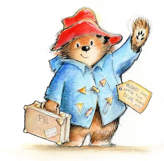
I also completed a few quick sketches, which I really enjoyed and am quite pleased with how some of them turned out! These sketches demonstrated how important a colour palette can be with maintaining Paddington’s cute aesthetic. Looking into Fortnum work was really essential to working out what type of bear character I wanted to create for my scenes. It solves my original dilemma around the sizing and shape of the bear, as clearly a bear of this likeness really resonates with a younger audience highlighted by the characters long running success. I will use paddington’s design as the starting point for my own character.


I am not overly fond of this style of design, he doesn’t uphold the qualities that I really enjoy with bears, such as their rounded faces and shorter limbs in proportion to their overall scale. I hate the fact Rupert has human hands as it just adds to the creepiness of his design.
Rupert the bear – Mary Tourtel and Alfred Bestal
Rupert Bear was created and initially drawn by Mary Tourtel in 1920. Tourtel used a pen and ink drawing style, often incorporating watercolours and crayon pencils. Later, Alfred Bestall took over as illustrator and writer, and his style was known for a more loose and expressive impressionistic approach. He drew the outlines in pencil first, then used black pen to add detail, focusing on making each panel a work of art. It was really helpful to learn that Bestall would always drawing Rupert starting with his head in order to capture his character perfectly.
Similar to Paddington, Rupert is another famous bear character complete with a signature outfit. However, in contrast Rupert definitely has more human qualities, with his figure being more similar to a human child than a bear cub. I actually think his design is quite creepy, and highlights what I want to avoid when designing my bear character.

Visiting my bears

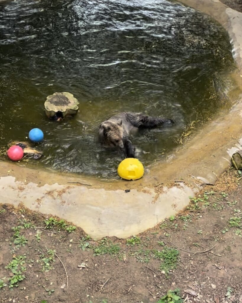

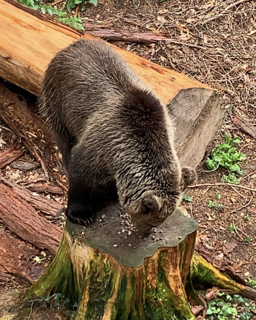
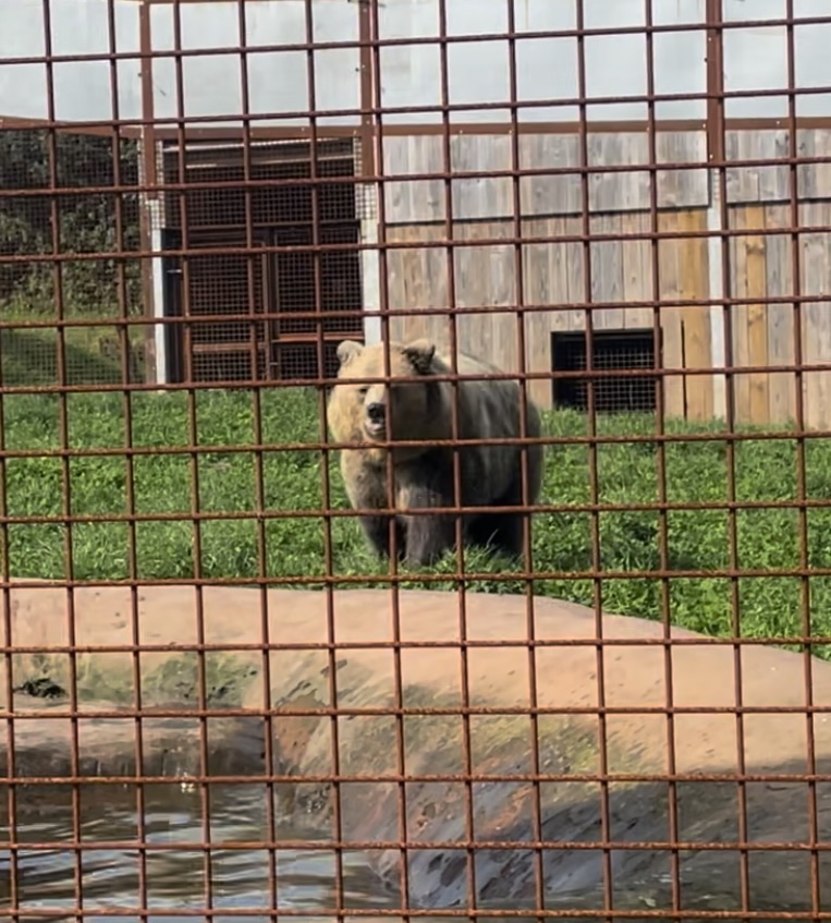
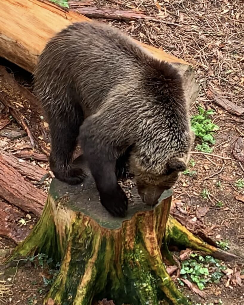
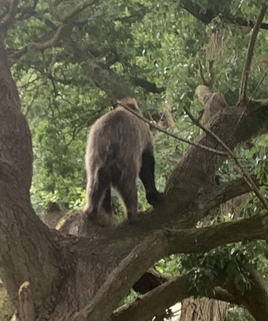


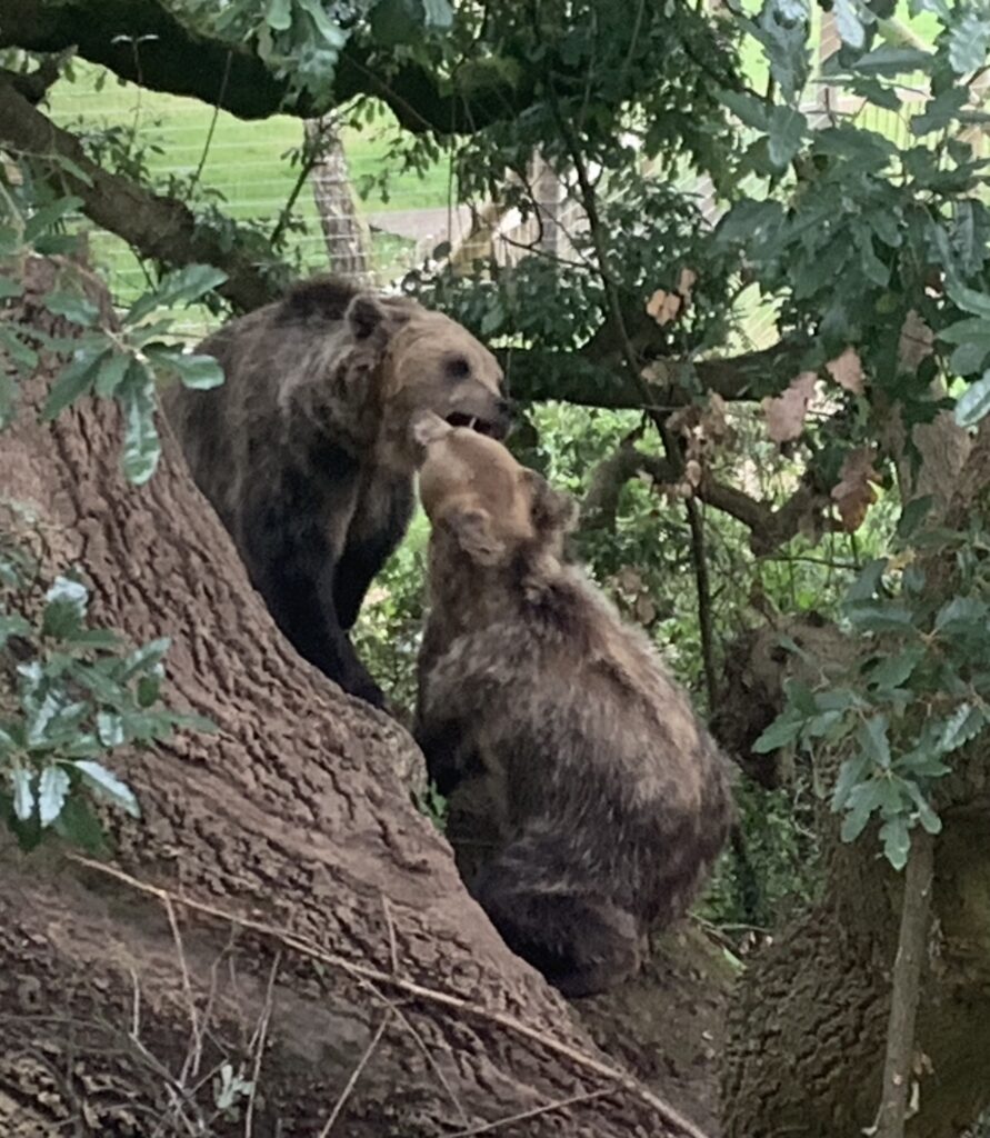
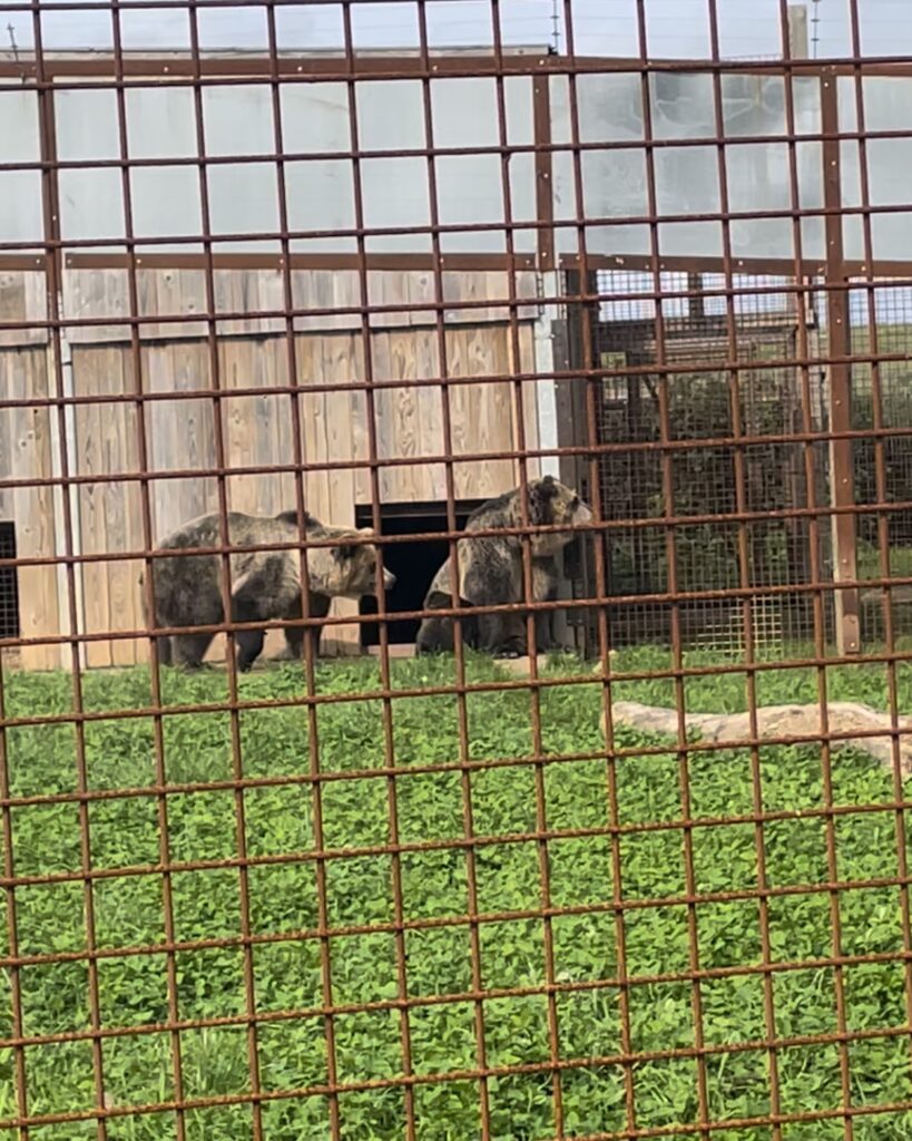
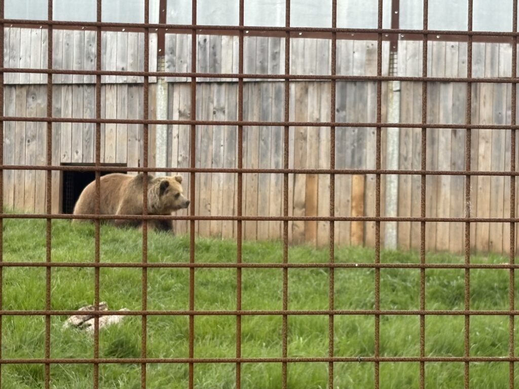
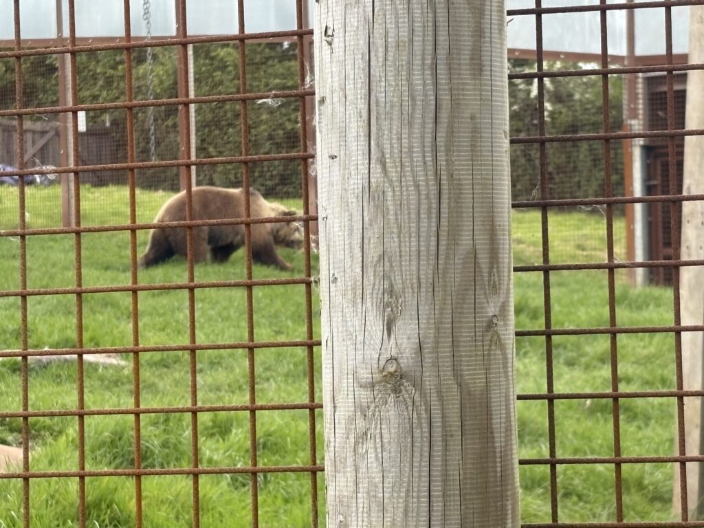
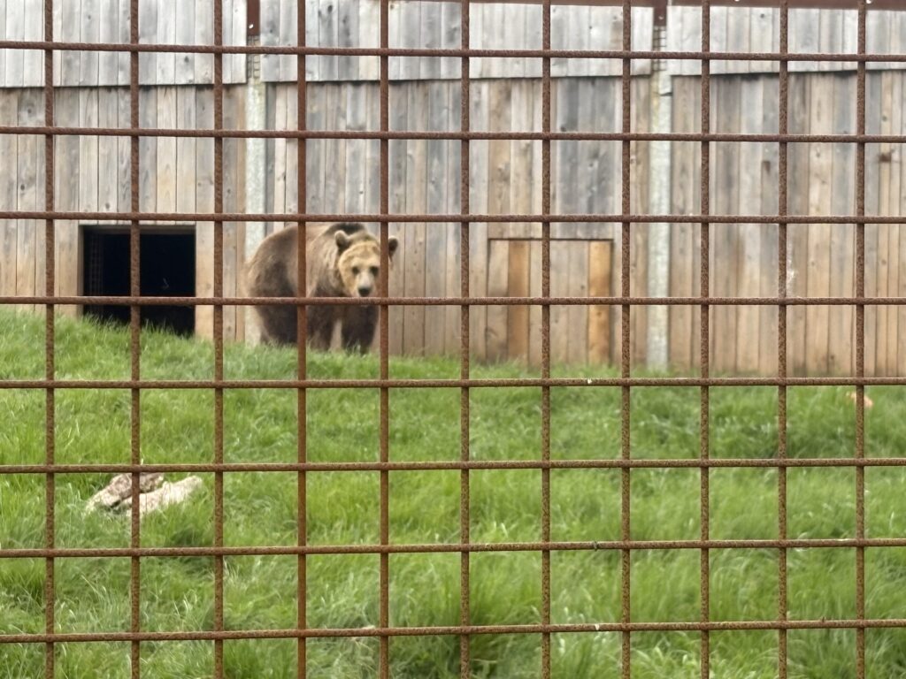
Lucy and Mish are two twin bears living in Wildwood Devon. Lucy is the slightly bigger bear, with Mish being more yellow on his back. I have a membership so I can visit them whenever I get a chance which makes them the perfect primary research for this project. There are two different viewing areas for their enclosure, one that offers quite close contact but has a metal fence around it. And a treetop viewing platform that lets you view the bears fence free, from up above. If you get lucky enough the bears will be playing in the trees directly parallel to the tree top platform, offering you close contact without the fence getting in the way. I think if the bears hadn’t been raised in Wildwood from when they were cubs the owners would have had a bit of a problem with this. But luckily the bears have grown too fond of their dog food and cabbage diet to plan an escape any time soon.
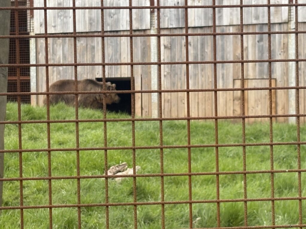

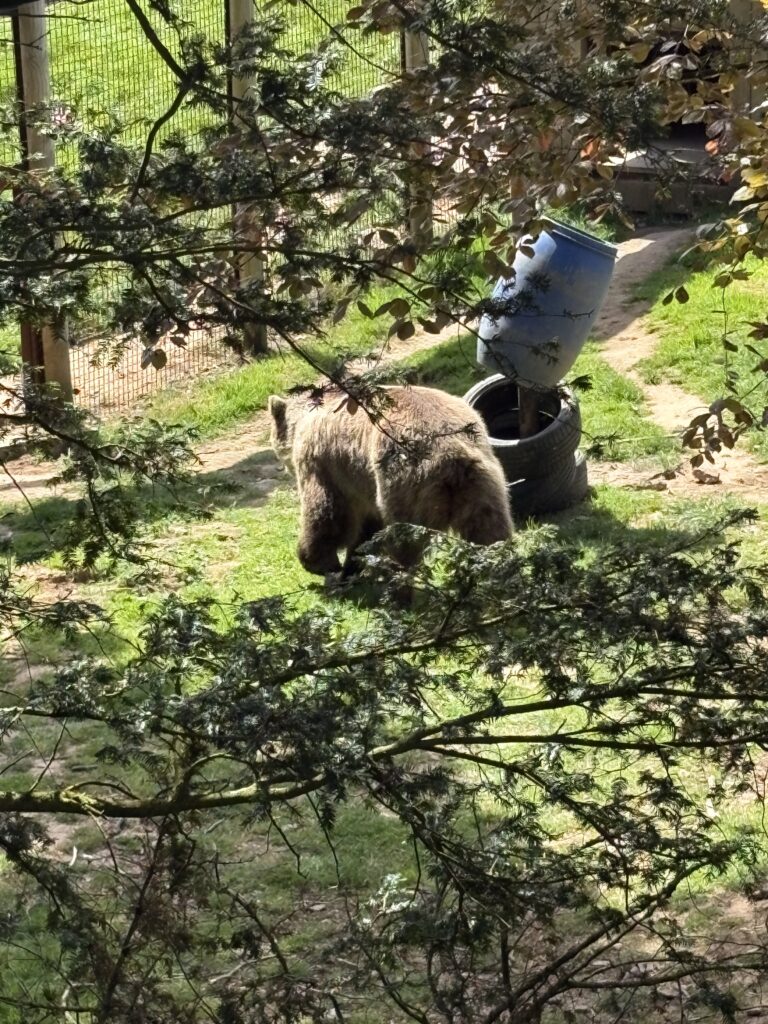

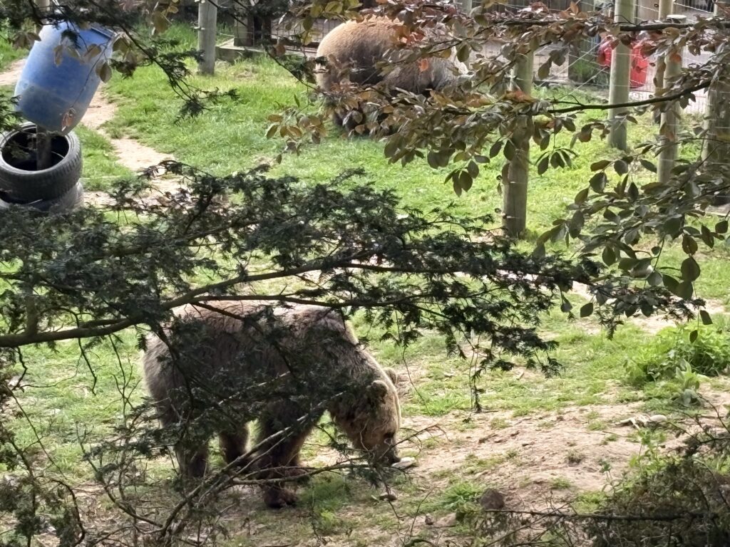
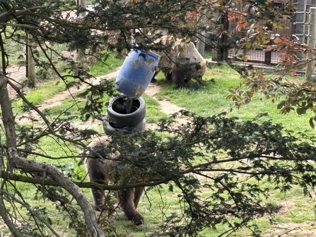
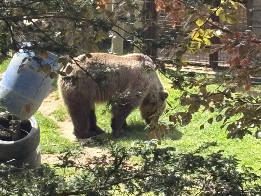
Observational Drawings of bears.
To help develop this character, I revisited a lot of the bear drawings I have done in the past, where I completed detailed analysis of a bears shape, drawing over 210 bears across 15 hrs. Since some of these sketches were completed very quickly, it helps to see which elements I chose to include within the sketches as these would also have to be clearly communicated for my character.
Observational Bear Sketches
I did some quick ink sketches whilst sitting with the bears on one of my visits, however they all came out a bit messy, life drawing with an ink brush isn’t exactly the cleanliest process.


Working out the Bear character
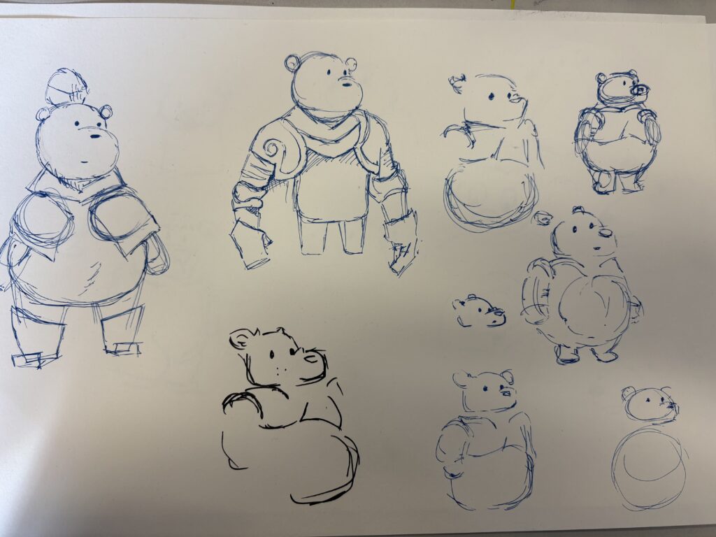
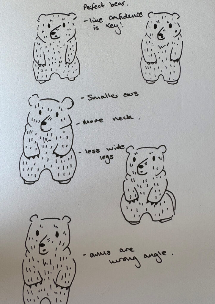
I thought a good method of developing my character was to just draw potential ideas over and over again, until I found one I liked.
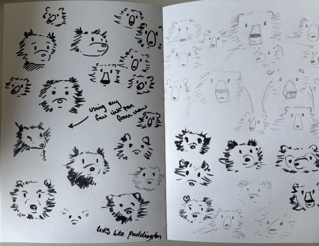
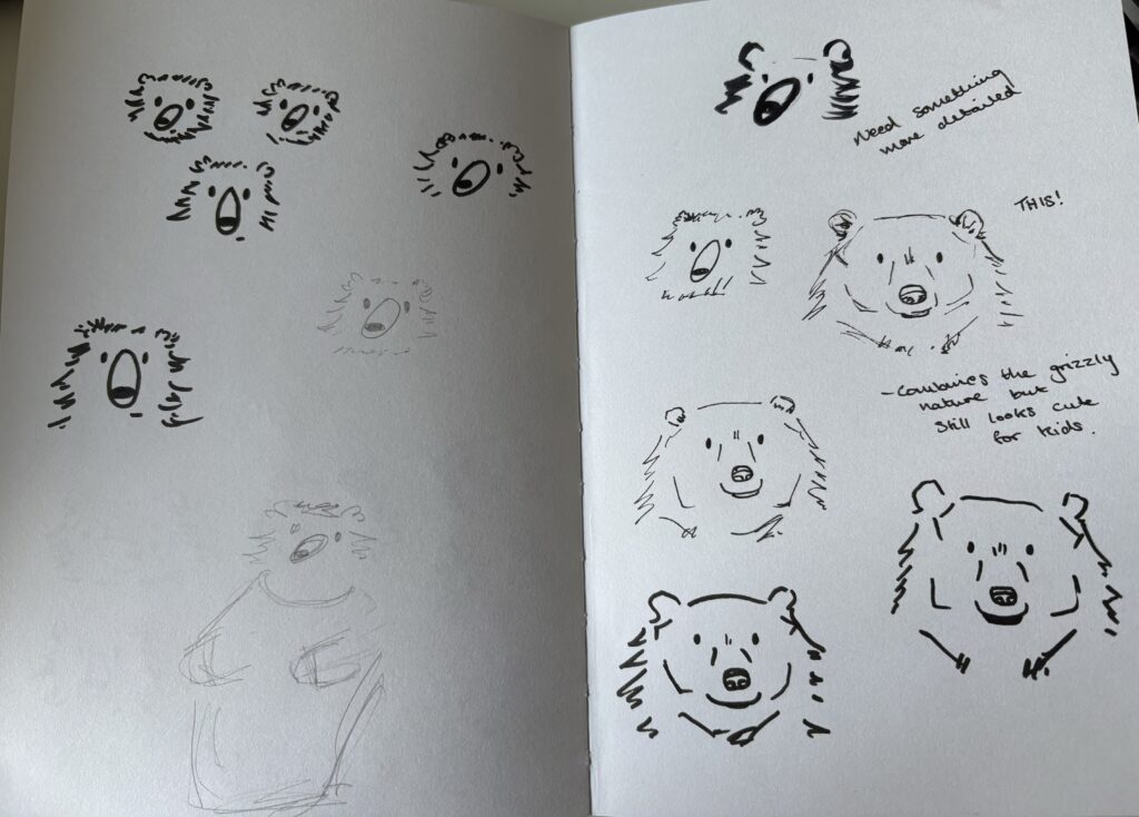
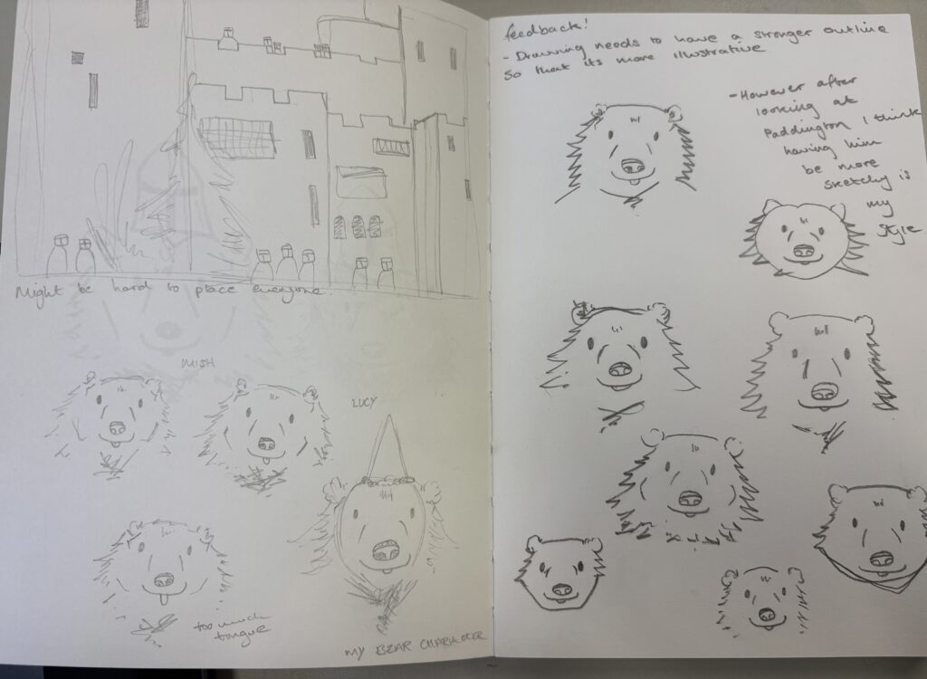
Here are the many drawings I completed trying to gain a shape and outline for my bear. He started off looking very similar to the paddington design but after changing different variants I landed on a design that I felt I would be able to replicate again and again across the different scenes that I would need. Looking into Peggy Fortnum’s work definitely helped with this development and I think you can clearly see her inspiration behind my linework.
Finished Bear design
Here’s a little spoiler for my scenes later on showing the finished lineart of my bear character.


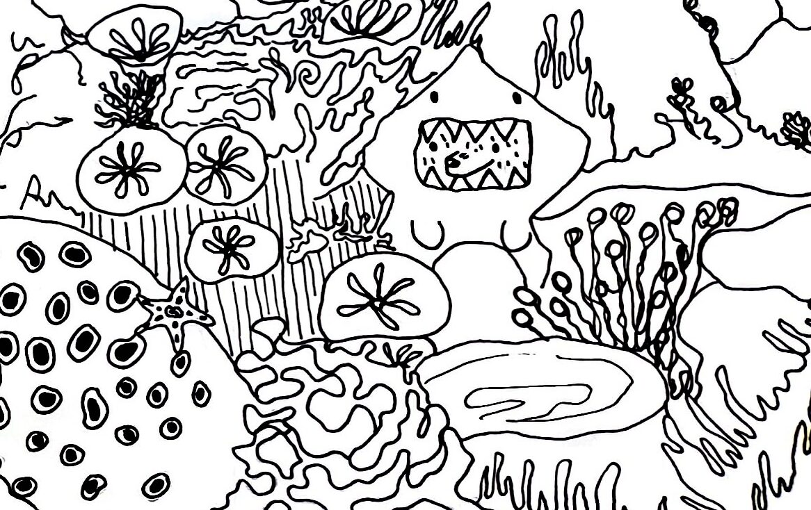
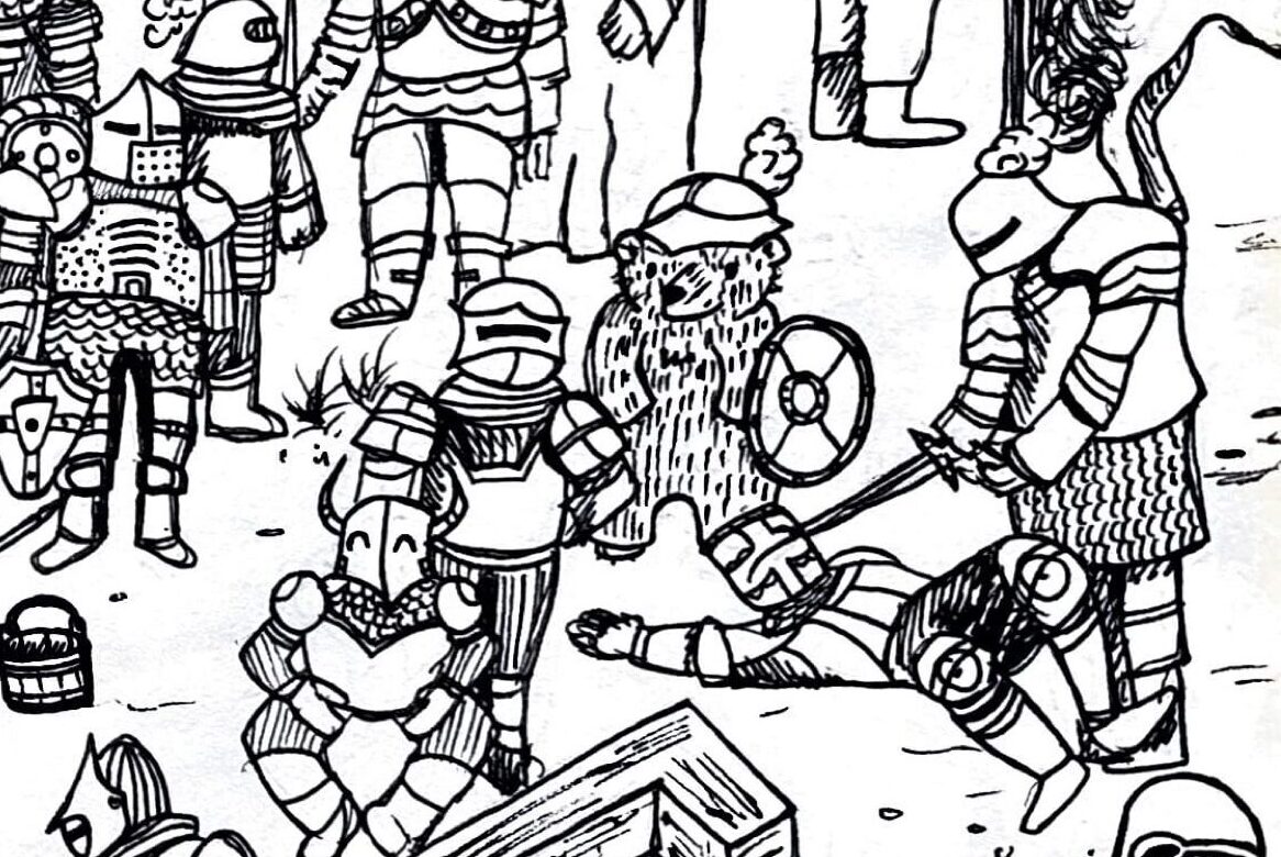
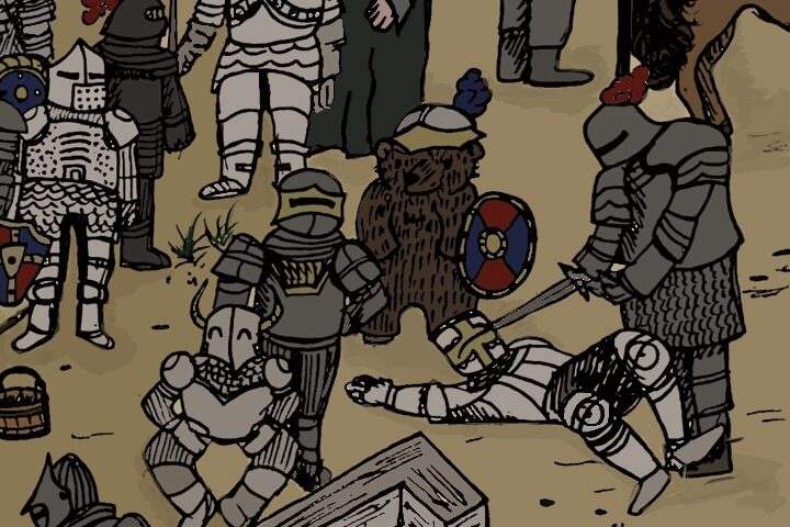
Here are my finished bear designs that are featured within my search and find scenes. I really like my finished character as I feel like he is a perfect amalgamation of a cute children’s book character, yet he still upholds the rugged nature of a bear. I love how customisable he is, since I can throw him into any costume and hide him within the scene. My favourite design is the knight bear as I think he’s the most detailed. By looking into the work of other artists I was able to use the foolproof method of first drawing my character in pencil, doing the the line art in pen, then later adding colouring over the top, similar to how both Paddington and Rupert were created.
Experimenting with ideas
Artist research
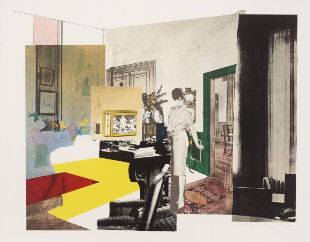
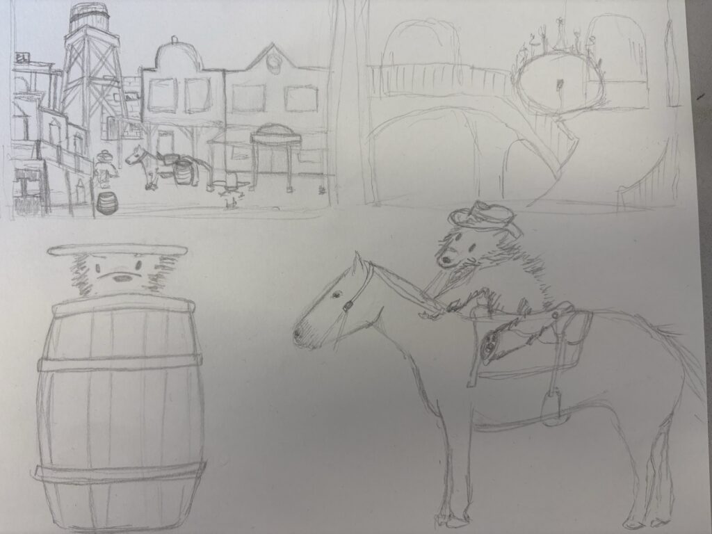
Richard Hamilton – Painter and collage artist.
Richard Hamilton created his collages by cutting and pasting images from various sources, including magazines and advertising materials, and arranging them on a support surface. He used images of consumer goods, celebrity culture, and domestic spaces to create his collages. Hamilton’s collages were a form of visual commentary on the changing cultural landscape of the 1950s and 1960s, using the mass media imagery of the time to express his artistic vision.
Since for this project I knew I would have to cover a lot of space quickly, I wanted to explore collage. In the past I have made smaller collages but I have never tried to make one cohesive scene, similar to how Richard Hamilton takes magazine cuttings to tell a narrative. A lot of time collage work appears more abstract, but Hamilton’s work is a lot more grounded, almost looking like an original photograph, rather than multiple glued together. I wanted to use this technique, although for a less political reason, for my own work so I took one of my initial ideas and brought it to life using collage.

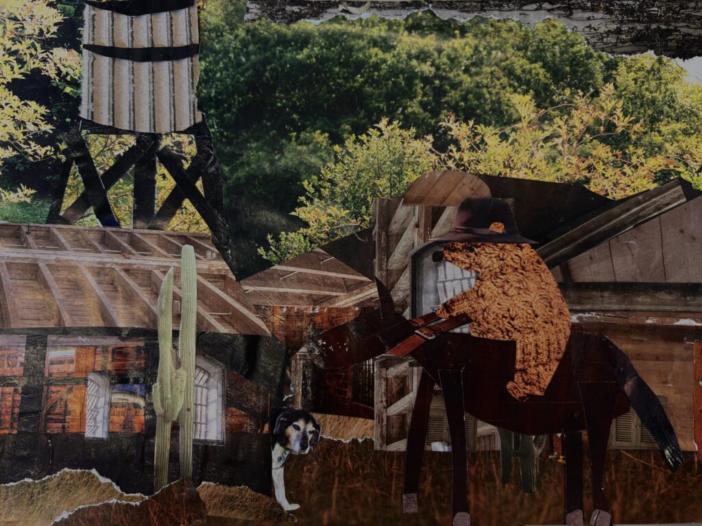
One of the ideas I had for my scenes was a western inspired narrative, sporting a horse-riding cowboy bear! I selected this idea for the college because as much as I wanted to use this idea, I felt it would be very challenging to build primary references for both the landscapes and cowboys. So I thought this would be a good opportunity to still explore the idea. I really like the outcome of this collage and I had a really fun time making it. Whilst it doesn’t really uphold the search and find aspect I am going for, it did teach me a lot about utilising layout and shape in order to make an effective composition. I think it would definitely be interesting to try to create an entire search and find in this way, however it would really challenge how much control I have over what’s included in the image itself.
Artist Research
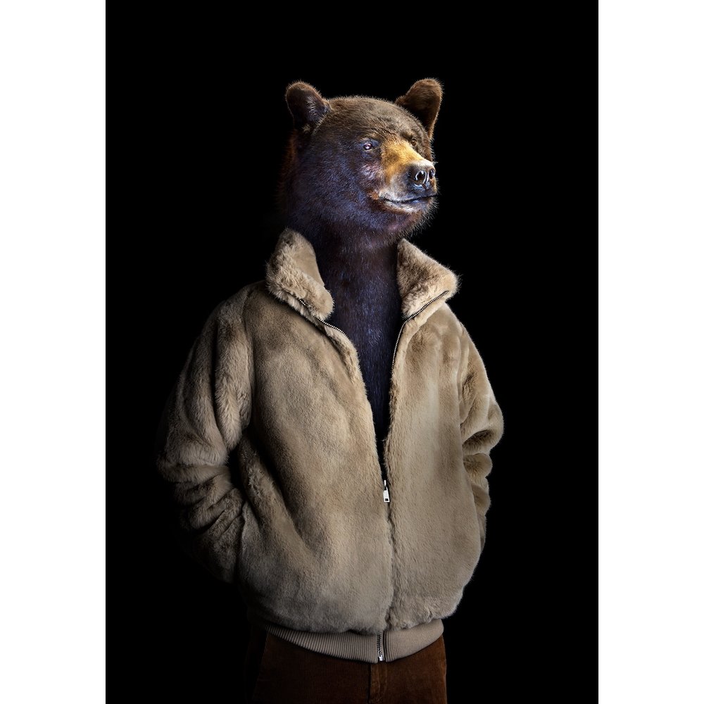

Prieto’s collection, Second Skin, is intended to explore the “animal within all of us”, whilst for this project I am almost doing the opposite, I thought it would interesting to look into as I intend to put my bear character in a collection of different costumes. Prieto made his animals look like humans with animal heads, I instead intend to make my bear look like he is actually wearing the costume itself, rather than attempting to replicate what a human would look like.
Miguel Vallinas Prieto – photographer
This photo series sees various animals dressed in modern outfits, posing as typical human models would. The clothes appear to match their personalities, acting as a true second skin. Miguel didn’t actually photograph living animals. The taxidermied specimens are photographed in various museums and private collections, while each outfit is modelled by volunteers in Miguel’s studio. The two images are then spliced together by the artist.


My own (less serious) versions
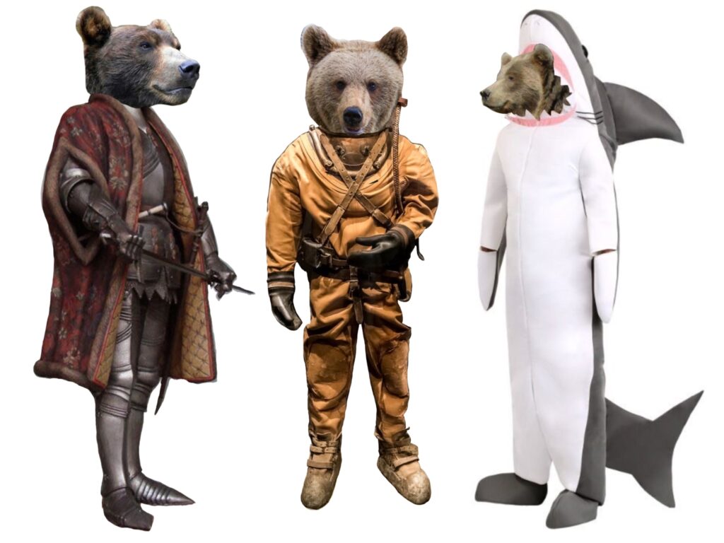
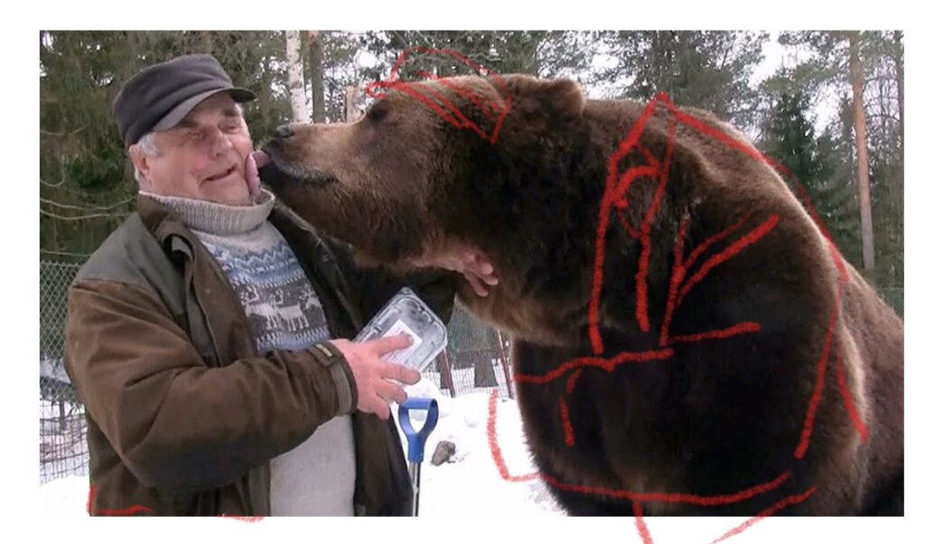
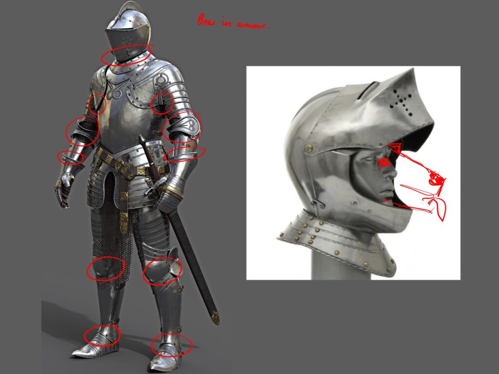
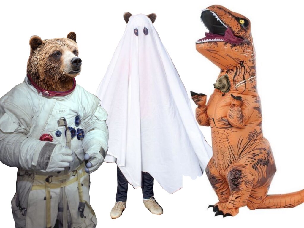
I also spent a little time editing bear heads into different costumes. Obviously it would be quite challenging to get primary referencing for my bear character in costume, so I thought it would be interesting to try to add the bears into the costumes digitally. Whilst the result is slightly ridiculous, it did offer the opportunity for me to consider how exactly a bear would fit into human clothes.

Lino Print
I thought it would be interesting to explore medieval lino prints as another way of making a character. If I were to make a successful print I could use this to produce knights for my search and find book, being able to print the same scene again and again.

Artist Research
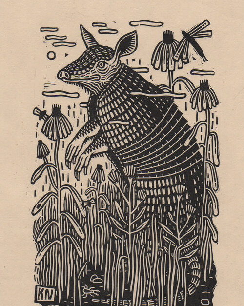
Kathleen Neeley – Linocut artist
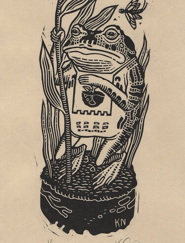
After looking at Medieval style linocuts, I found the work of Kathleen Neeley. I really enjoy the the thick linework of the pieces and I would love to be able to replicate this style for my own bear character. I think it would just offer as a different type of material that I could potentially use for my search and find scenes.

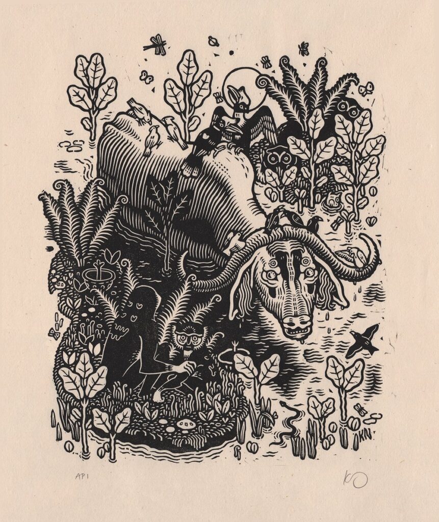
Neeley workes by drawing directly on the block with pencil and permanent marker. Her colour prints are created by layering multiple linoleum blocks, one per colour or colour family. All of her work is printed by hand using a glass baren and a spoon!

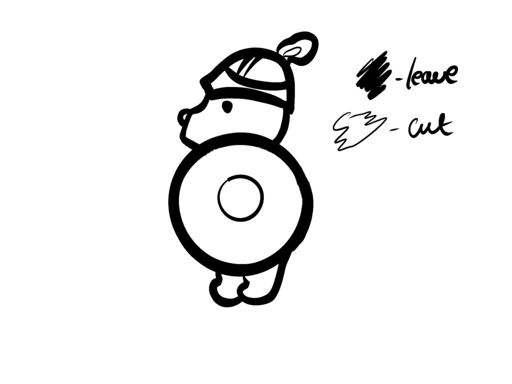
I went with a really simple design for my character as I was going for a more cartoonish style which I haven’t really tried in the form of a lino cut before. I think the hardest part of lino cutting is working out which part of the design to cut out since it’s the reverse of what you would usually do with drawing. Unlike last time with the boo project, I actually remembered to flip my design so that it would print the correct way.


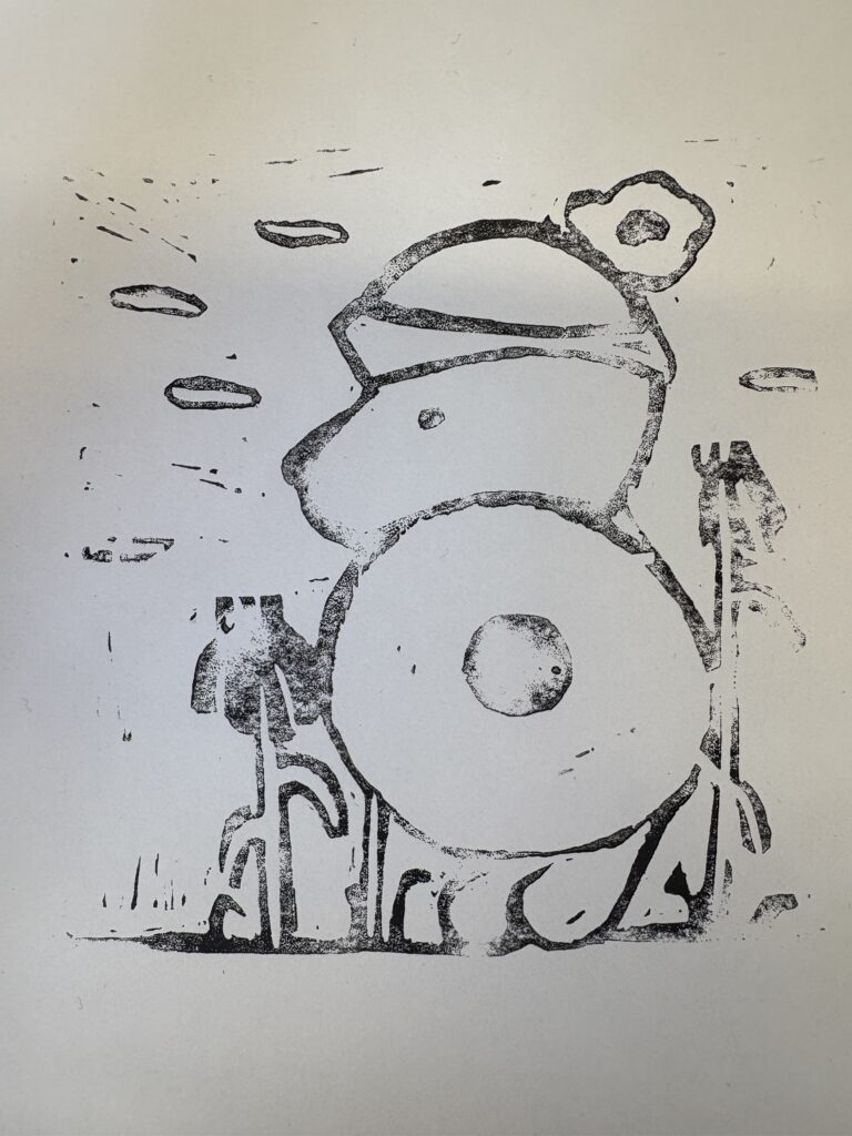


Lino Evaluation
I quite like how my Lino cut turned out, I think it’s a different way of designing a character, however I think if I were going to do this type of experiment on a larger scale I wouldn’t enjoy the lack of control I would have over the finished result. I ended up digitally improving my piece, whiting the nose and adding in the ear that I forgot to add. It was definitely interesting to look into a different method of creating a search and find book, I probably won’t be using this method going forward.
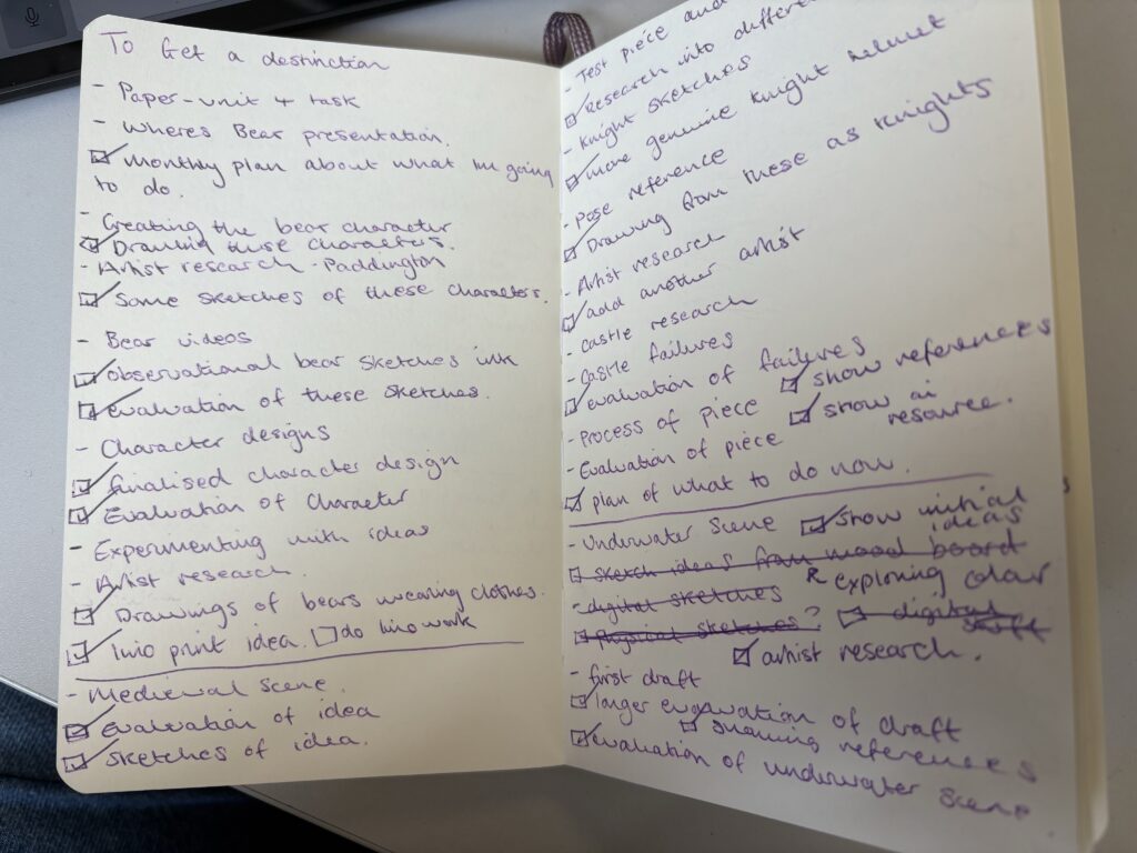
Rough to-do list

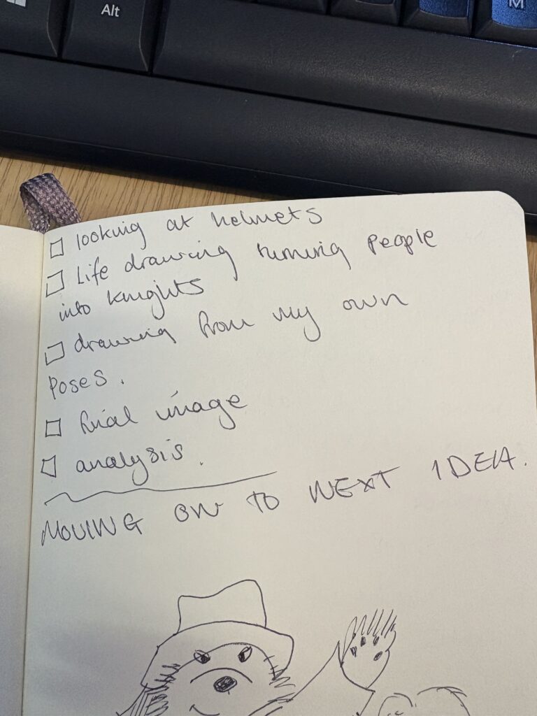
Medieval Scene

One of the scenes I was most excited about drawing was a medieval castle scene, where the bear was hiding amongst some armour, whether he would be wearing it or hiding behind it. When trying to generate scene ideas for this project I decided to go with typical children’s book subjects. Using my own childhood interests as inspirations for the subject matter, I started with a medieval style scene. Crowded with different knights, within or close to a castle. Above, are a few Pinterest pins that show the type of imagery I intend to create. I want to have lots of fun with this project so I plan to include different types of armour types that were used across history rather than keeping it to one time period. For my first practice sketch of this scene I hadn’t completely found the style I wanted to use, so being able to complete a practice scene showed me which elements I would have to change in order for this project to be successful.
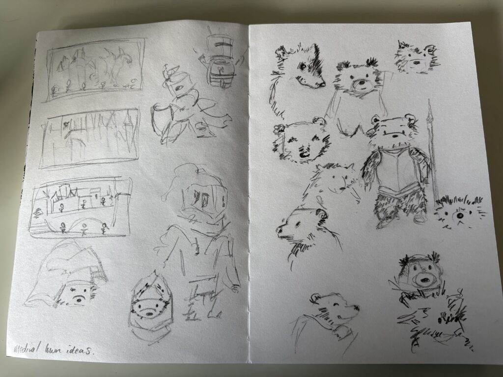
Still trying to get a grasp of the character, this time in costume.
Creating a practice scene based pinterest ideas.

Using this image I found on Pinterest as background reference.
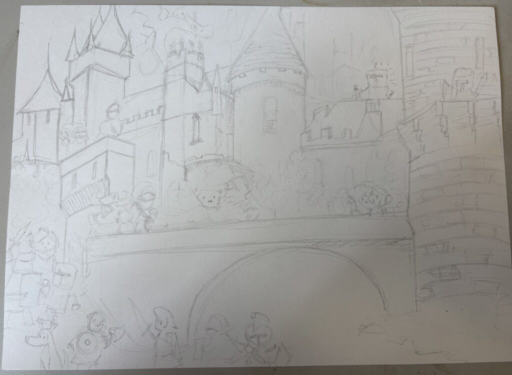
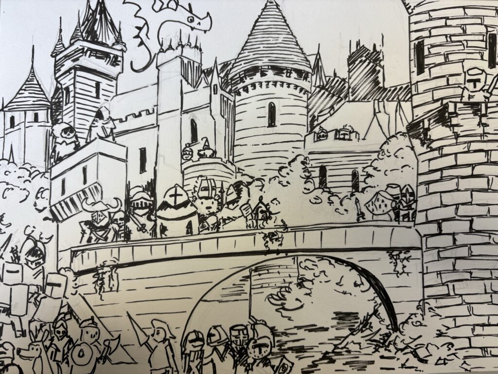
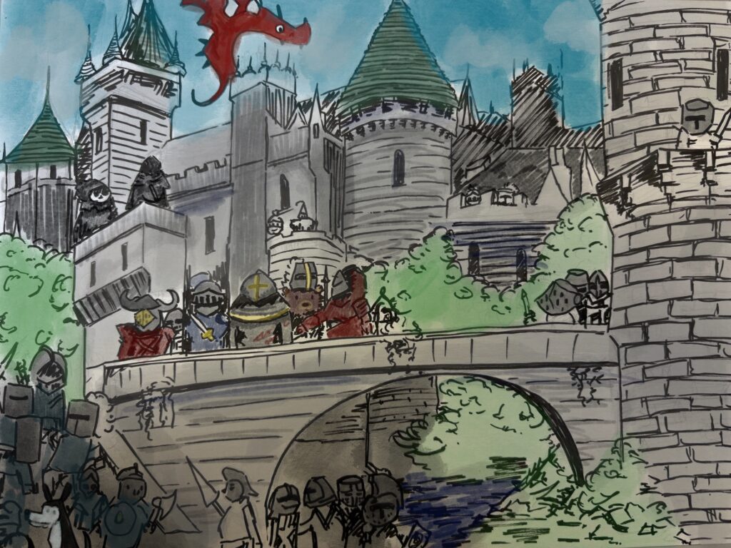
Evaluation
I completed this sketch to see if my idea was actually possible. I wanted to see if I could fill the page with my drawings effectively even if they are quick sketches. I roughly added the colour digitally as I didn’t want to spend too much time on a sketch yet I still wanted to see if it would work effectively. In completing this rough version it became very clear the amount of planning I would need to make in order to have full control over what was happening in the scenes. The pose and armour of each of the knights would have to be planned ahead of time, and getting the perspective for the scenes would be quite difficult to achieve without practice.
Developing knight characters

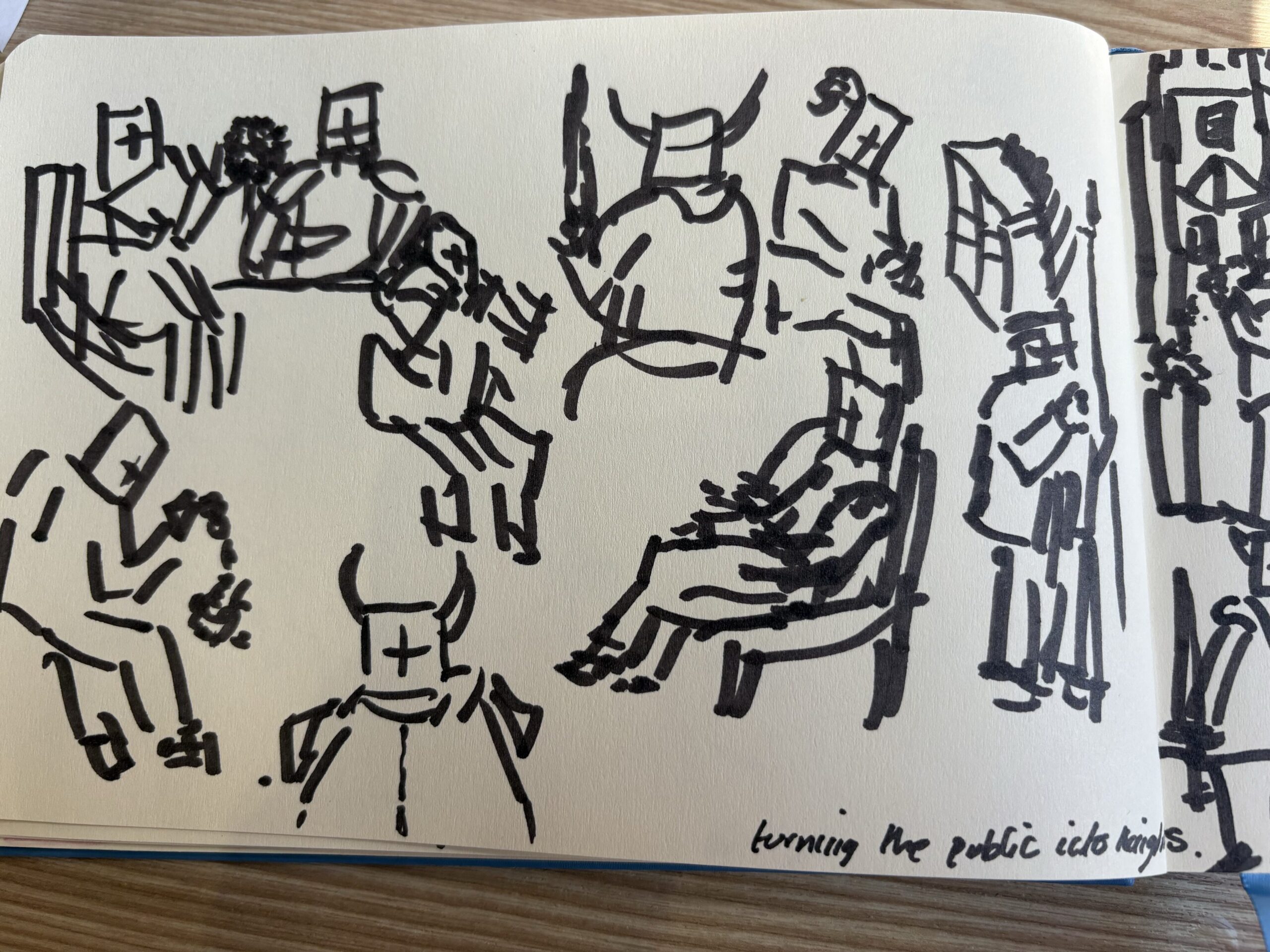
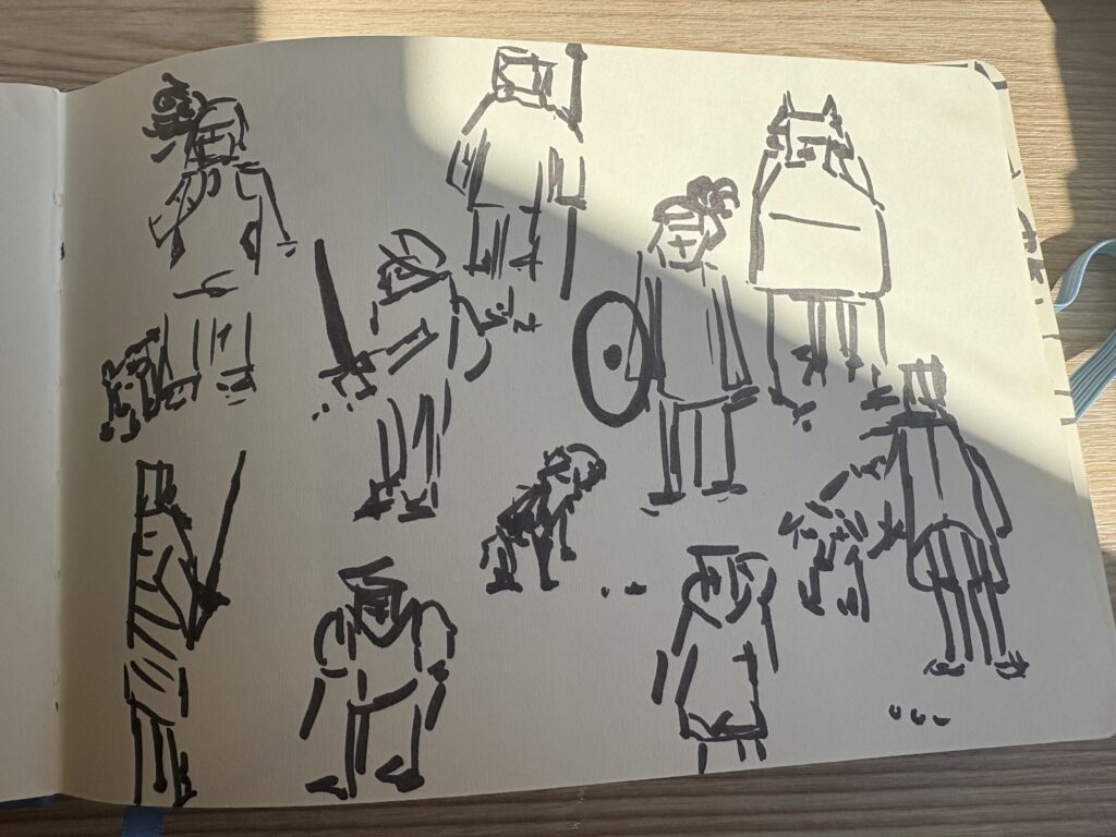
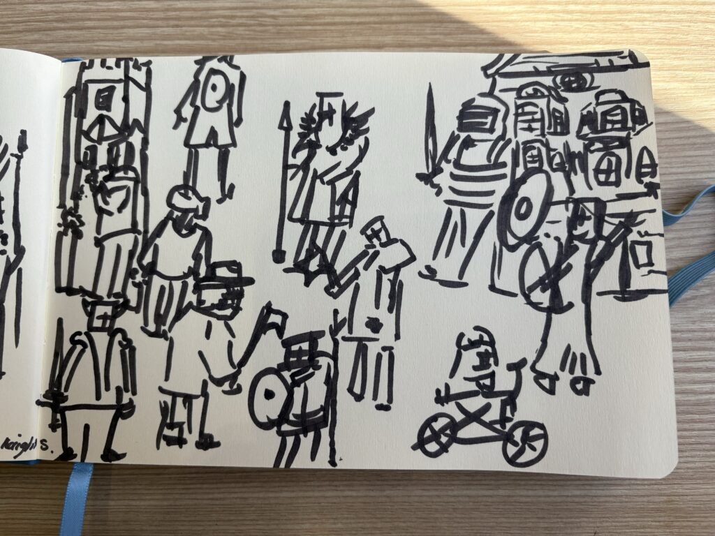
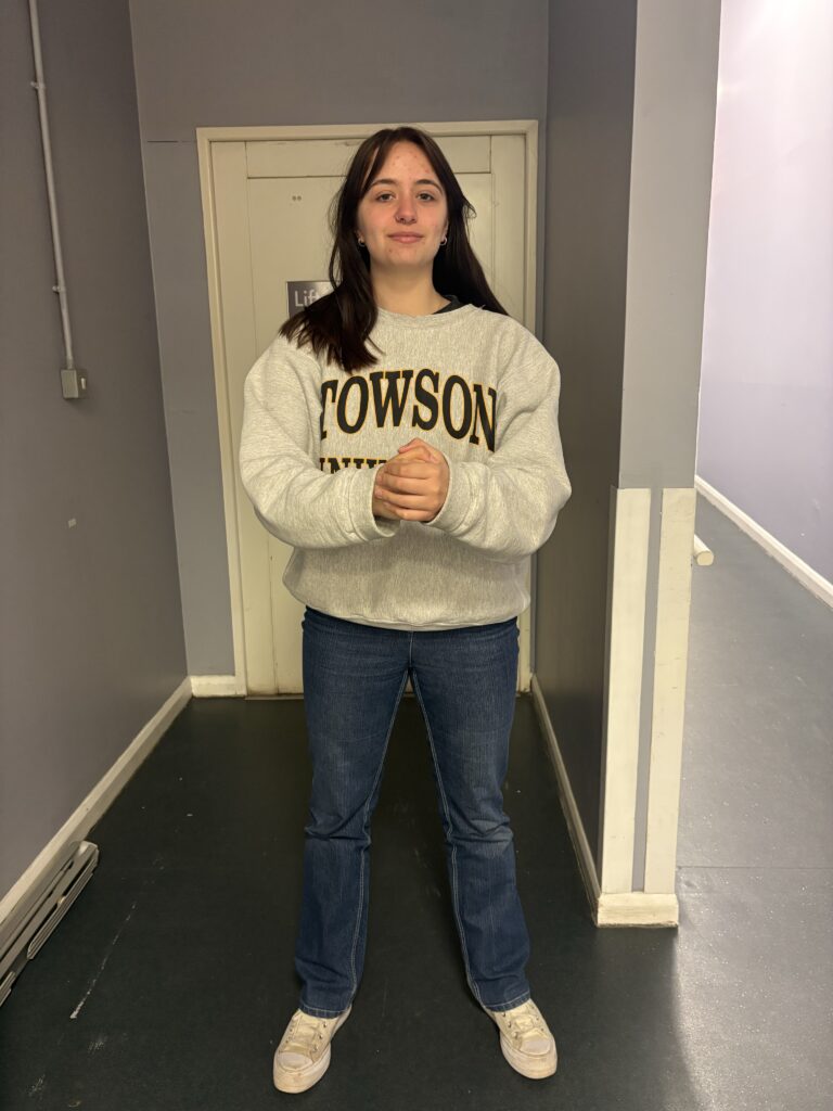
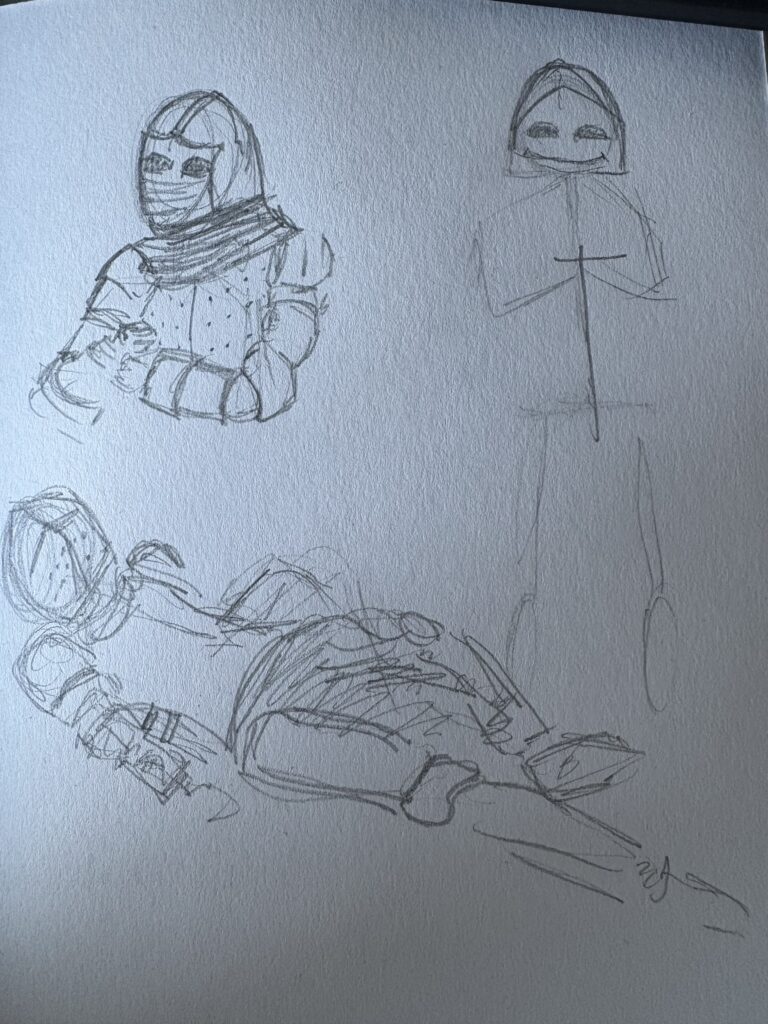
I wanted to practice the layout of people in a space as well as how people naturally pose, so I decided to life draw, except I added swords, shields and helmets, turning people in public into my characters. This was really essential to planning how each knight was going to stand within the castle walls, since it allowed me to see how people naturally stand next to each other. I had a lot of fun with this exercise and I definitely think it helped throughout the entire project, helping me improve my ability of drawing people within a space.
Understanding the mechanics of armour
Whilst I felt I had a basic understanding of how armour worked I wanted to make sure what I was drawing was mostly accurate so I did some research into armour as well as the method of drawing it.
I wanted to have a basic understanding of the armour I was drawing, as I knew I wanted to combine the different time periods and styles but I didn’t want to make any fundamental mistakes that would ruin an audiences enjoyment of the piece. The main thing I noticed with the design of armour is how over time it adapted to cover all of the body, whereas in the earlier century, their hands and faces were left uncovered. This change is most likely due to the adaption of weapons being able to get through the less protective armour, forcing armies to make changes. I think for my piece I will be combining 13th Century armour as I enjoy the use of draped fabric and the 15th Century armour as it has the most similarities with the typical presentations of a Knight.
I watched this youtube video to gain a basic understanding of how armour is layered and held together on top of the human body. This video highlighted the importance of breaking the armour down into different chunks, using belts and more metal pieces to connect all of these together. The armour isn’t supposed to be skintight to the soldier, so it important to get the proportions of the figures correct before adding the layers of armour.
Pose Reference
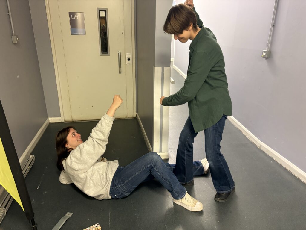
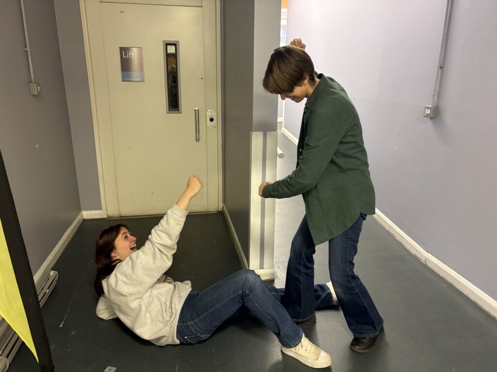
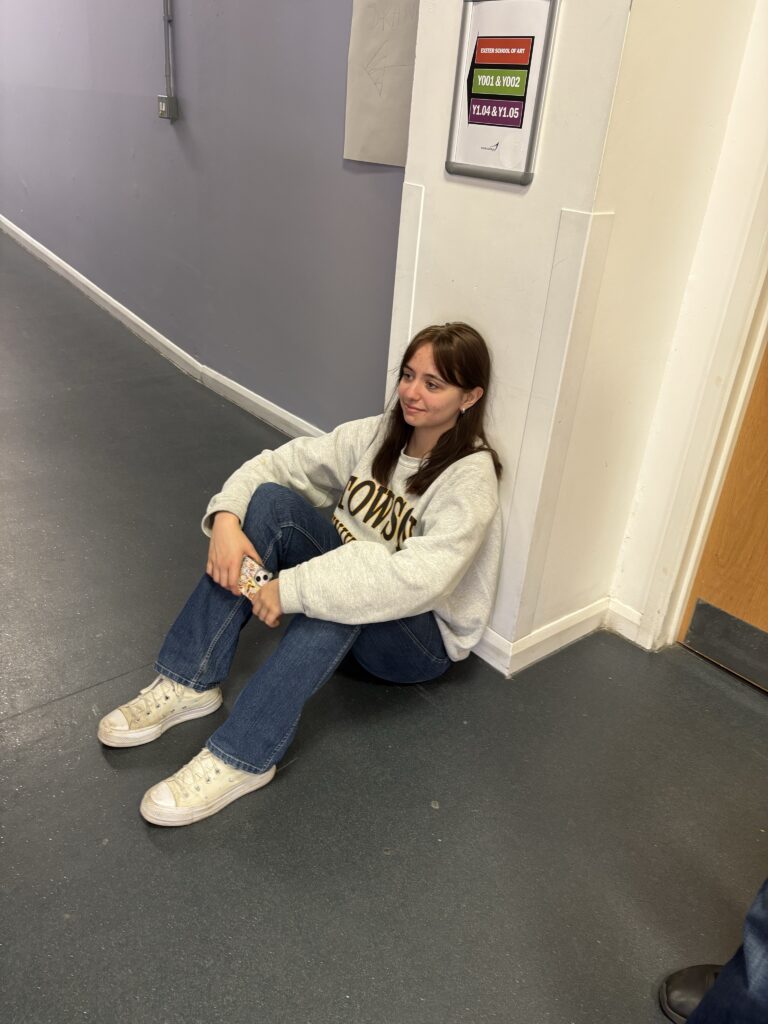

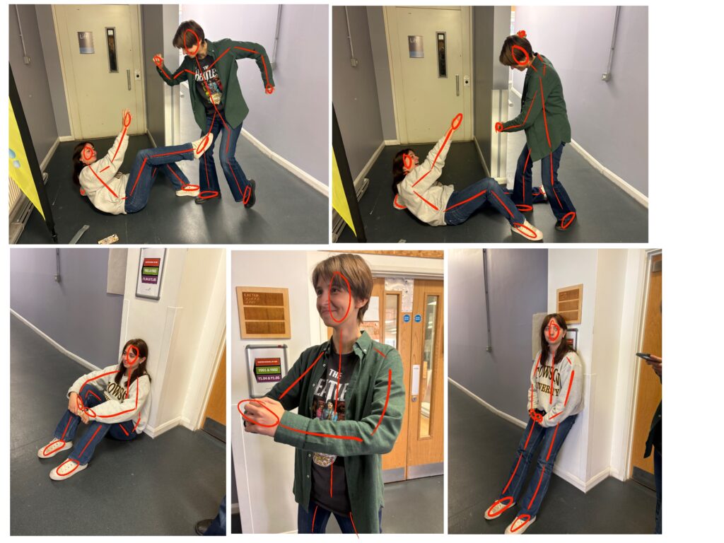
I got Dan and Hannah to pose for these more particular poses, such as two knights fighting as well as how they would pose with their swords. This helped a lot with completing the more intricate poses as I got to see it in person rather than just on a screen. I used these pose references to do some quick amour sketches, as well as later using them in my final scene.



Looking into creating the background for my scene.
Once I felt confident I knew how I was going to approach drawing the knights, I had to work out the type of background I wanted to add these characters into. I felt a good place to start was by looking into successful background artists who are able to cover a lot of space with a lot of detail.
Artist Research


Mira Ko – Background Painter and Designer
I thought for my scenes it would be beneficial to look at some background artists to gain a better understanding for the composition I would need to turn my pages from simple scenes to a search and find book. For search and find books compared to normal scenes there is a big difference in the perspective chosen. As shown through Mira Ko’s work the background seems large in comparison to the small scale of her characters, making them seem cuter. The straight lines of buildings emphasise their roundness , and the composition of the scenes feels realistic, like the scenes could have been real events where humans have been replaced by these animals, rather than a new type of reality.
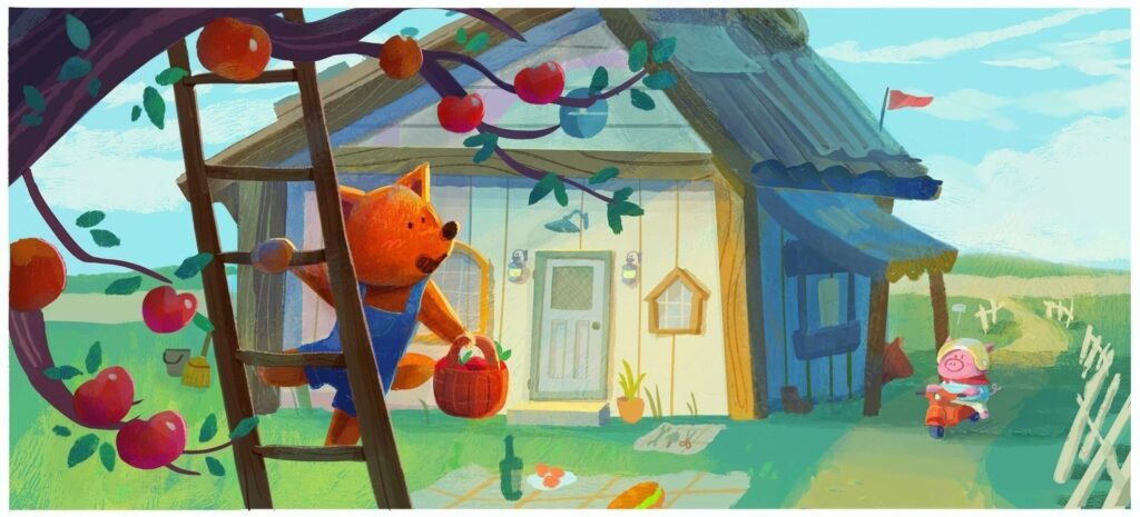
Mira Ko is a background painter and designer who works in animation, with studios like Nickelodeon, Warner Bros., Disney, and Cartoon Network. She uses her skills in illustration, visual development, and storytelling to create animated backgrounds. Her work often involves a focus on light, perspective, and composition, aiming to evoke a sense of artistry and visual storytelling

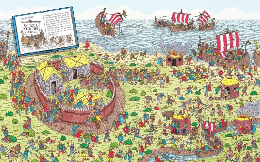

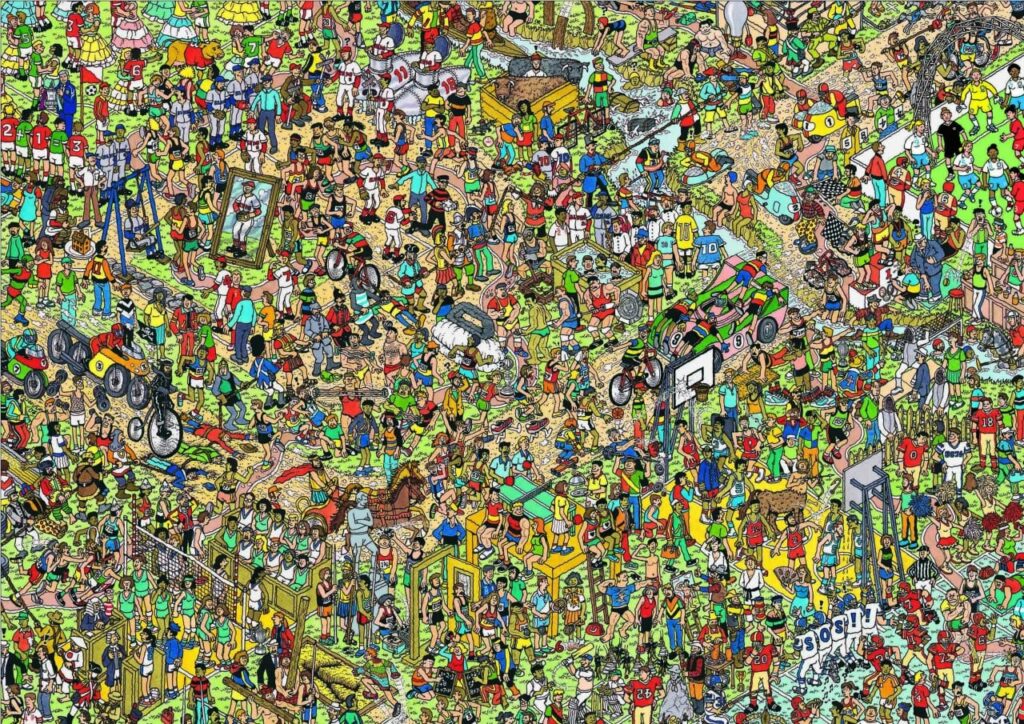
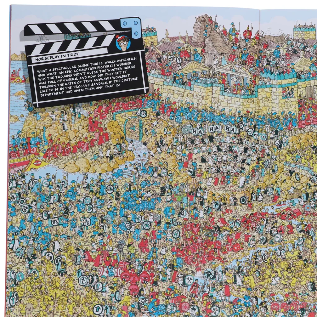
For my piece I think I would like to almost combine the two. Managing to still have the scale that Ko creates, but without having to fill the scene so completely, as its the business of the scene that determines the age range of the books., with the busier the scene the older the audience. I also plan to use Handford’s method of working in smaller sections of left to right.
Martin Handford – Author and Illustrator
Martin Handford creates his illustrations, by first researching and gathering inspiration from various sources. He then draws the scenes, working on them for weeks, and incorporating characters and details. Wally himself is often added as the last step, with no specific method for placement. Similar to the other artists I looked at his draws are originally drawn in black and white, adding colour as a last step. He works on the illustrations in sections, often creating a quarter of a page at a time, moving from left to right.
This type of perspective causes the characters and the buildings to be on the same scale. As an audience you can see every angle of the ground, something that realistically doesn’t exist. For example if you look at the angle of the walls to the angle of the figures you wouldn’t be able to see inside the castle wall, yet the scene is so full this choice doesn’t stick out. Instead it offers the audience an omnipotent viewpoint, where they can see every aspect of the scene.


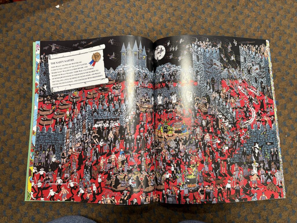

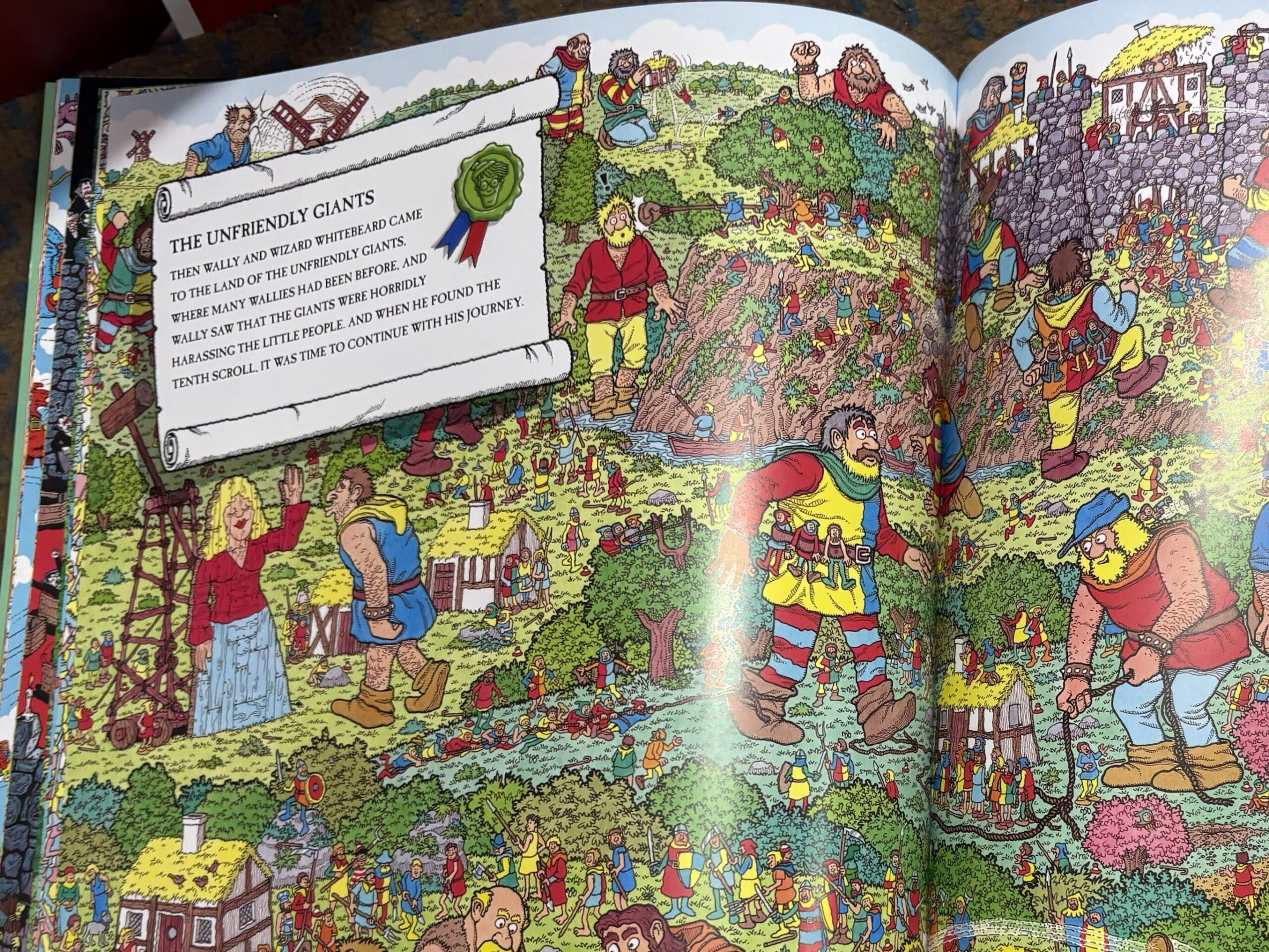

Seeing these pages in person shows how much detail goes into these scenes, with every inch of the page completely covered in a different character. In all honesty looking at Handford’s work really stresses me out for this project as I know in order to create similar scenes I have to be really thorough
Creating my own castle
Artist Research
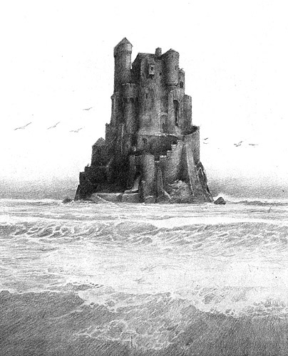
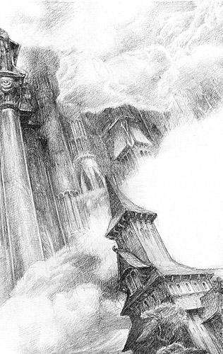
I really like the intricate detail included within Lee’s art, creating an atmospheric tower that clearly show every single brick and tree. I hope to be able to create the same level of detail within my own castle drawings, something that captures the imagination the same way Lee is able.

Visiting a Castle
I got really lucky with finding primary sources, I found the most perfect medieval castle in Ludlow, that had the shape and battlements that I was looking for.
Alan Lee
Alan Lee typically draws and paints using a combination of analog and digital techniques. He uses a variety of pencils, sometimes charcoal, for sketching and initial outlining, often using tracing paper to transfer details onto watercolor paper. Lee describes his approach as intuitive, often responding to the text and atmosphere of the stories he’s illustrating. Basically explaining how he is able to design the castles based on Tolkien’s imagination.
He has an entire book which I have linked : https://archive.org/details/castles0000leea/page/n7/mode/2up ,that shows his detailed illustrations of these castles. These acted as a strong source of inspiration for my own castle, as he shows a wide range of different types of battlements, influencing me to narrow down the type of structure I want to create. More examples of these Castles I found here : http://www.dana-mad.ru/gal/display.php?img=22

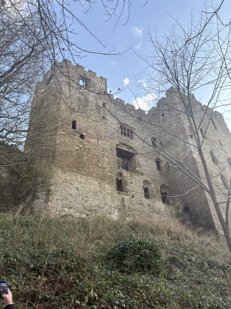
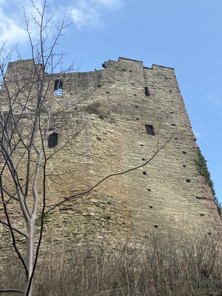
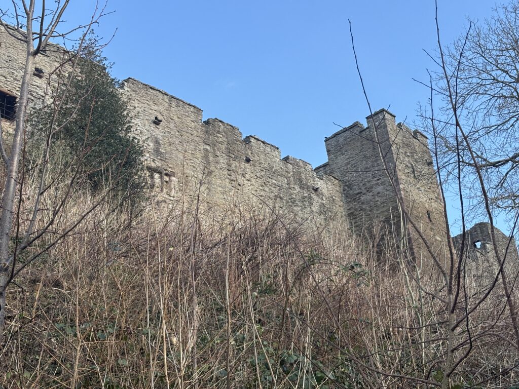
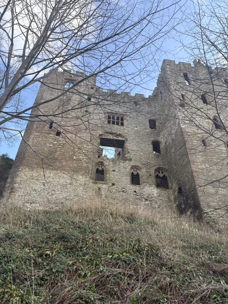
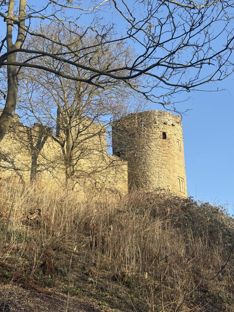
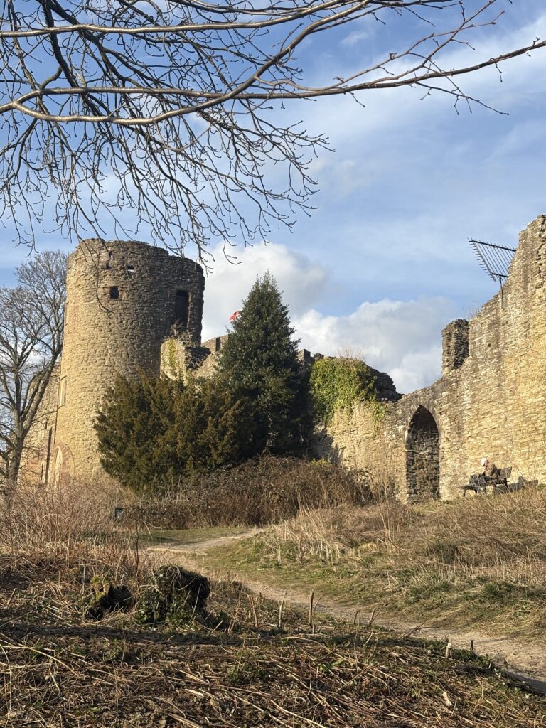

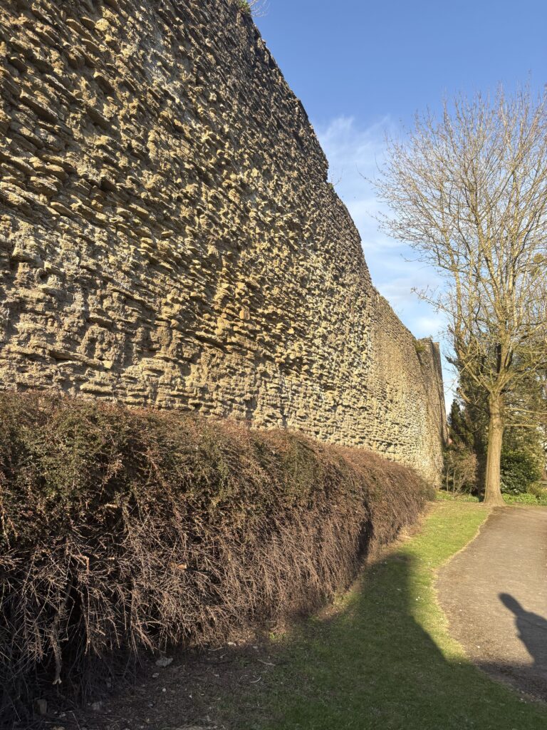
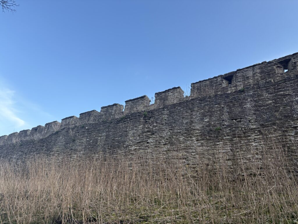


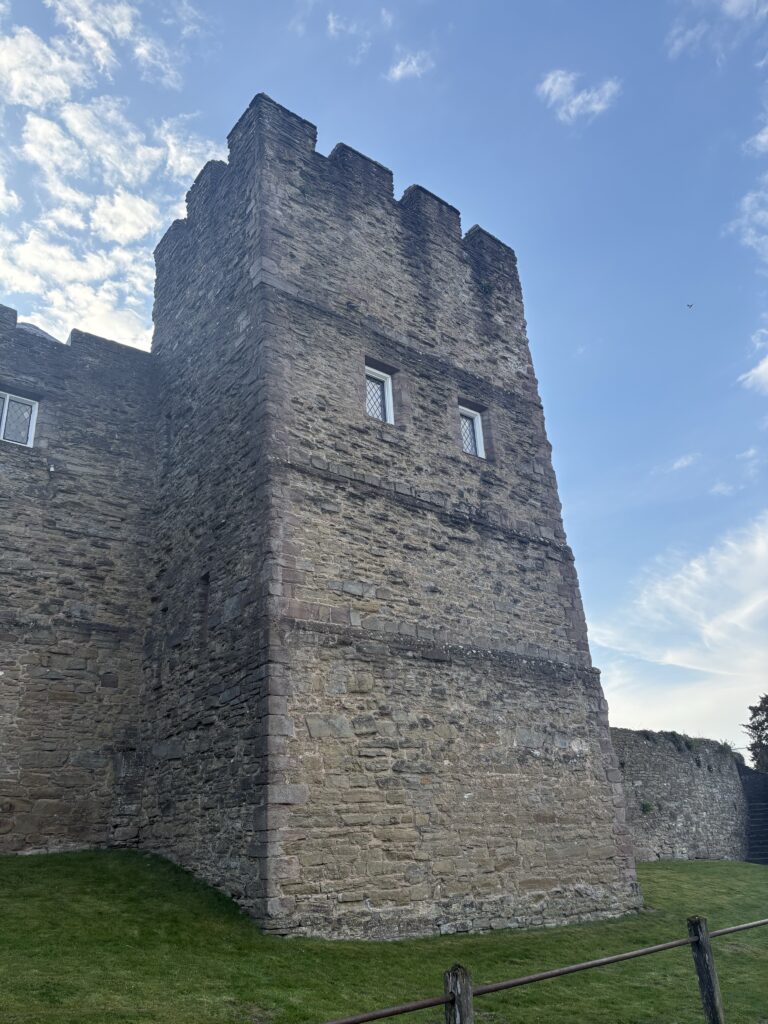
As part of my research I visited Ludlow Castle, whilst I was there I did some quick ink sketches, then later went back and did some more detailed ones in pencil. This visit granted me references that I could shuffle in order to design my own castle instead of copying one from a different illustrator.


Perspective failures
My castle went through a lot of struggling before I decided on the finished design. The perspective of search-and-find book has a unique Birdseye view, yet you can see all the the characters clearly rather than from above. This made it quite a challenge to try to draw a convincing castle that also had room for all the knights I wanted to add. Below are some of my attempts, as you can see I had a battle with getting the walls proportions correct, which influenced me to try a different approach.
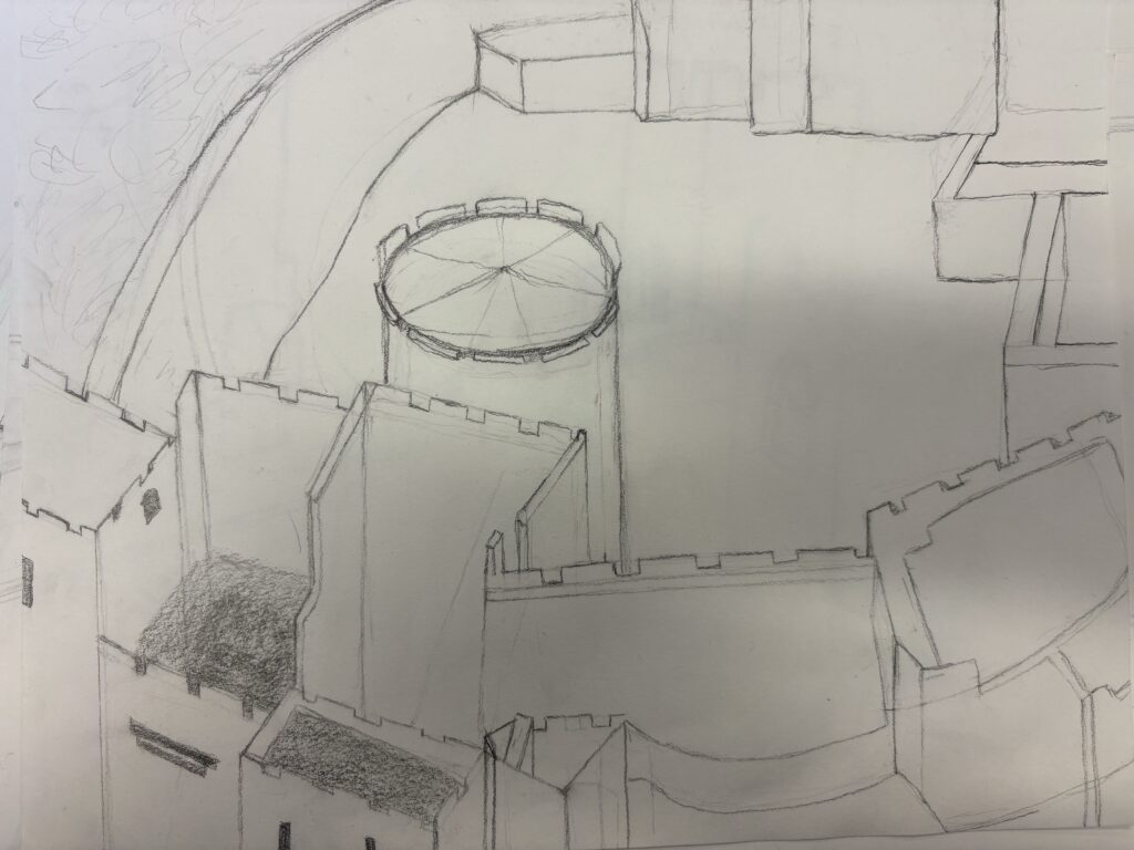
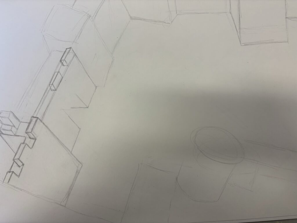


Whilst I had originally intended to have a more complex castle battlement, I did realise that the focus should be more on the knights rather than the castle walls so as the design continued I reduced the building into more walls than towers. I also decided to remove the doorway as it turns the castle into more of a world of its own, keeping the characters contained within the walls. This more simplistic design allowed me to focus on the characters inside of the walls , it was also the best I could achieve whilst still struggling with the perspective of the castle. By keeping the design on the more simplistic side, I could make sure it was all proportionally correct.
To work out the perspective I needed for my scene I tried to build my castle plan in Minecraft, using the bird’s eye perspective to get the angle I needed. However when I started drawing from this I felt it was really difficult to translate the blocks into a real building. Instead I used procreates Isometric Drawing guide , and assisted drawing that gives you a grid made from triangles, and a tool that makes your lines straight every time.

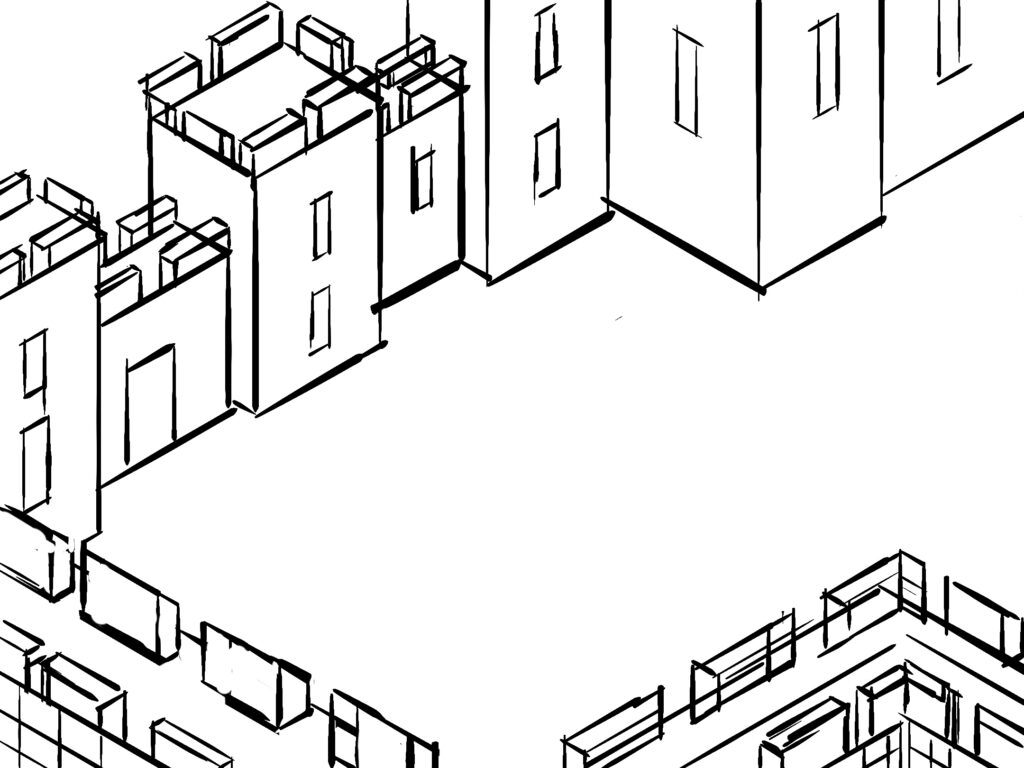
I used this digital template in order to trace the design onto my scene which made this process go a lot faster and I think resulted in a more finished outcome. Using the Procreate Isometric grid was really helpful and definitely something I will utilise again. I wish I was able to keep the complex nature of the castle I had originally hoped for, but it may have been too overwhelming for the audience. The scene is going to be very full, so perhaps its a smarter and more convenient method.
Armour References
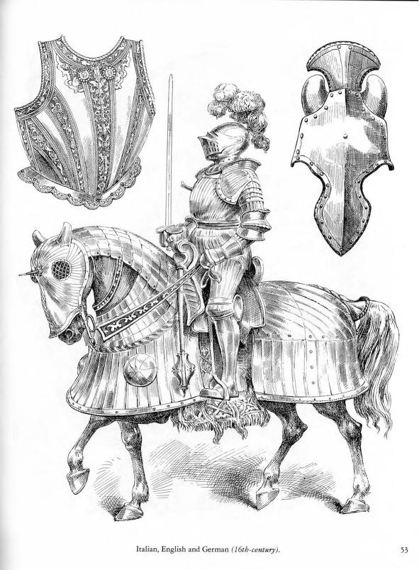
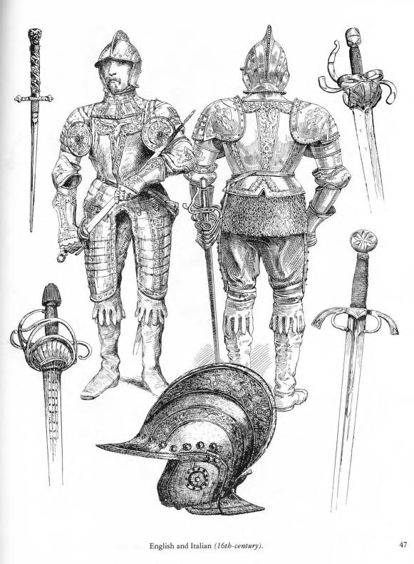
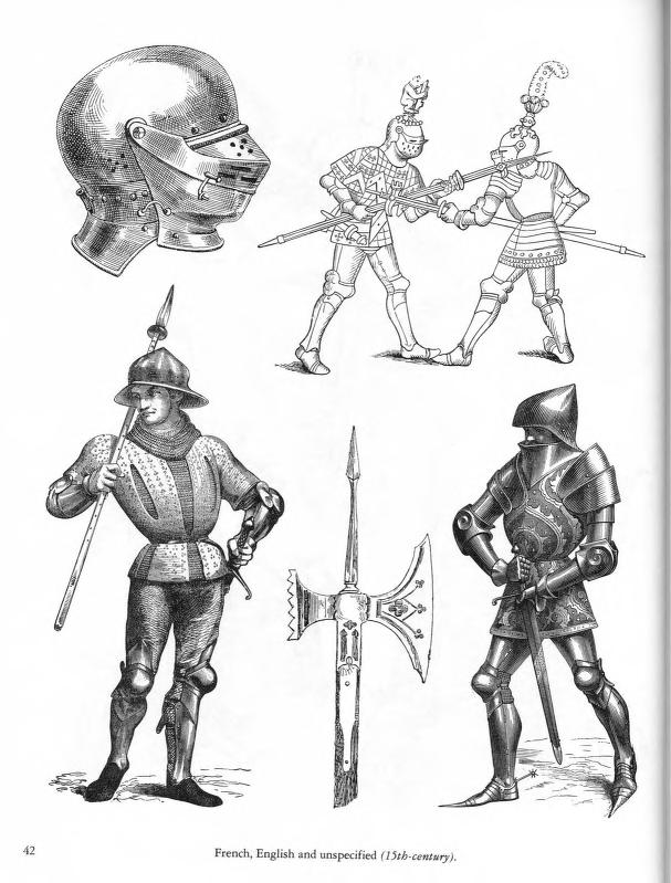
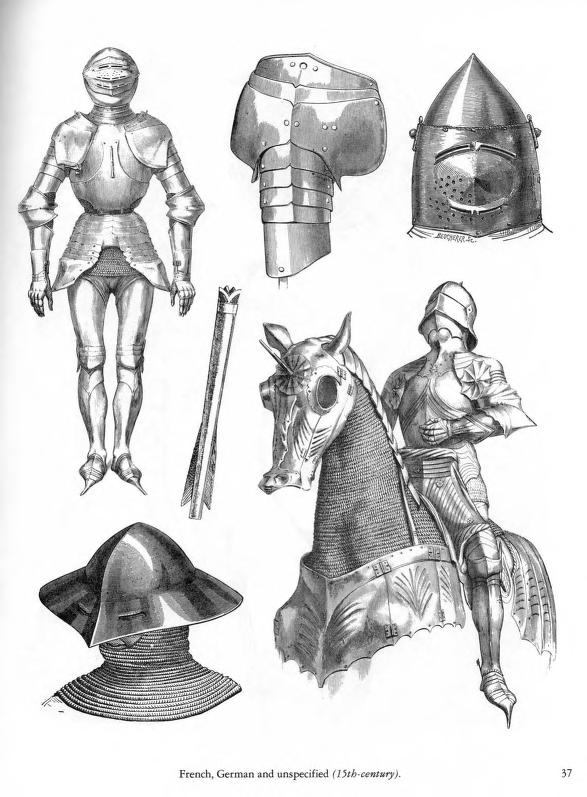
Here is the online resource I used in order to make sure my armour was correct, or just recognisable to someone who has some knowledge of medieval armour patterns : https://archive.org/details/Ancient_and_Medieval_Arms_and_Armor/page/n41/mode/2up
This resource compiled by graphic designer Carol Belanger Grafton was really helpful when it came to making each of my knights different, as it offered different inspirations into what they could look like as well as the time period and location they came from.
Drawing Process

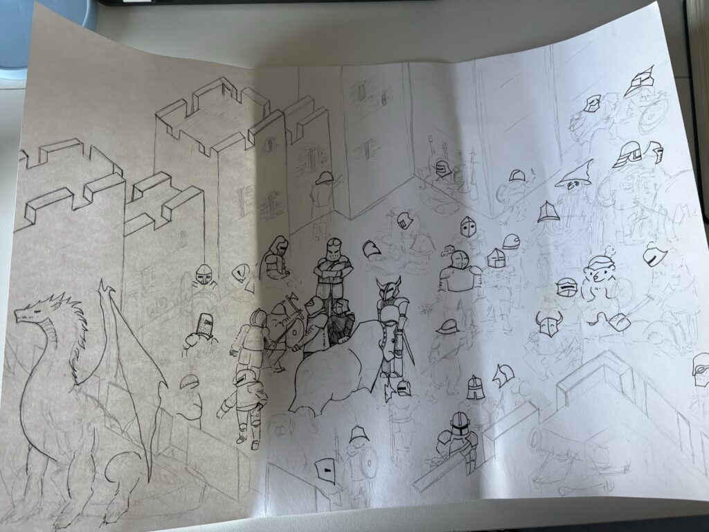
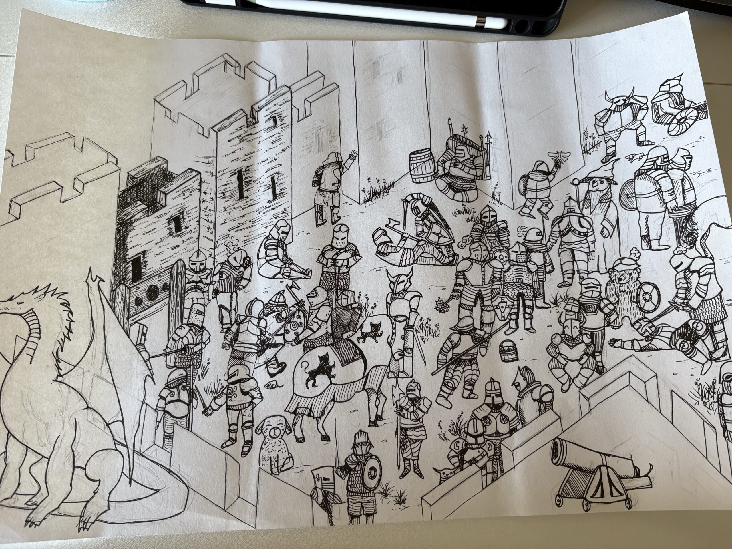

Using adobe scanner to transfer the image digitally.
Adding a poem
A lot of Search-and-find books include a short poem that hints at where the character is hiding. Since my book is for a younger audience I thought this would be essential to include. I didn’t want to spend much time on the poem as it isn’t the main source of the project so I used: https://openai.com/index/chatgpt/, to write me different poem options which I then pieced together to get the one included on my finished result.

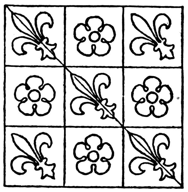
I referenced this design using a genuine medieval stain glass as reference for the border.

Evaluation
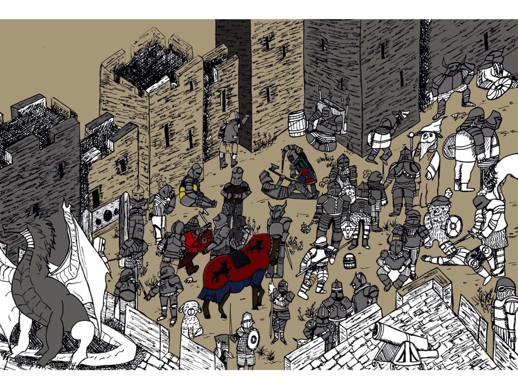
I compiled all my previous research, starting to complete a rough sketch of all my knights, with the positioning I tried to emulate what I had seen in the street, whilst still trying to generate an interesting composition that would be interesting for children, offering them small hidden details that they may not notice on first glance, granting them the enrichment that search and find books offer its audience. After my sketches, I used the same method that the artists I researched towards the beginning of the project used, completing my line art with thick black lines, knowing later I would fill in these lines with colour.
Overall, I am really pleased with the outcome of this piece, it includes a lot more detail than I thought I wouldnt be able to include. I think the perspective I decided to go with is very effective, and I like how the bear isn’t really easy to find despite him being out in the open. I think for this project I have learnt way to make the whole process faster, using procreate to repeat different characters so that I can add more without spending any more time drawing them. For the next project I also want to use more of my own references as a lot of the armour is from secondary sources. This would mean I would have to create a more realistic scene, something I can find the references for easily, rather than an entire army of knights!
What to do now / to improve.
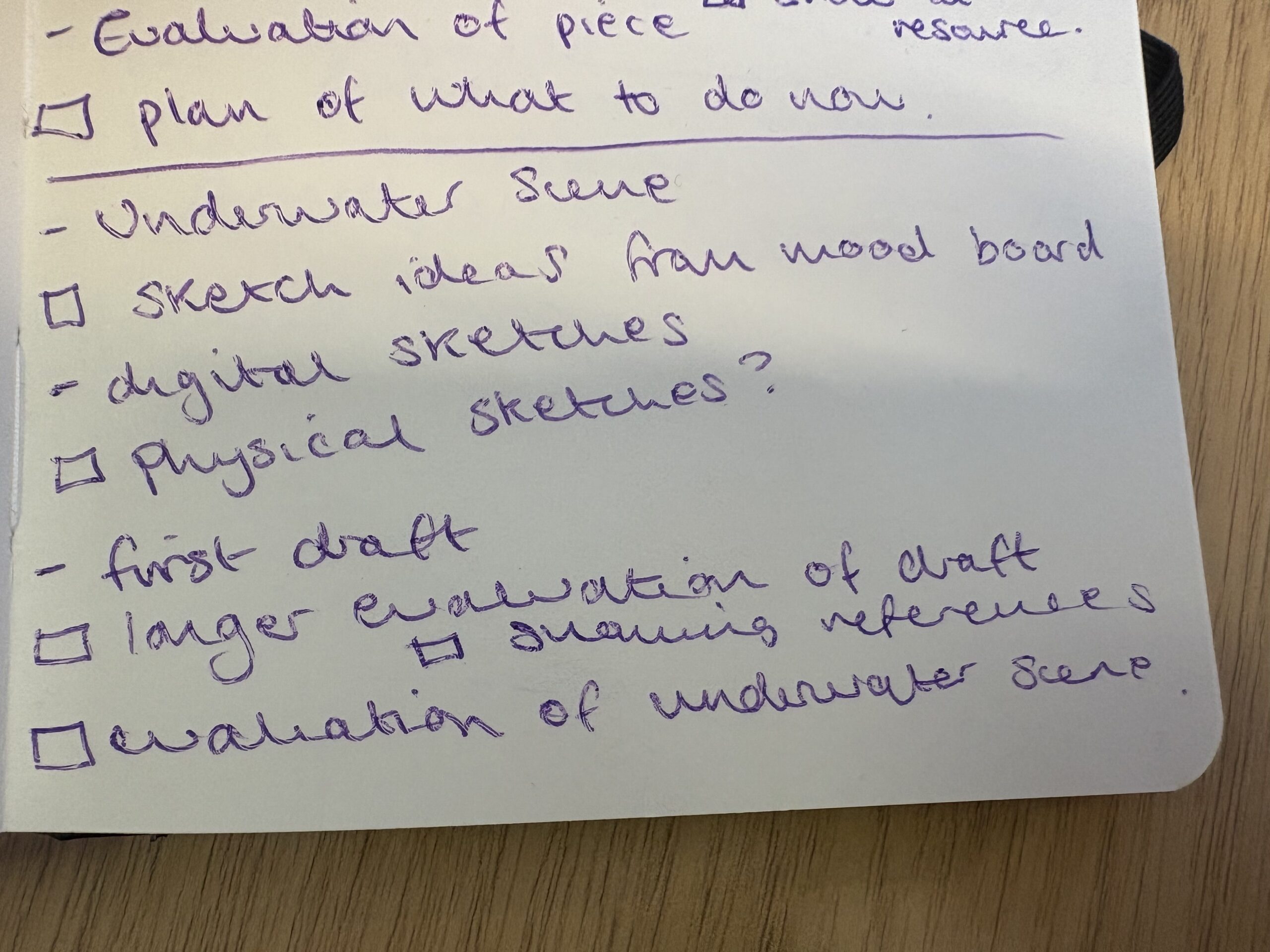
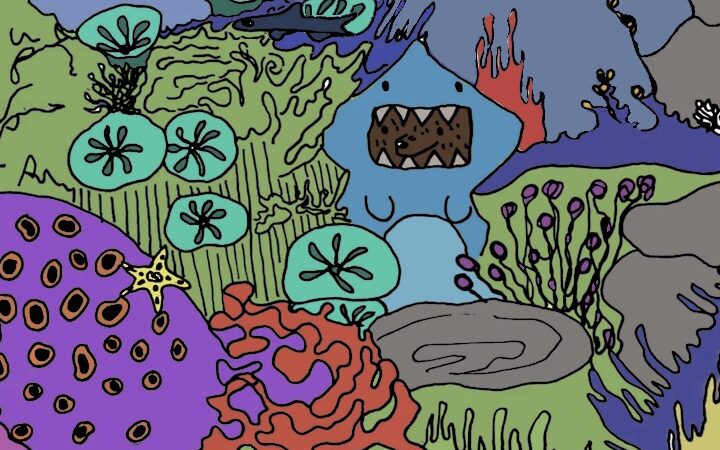
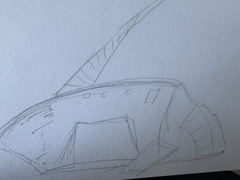
Underwater scene

Initial Ideas
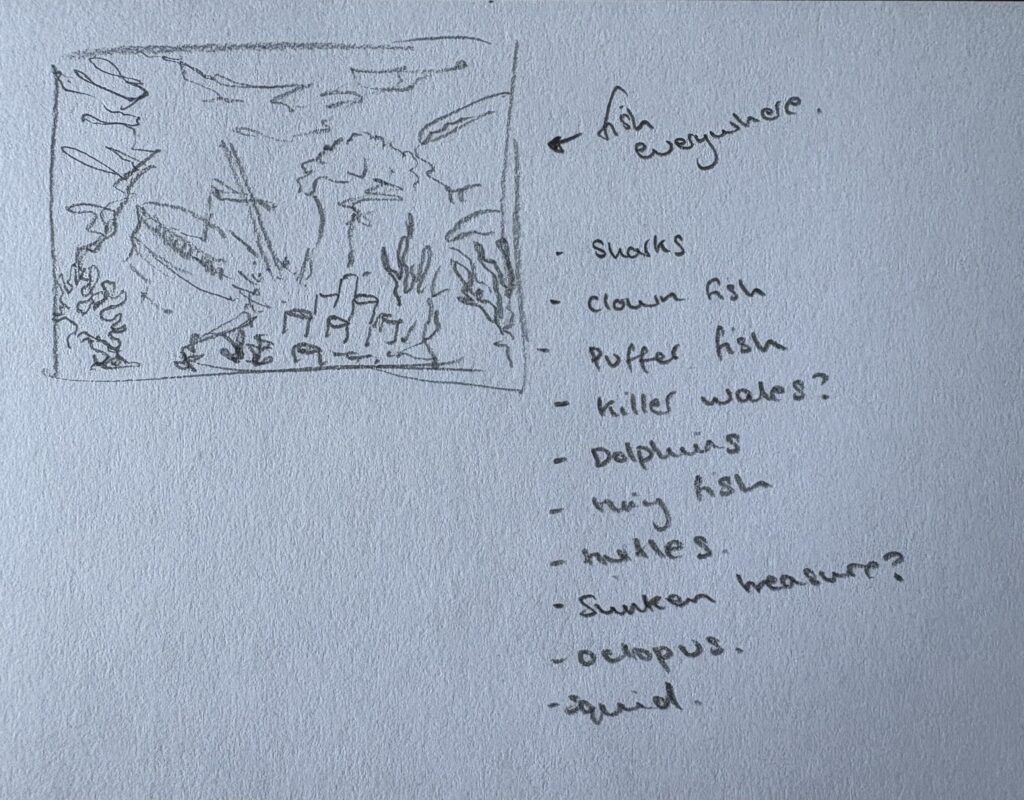
Visiting Plymouth Aquarium
As I mentioned before, I wanted to draw a scene that I could more easily find references for. This influenced me to visit Plymouth aquarium. I had a really nice time and even experimented with doing life drawing on my iPad.

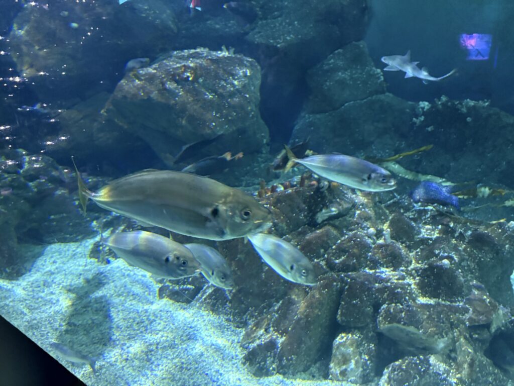


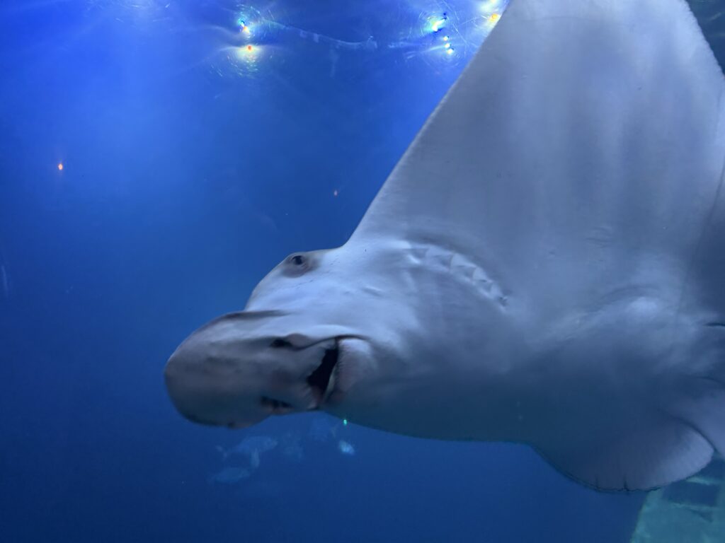
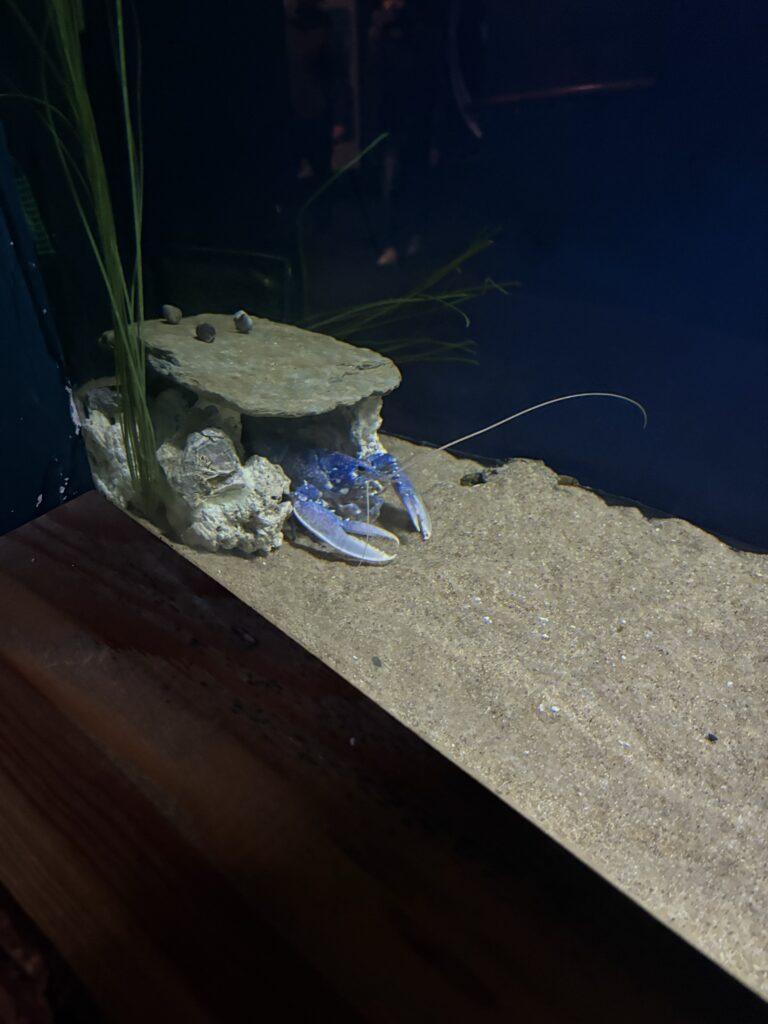

Since the Aquarium is quite dark I wanted to try life drawing on my iPad, something I haven’t done before. I did enjoy the experience but it almost adds too much freedom as you can erase an entire image really easily which almost defeats the point of the exercise.
Artist Research

First Draft drawing process
Olga Nikitina
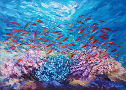
Olga Nikitina is an underwater painter who creates her art while scuba diving. She uses a special canvas cover and non-toxic oil paints, inspired by the marine environment and its vibrant colors. Nikitina aims to finish each painting in a single underwater session, as she believes the unique environment and mood are impossible to replicate on subsequent dives. She paints directly on a canvas while submerged, using a palette knife technique.
I wanted to look at a painter to gain inspiration for my Underwater Scene. Nikitina uses vibrant almost neon colours as fish, painted upon a darker blue background. Her strong uses of contrast offers, the underwater vibe that I am looking for. For the first draft I was deciding the colours based on my imagination, trying to create a neon vibe, that acted in strong contrast to the more grey colour pallet of my medieval scene.


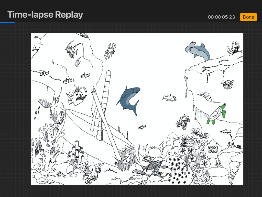
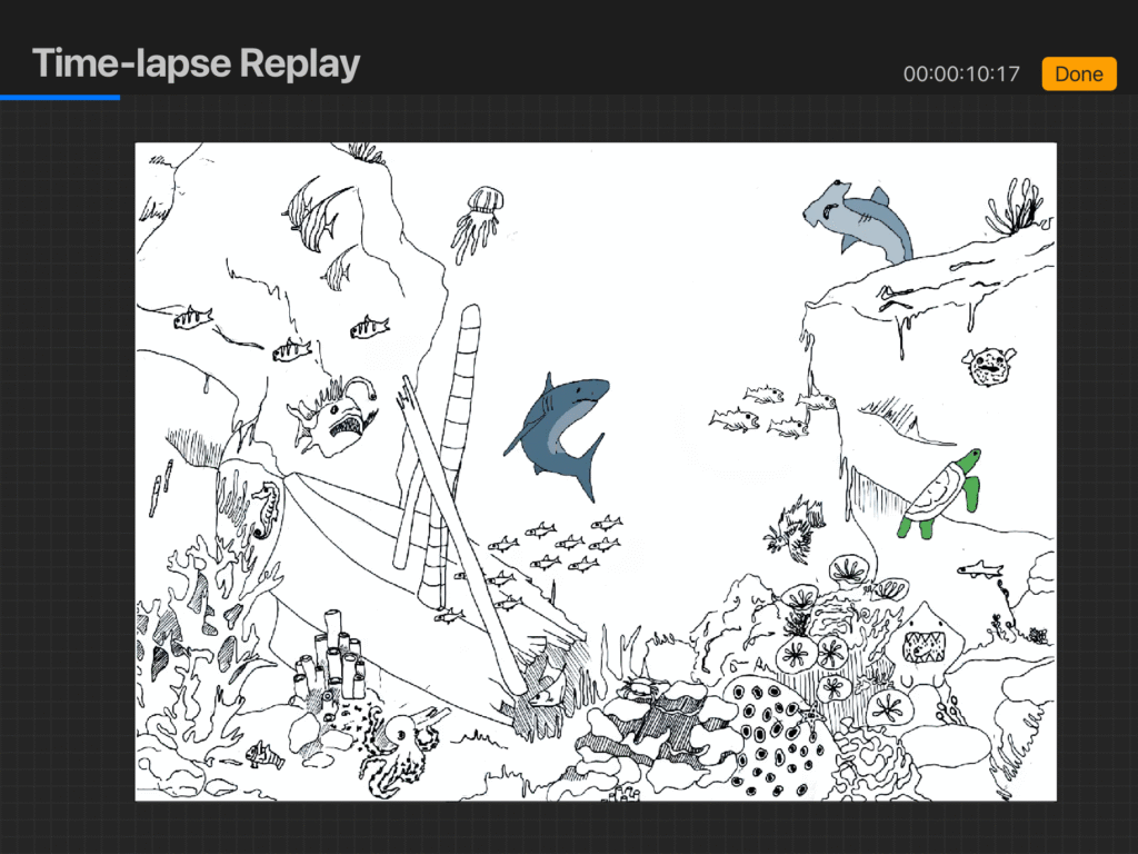


Draft Evaluation
Whilst I really enjoy the composition of this scene I think I need to go back to the original drawing and add more detail so that it matches the level of my Medieval scene as right now it is nowhere near as detailed. I need to add wood texture to the boat, and scales to the fish as right now the image seems really flat in texture. I also don’t think my colour selection is working. My method of utilising Nikitina’s contrasting paints, isn’t successful as I wanted to include lots of colour but in order to do that they are clashing with each other. This paired with the amount of fish within the image is causing the visual to be very overwhelming, which is the opposite of what I want in a children’s book. I think I need to look at a different type of colour pallet perhaps leaning towards a more pastel outcome.
Further Artist Research
I wanted to look at the different colour pallets artists use to show an underwater environment. This led me to a collection of different pieces by completely different artists all using different techniques to create the underwater effect: https://www.saatchiart.com/paintings/underwater-scenes/feature. One of the pieces I was particularly drawn to was: https://www.saatchiart.com/art/Painting-Hope-Also-available-An-unframed-Copy-Giclee-on-canvas-Numbered-2-5-and-Signed-with-Certificate-Ready-for-shipping-at-600-USD/716537/2916954/view , the piece has a lot of white within the colours, creating a hazy, sun filled sea effect that I would like to create for my own piece. When selecting my colours this time around I will add white to each one to create this same effect but digitally.
Using adobe scanner to transfer the image digitally.
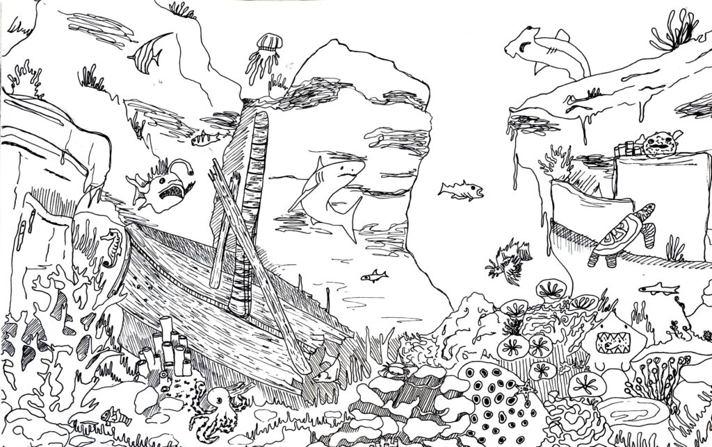
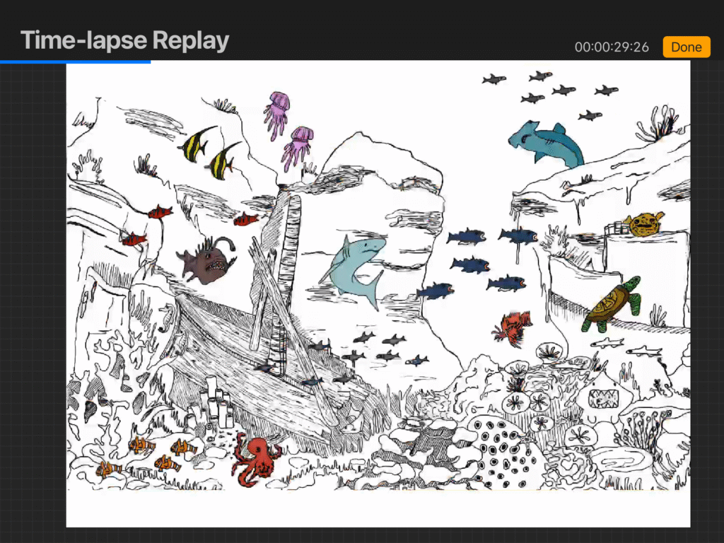
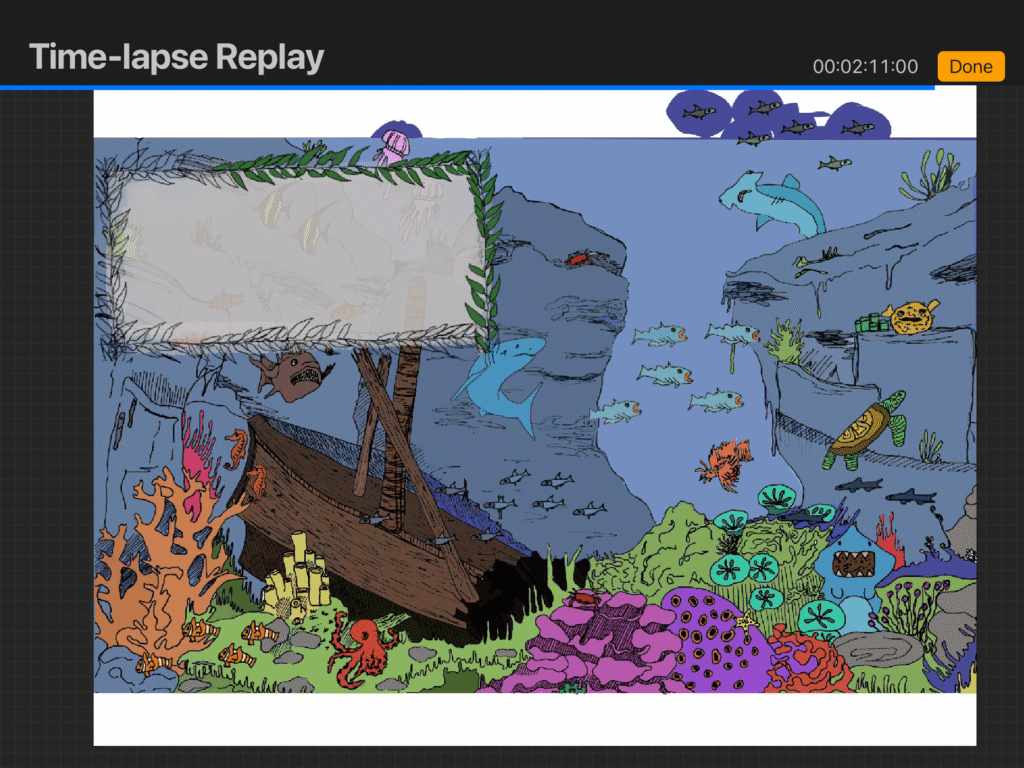
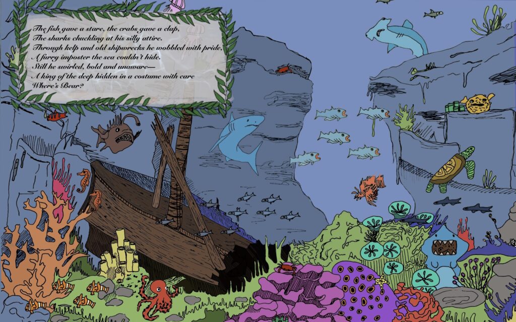
I went back to the original image, adding another cliff face, and adding more details to the ship wreck, as well as adding depth to the mountains. I think this design is much more effective, and definitely works better as a Search-and-find piece. When deciding the colours of my fish I used this resource: https://www.ikijime.com/ which is an archive showing you detailed images of every single fish all across the world. This allowed me to make more informed choices about the colour pallet, as this was the issue with the first draft.
Poem written using:https://openai.com/index/chatgpt/
Drawing process



Evaluation
The changes I made to the first draft of this piece were definitely very effective. I think this version works much more effectively, whilst still using a large variety of colours I wasn’t able to use within the medieval scene. I really enjoy the placement of the bear character as well as the variety of fish I was able to add to the scene. The only problem with this scene is I don’t think it fully upholds the perspective I was able to create with my first scene. Rather than having the strange almost birds eye perspective, the piece looks more like an illustrated photograph. I think is this due to the fact I had less time to spend on the piece than the medieval one. I spent almost four weeks on that piece, however upon completion I realised I wouldn’t have as much time on the rest if I wanted to complete multiple scenes. Having said that I am still pleased with the outcome of this piece, and I definitely learnt a lot about the use of colour within a large scene like this.
Prehistoric Scene
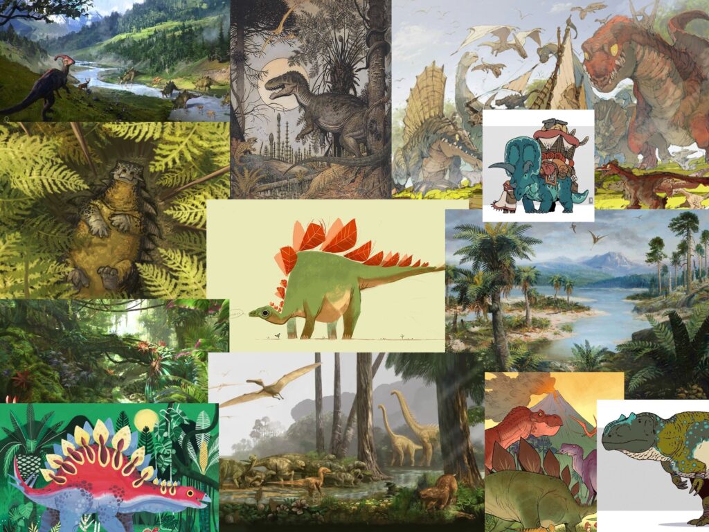
Rough Plan

Sketching dinosaurs from memory

I wanted to do some quick sketches of dinosaurs from memory to see which types were memorable to me as well as to establish a more cartoonish style.
Drawing from lizards
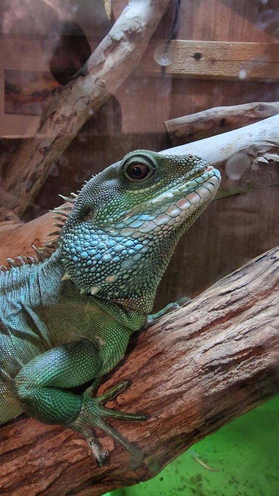
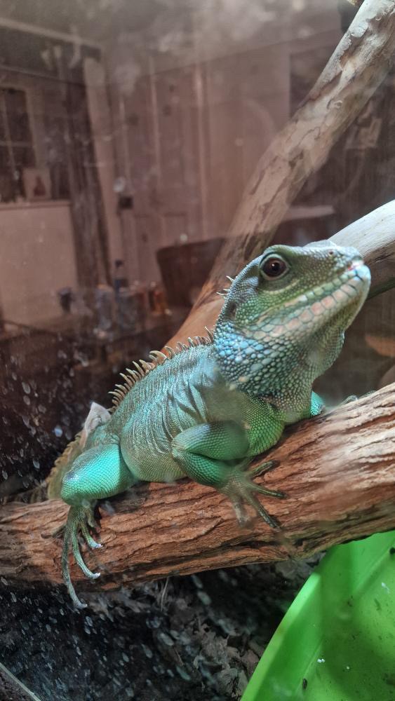


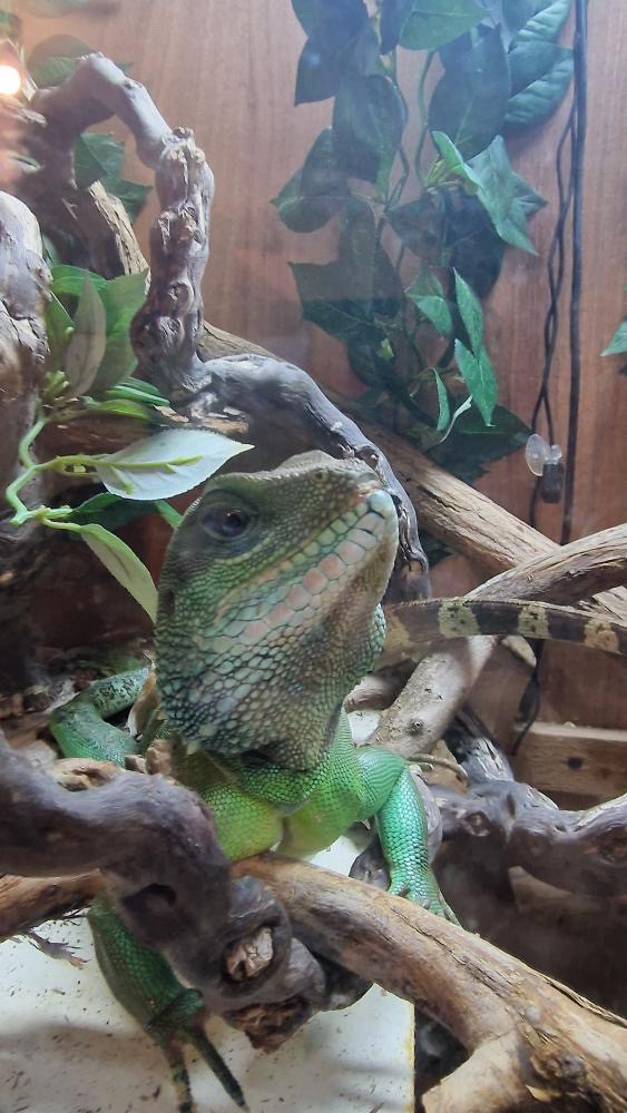

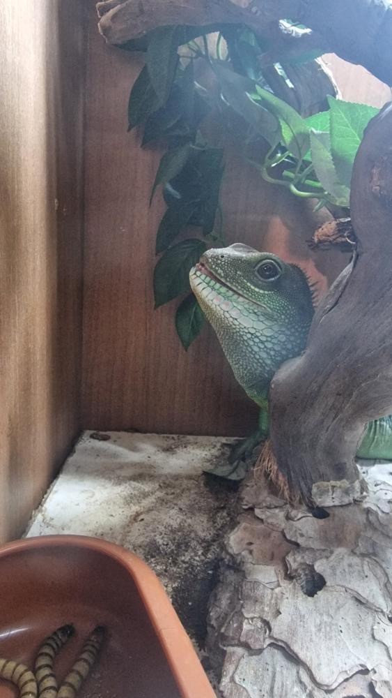
Since I can’t actually use real dinosaurs as reference I thought it would be a good idea to look at different lizards for their dinosaur attributes. I had a lot of fun drawing from Charlie the Australian water dragon. I think for my scene I want to include large versions of these reptiles as well as the more classic t-rex, and Triceratops, which I will have to reference from other artists renditions. I don’t think I have ever actually drawn reptiles before so I was pleasantly surprised by how they turned out, which makes me quite excited by the potential this theme has.
Visiting Paignton Zoo
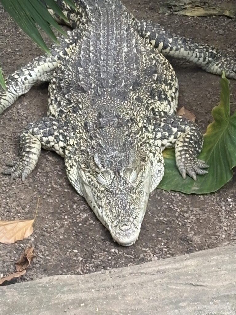
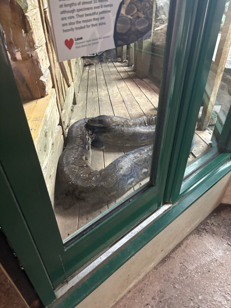
In order to gain more access to reptiles and prehistoric looking birds, I visited Paignton Zoo. They have a newly opened crocodile swamp exhibit, that includes reptiles such as alligators, crocodiles and a stunningly massive Python. I used these images as well as ones of Charley to do some sketches of the reptiles.




Artist Research
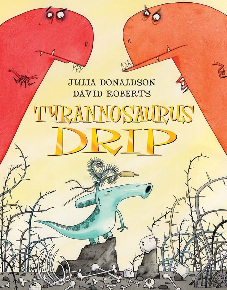
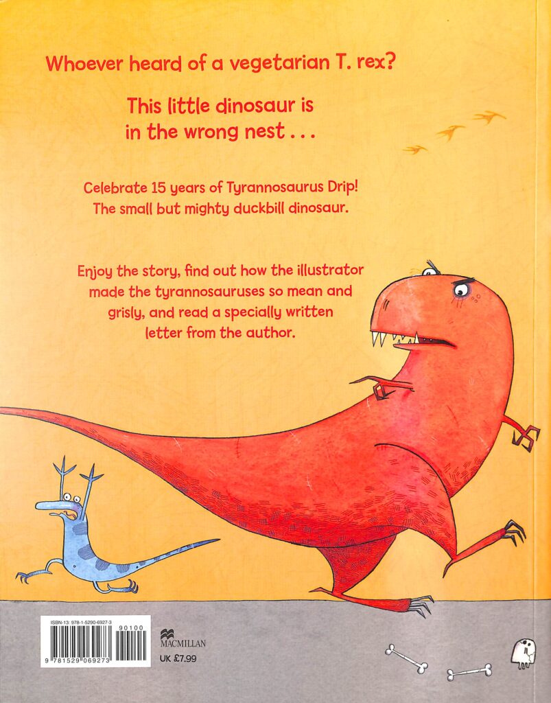
I really enjoy the use of shape within Roberts characterisation of the dinosaurs, being able to show the strong personality difference between the evil t-rexs and the passive vegetarian duckbill. This characterisation shows its younger audience the direct juxtaposition between the two characters, something I would also like to play on with the difference in the dinosaurs and my smaller character of the bear. I think a way of achieving this, as well as using shape, would be to utilise scale, using the scene to highlight how much a dinosaur would tower over a bear.
Julia Donaldson and David Roberts
Previously for this project I looked at another one of Julia Donaldson’s books illustrated by Axel Scheffler. Similar to Scheffler’s work, David Roberts uses the same black ink outlines, later coloured with various inks and crayons.

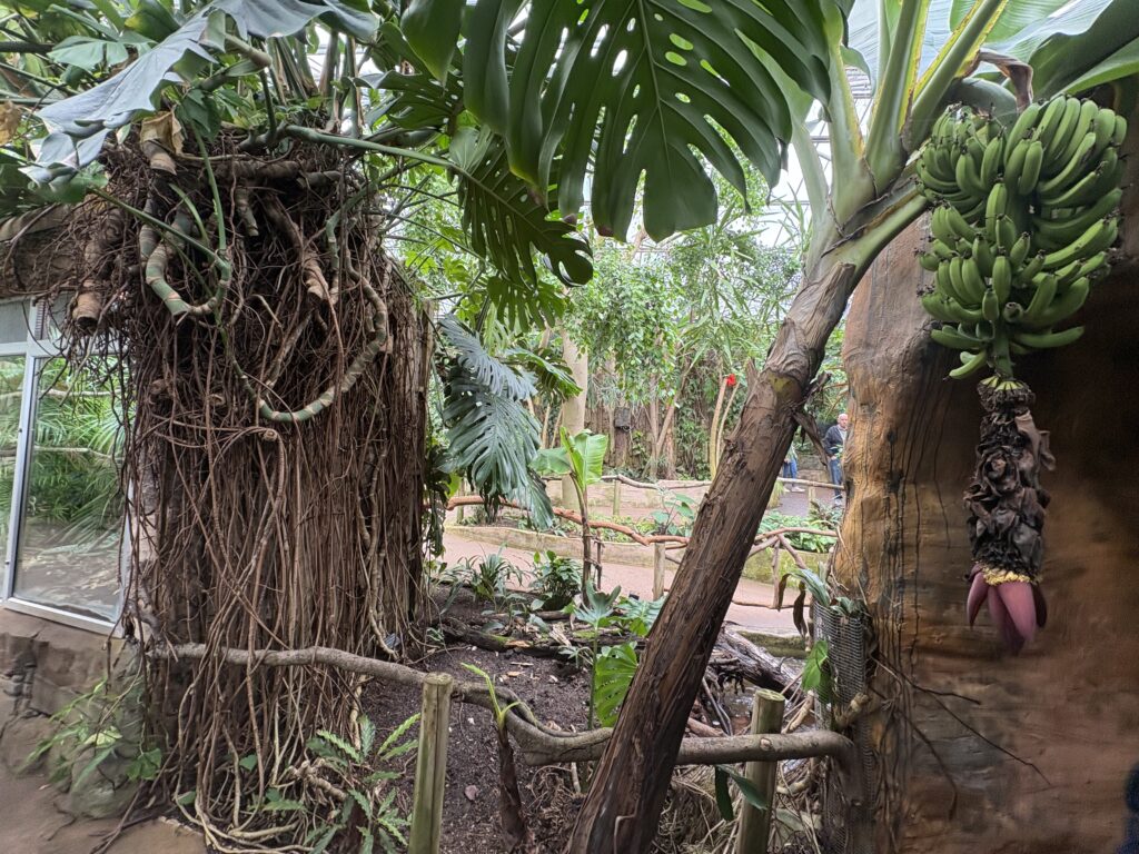
Initial Ideas


The images above are ones that I took at the zoo that influenced the background scene of this piece. As I was drawing I used different parts of these images, such as the banana tree to add more detail.




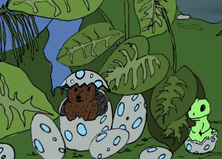
Using my own images as reference I decided to draw a scene that included some of my favourite dinosaurs spread across a river, volcano and banana tree! I really enjoy the composition of the first sketch I did.
Reference Research
The National History has an archive that lists EVERY SINGLE DINOSAUR: https://www.nhm.ac.uk/discover/dino-directory.html ,in an alphabetised list that was essential for choosing which dinosaurs to include, especially ones that will appeal to a 12+ audience. They also include a dinosaur top 5 which helped me to choose which dinosaurs to include in the forefront of the composition.
Drawing Process
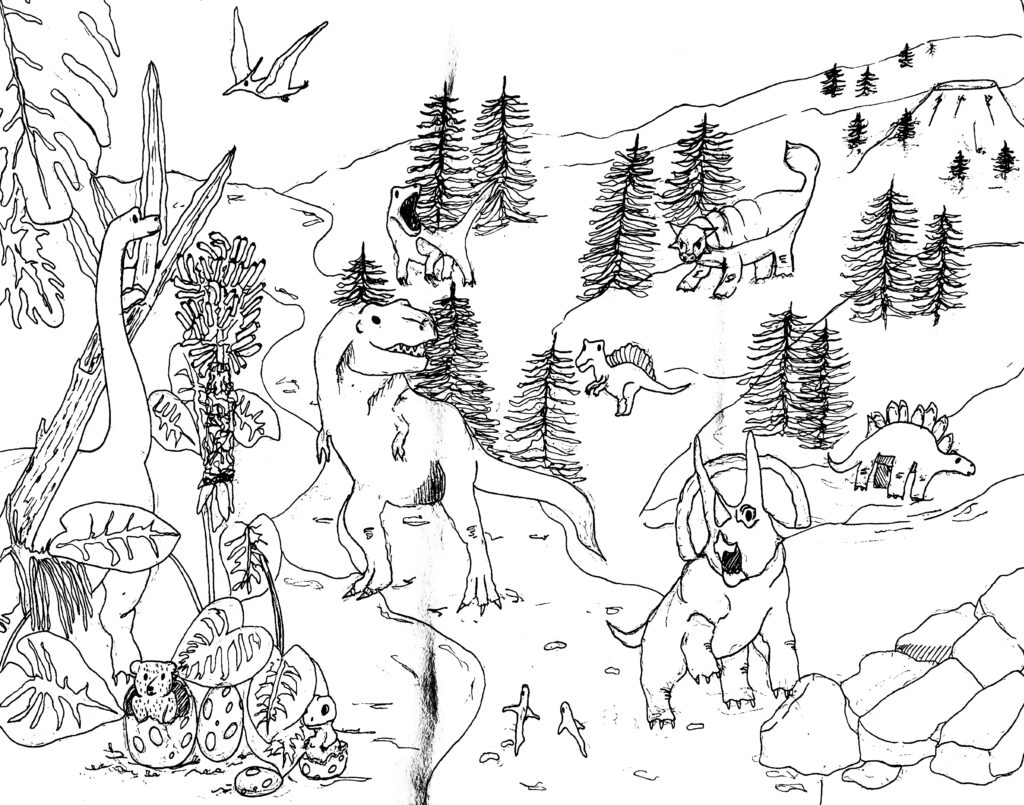


Poem written using:https://openai.com/index/chatgpt/
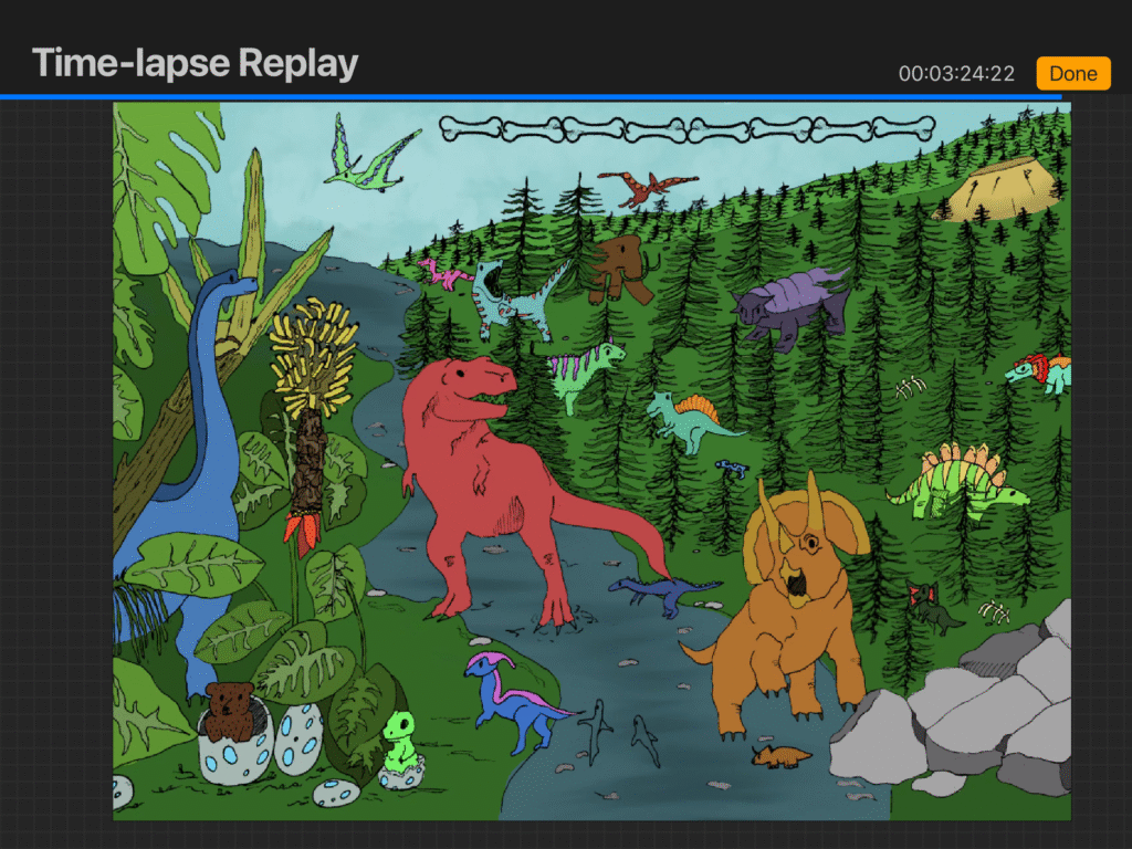
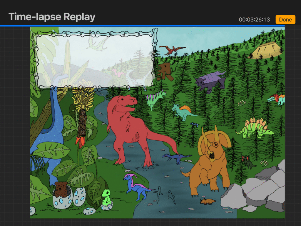

Evaluation
I have some doubts about the outcome of this scene, due to its simplicity in comparison to the two before. I think perhaps because it doesn’t have the same complicated perspective, as well as the fact the dinosaurs are quite simple in design. Despite this, I think it still works effectively for a search and find page, however if I find the time to improve the piece I will definitely take it. On a more positive note, I really enjoy the use of colours within the scene and I definitely improved on the speed of which I am able to create more detailed pictures.
Mid-Point Evaluation
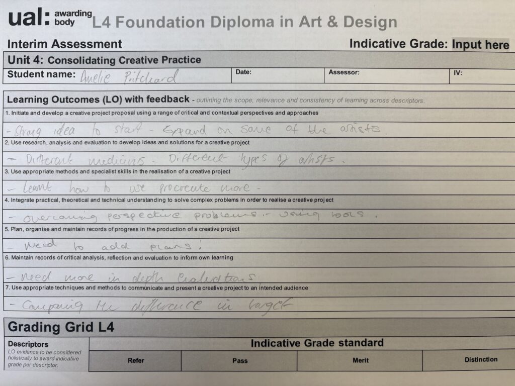
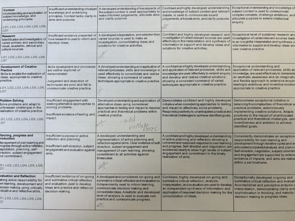
After having my work evaluated the main piece of feedback was to add more development of my scenes as well as including more about the artists effect on my processes.
Seeing all of my scenes side by side makes me so incredibly proud of what I have been able to achieve. I feel like the colours of each page work so well together, and the subject manner will greatly interest my target audience. I think my favourite of the three would definitely be the knights scene, simply because I put the most work into it , but I also greatly enjoy how colourful the other scenes are. Considering that at the start of the project, I had never really experimented with colour, usually leaving my drawings to be a tonal black and white scene, I think I have greatly improved my artistic ability. I have also greatly improved my understanding of a digital medium. I am able to still physically draw my scenes, yet able to improve and add colour digitally in order to generate a polished outcome. However, I am a little hesitant about my use of font as I am not fully confident it is always readable, so I may have to make some changes in the future.
Space Station Scene

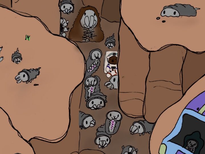
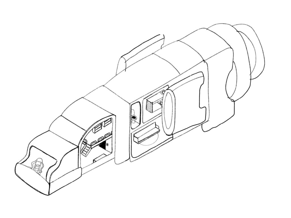
My initial goals for this scene was to draw my bear character as an astronaut, design my own planet, as well as design a unique space ship that wasn’t copied from another artist. I also wanted to make a harder search-and-find scene as my other ones have been slightly easier. I contemplated drawing the inside of a spaceship showing the bear floating in space out of the window, having no space ship just a sky of stars, as well as drawing a space ship that was almost cut in two so that you could see the interior as well as the outside ship and planet.

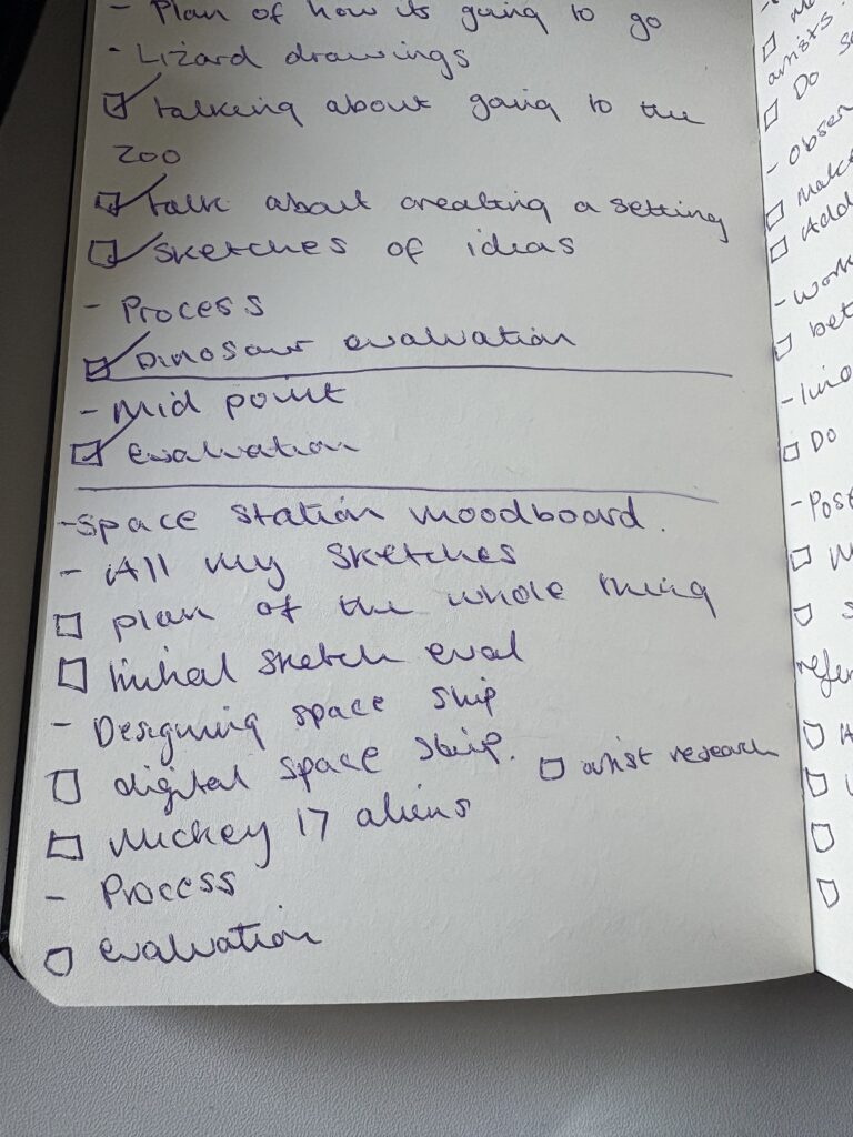

Here are some of the sketches I did based on the thousands of different space ship designs I found here: https://www.artstation.com/channels/Spaceship I thought that if I could find the features I liked the most I could combine these into a spaceship that was my own.


I had the idea of cutting the spaceship in half so that you could see the interiors. I thought a good place to start was working out the perspective of the interior and then building the ship itself around those rooms. After trying to create the perspective from hand, I ended up revisiting the same tool I used to get the perspective of my castle, the procreate isometric grid.

Finished spaceship design
Reference Research
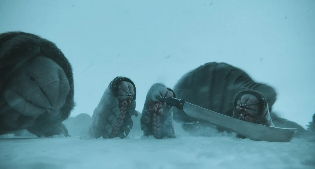
Instead of spending hours that I don’t really have design a new type of alien for this project, I decided to use the designs from one of my favourite alien films (I would have wanted to use the design for the xenomorph from Alien but I didn’t think this would be appropriate for my audience) Mickey 17. When watching the film, I thought the Creepers were absolutly adorbale and therefore really wanted to use them for this project, as well as the fact it gave me the opportunity to research more into the creatures themselves: https://theplaylist.net/alien-godfather-bong-joon-ho-mickey-17-20250311/
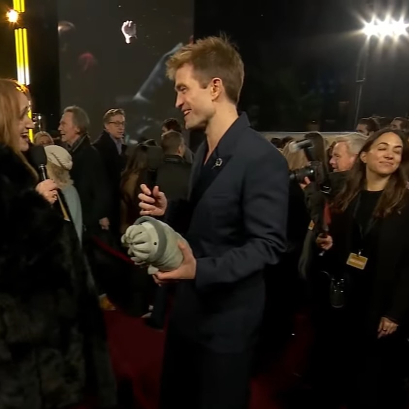


I did some sketches of the Creepers where I tired to make them more animated, making their eyes clear. Therefore making their design more kid friendly.
Drawing Process
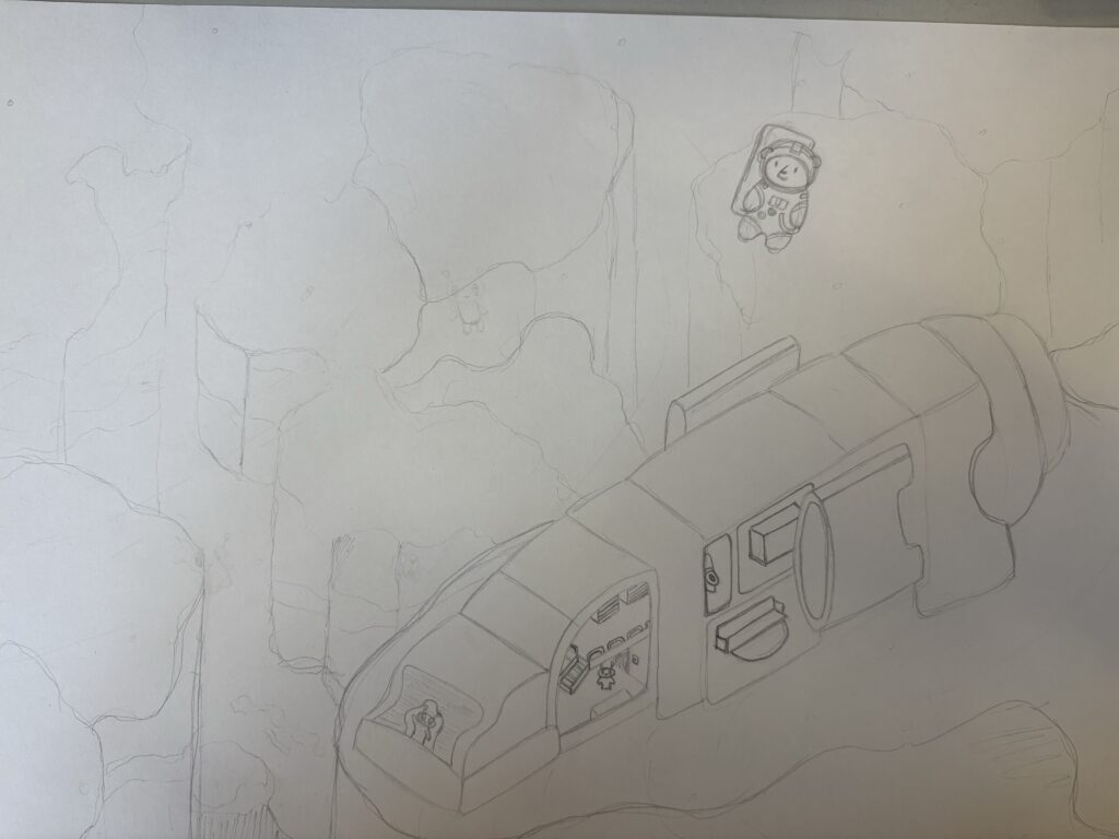

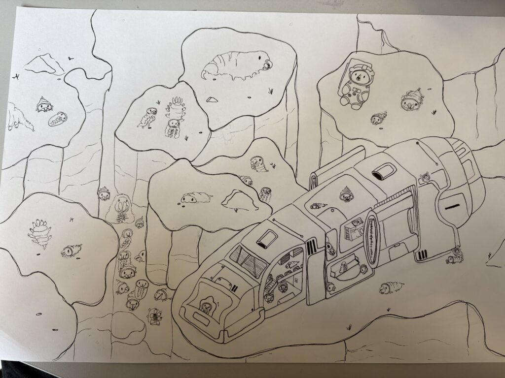
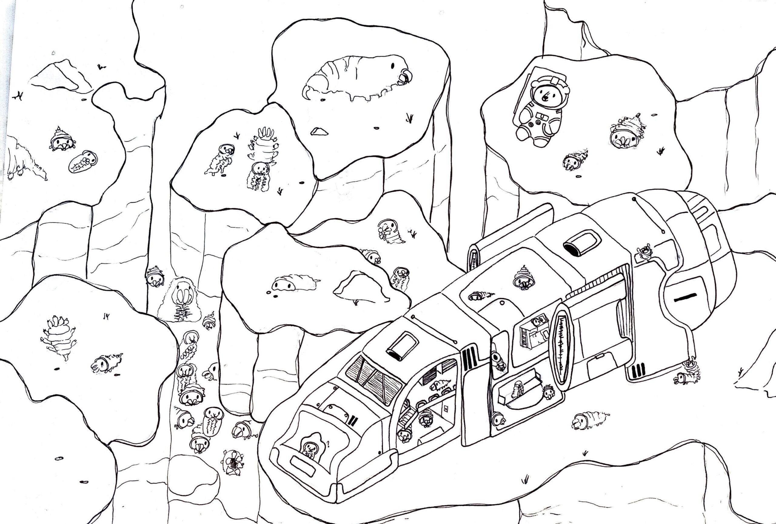
Using abode scanner.

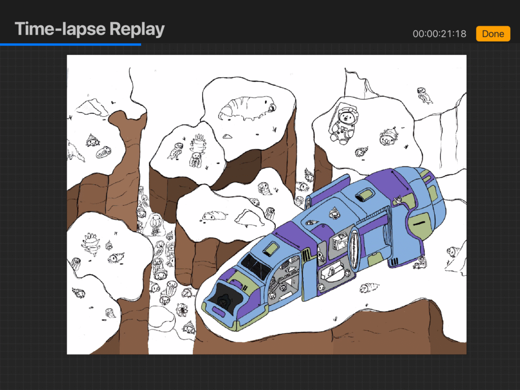
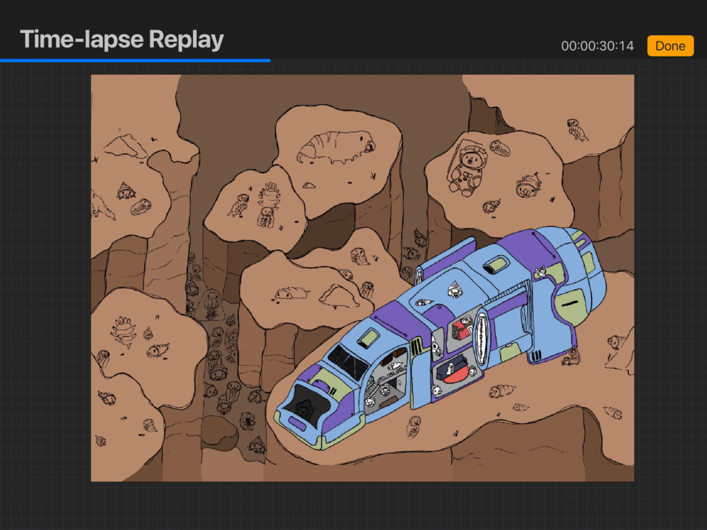

Poem written using:https://openai.com/index/chatgpt/
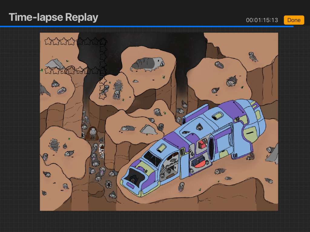

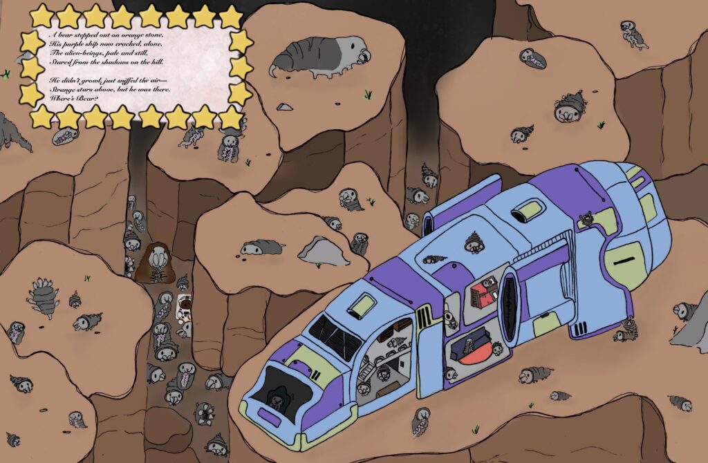
I had a lot of fun with drawing and design this scene. I felt it was a really interesting process to be able to design my own spaceship, and I had lots of fun working with the procreate tool once again. I tried to make this scene a little more challenging as its the last one I am going to be able to create within the time constraints. I think this scene was from my imagination a lot more than the previous designs (despite the Creepers) as the landscape design came from what I would think an alien planet would look like rather than one I had seen before, however maybe slightly inspired by the movie UP. I really like my use of contrasted colours within this piece, and I think the mostly orange colour palette really helps the ship I designed to take the spotlight. I had lots of fun showing the Creepers taking over the spaceships living quarters, with little ones tucked in bed and enjoying some time on the sofa. I think this scene was a really good ending to the project as it lets me combine my interests in a detailed illustration, as well as acting as a way of keeping my motivation at this point in the project going strongly.
Designing a cover
Whilst not really a focus on this project I thought it would be essential to design a cover for the book in order to really finalise the project, and so the audience can see my full vision. I went through lots of variations for this cover as I really struggled with fitting the target audience, whilst making sure my typography was readable for the age range.
Cover Research
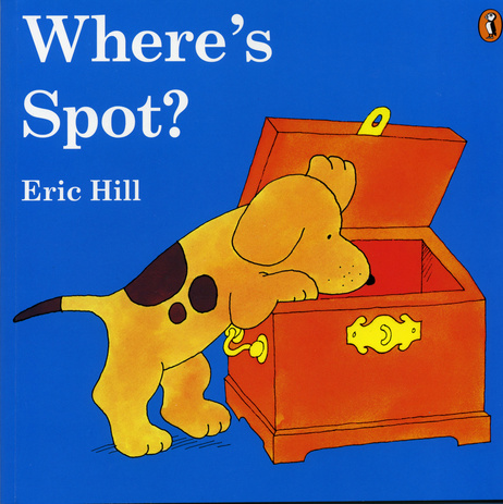


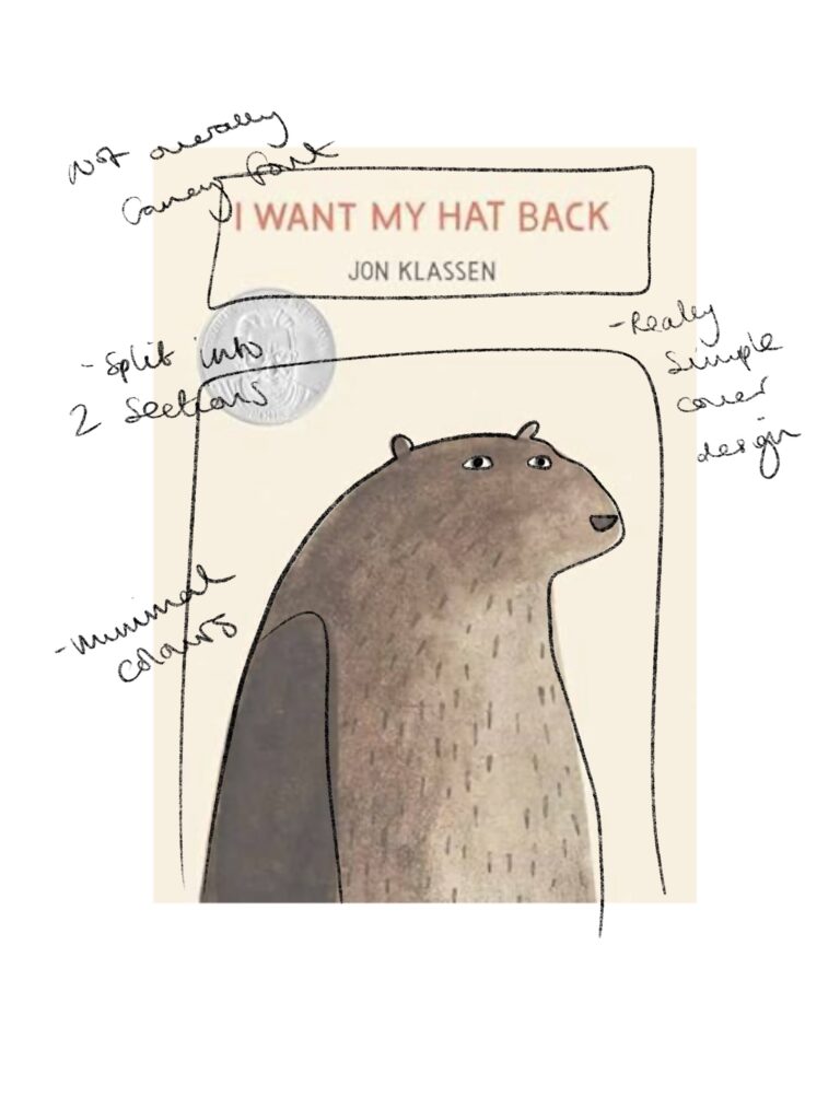
I went back and had a look at some of the artist I had looked at during the beginning of this project, and decided to analyse some of their covers., taking note of what I should include within my own:
- Simple half design
- Strong colour pallete
- Not too crowded with imagery
- Show main characters centre of image
- Character takes up more space than title

Making a mock book
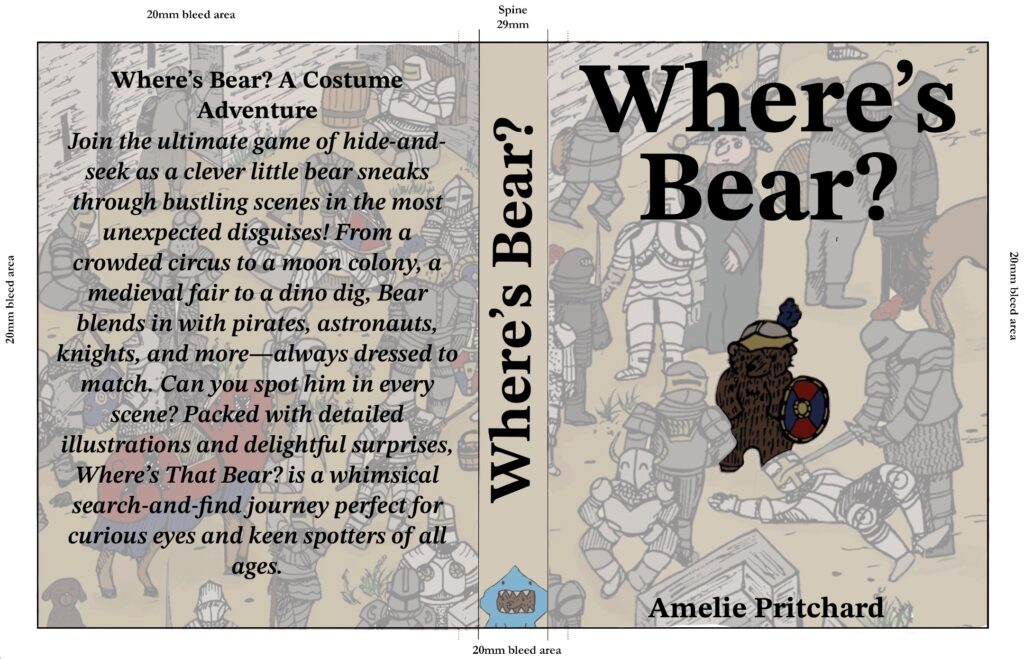
To put this research to the test I decided to make a mock book of all of my pages, starting with the cover. Whilst I really like this cover I do feel as though it doesn’t exactly hit my target audience as it’s not really colourful enough, and wouldn’t stand out on a shelf for a child. I think I will have to use a different one of scenes. I also need to make the bear a more central focus, as he appears quite small on the page, smaller than the title.


After putting together the pages I realised I greatly needed to make some changes to the scenes themselves. Due to my choice of font you actually can’t read the poems once they are printed, with some of the boxes also being too small within the scene. I am really glad I put together this little mock as I don’t think I would have noticed the need to make these changes with it just on my ipad.
Improving my scenes
Looking again at the work of Martin Handford, I realised how essential it is for my text to be readable for a younger audience. In the beginning I was trying to capture the vibe of the overall scene, but by catering to an younger audience, my text has to readable to everyone. This influenced me to switch the font to Helvetica, a font more commonly used, therefore children will be more used to seeing it used within their books.

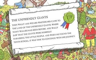
Before
After


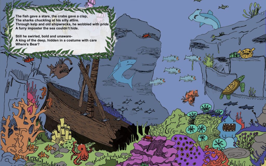

I think changing the font makes a huge impact on the quality of the scene, making the entire piece look more professional and therefore more accessible for my audience.
Re-designing a cover
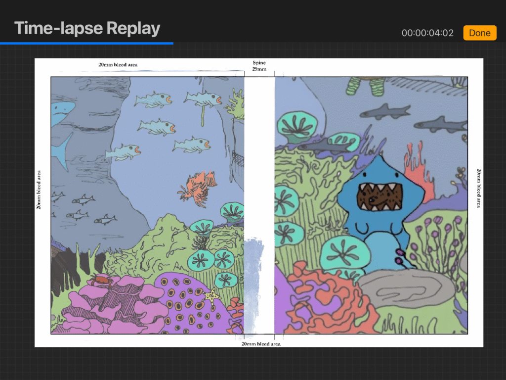
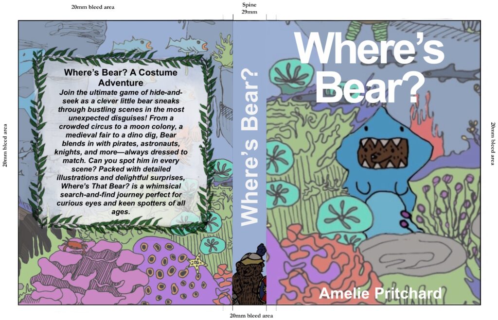
The cover went through lots of different variations before I landed on the final one, with the biggest one being a switch from the Medieval Scene to the Underwater Scene due to the colour palette being more appropriate towards a younger audience. To keep the continuity I also switched the font to Helvetica, which again, I think looks more professional.

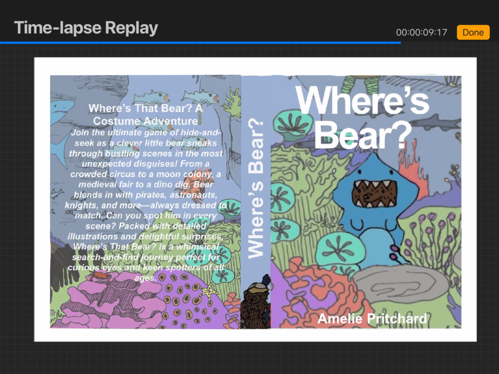
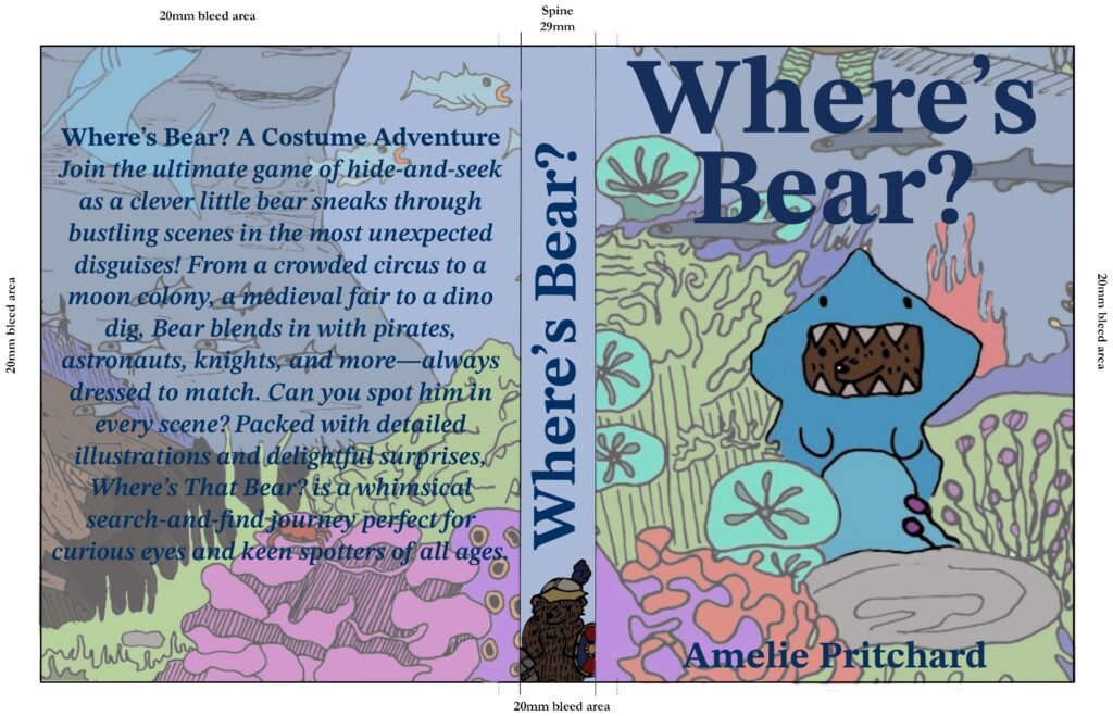

Before
After
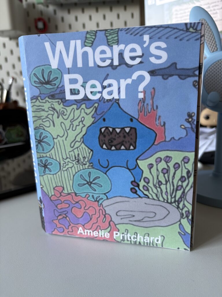
Making an improved mock book

Getting feedback from friends
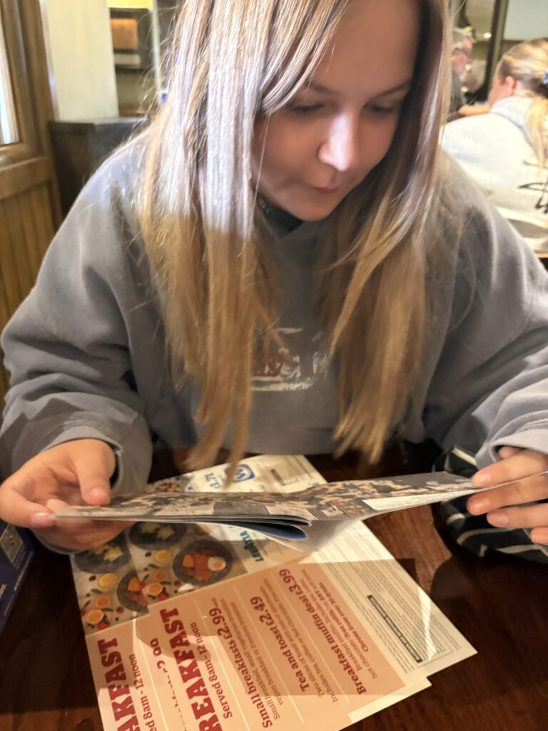
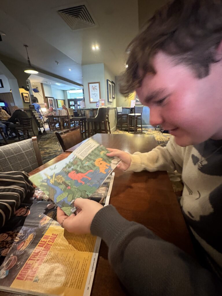
The feedback I got from my friends was very positive, with some of them easily finding the bear, and others taking a little longer, whilst I would have liked to test my project on the target audience, my friends will do for now!


Polished Mock-up
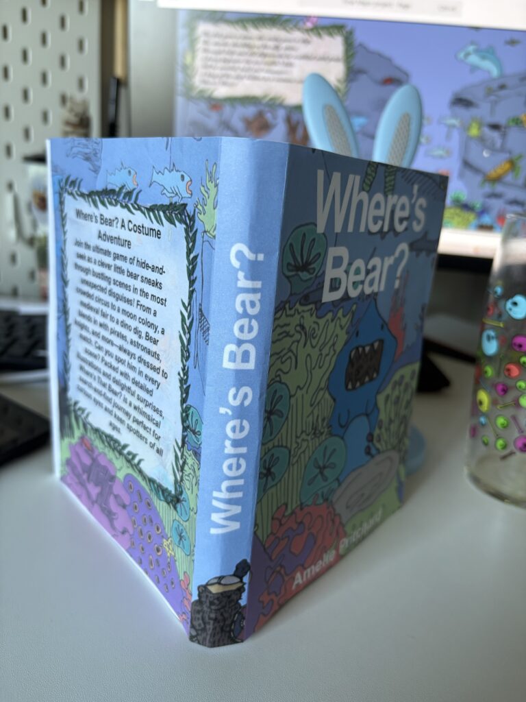
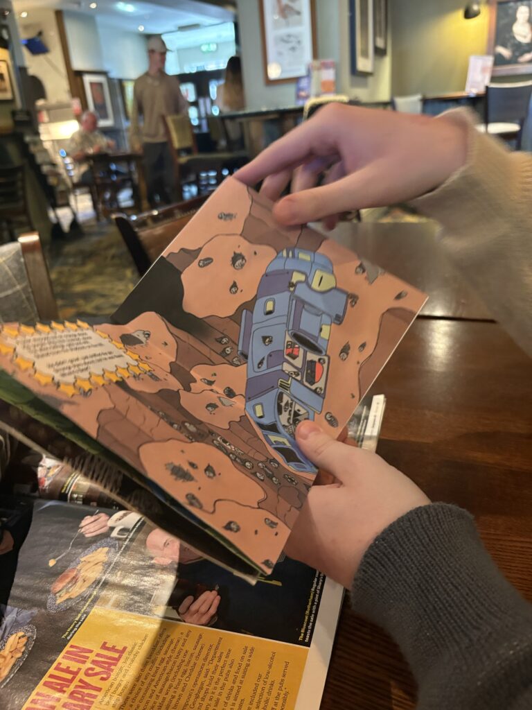
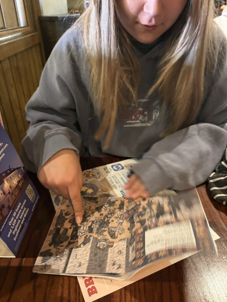
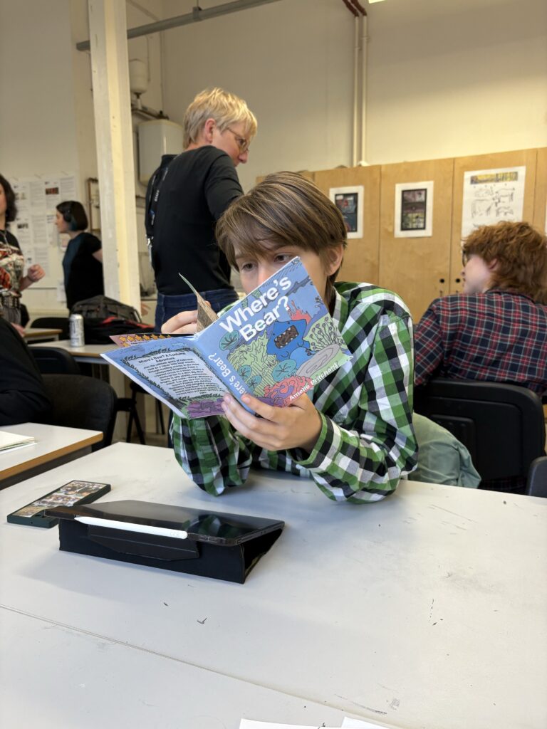
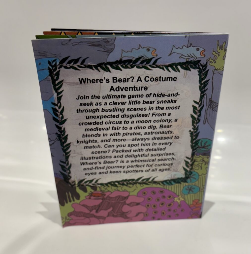
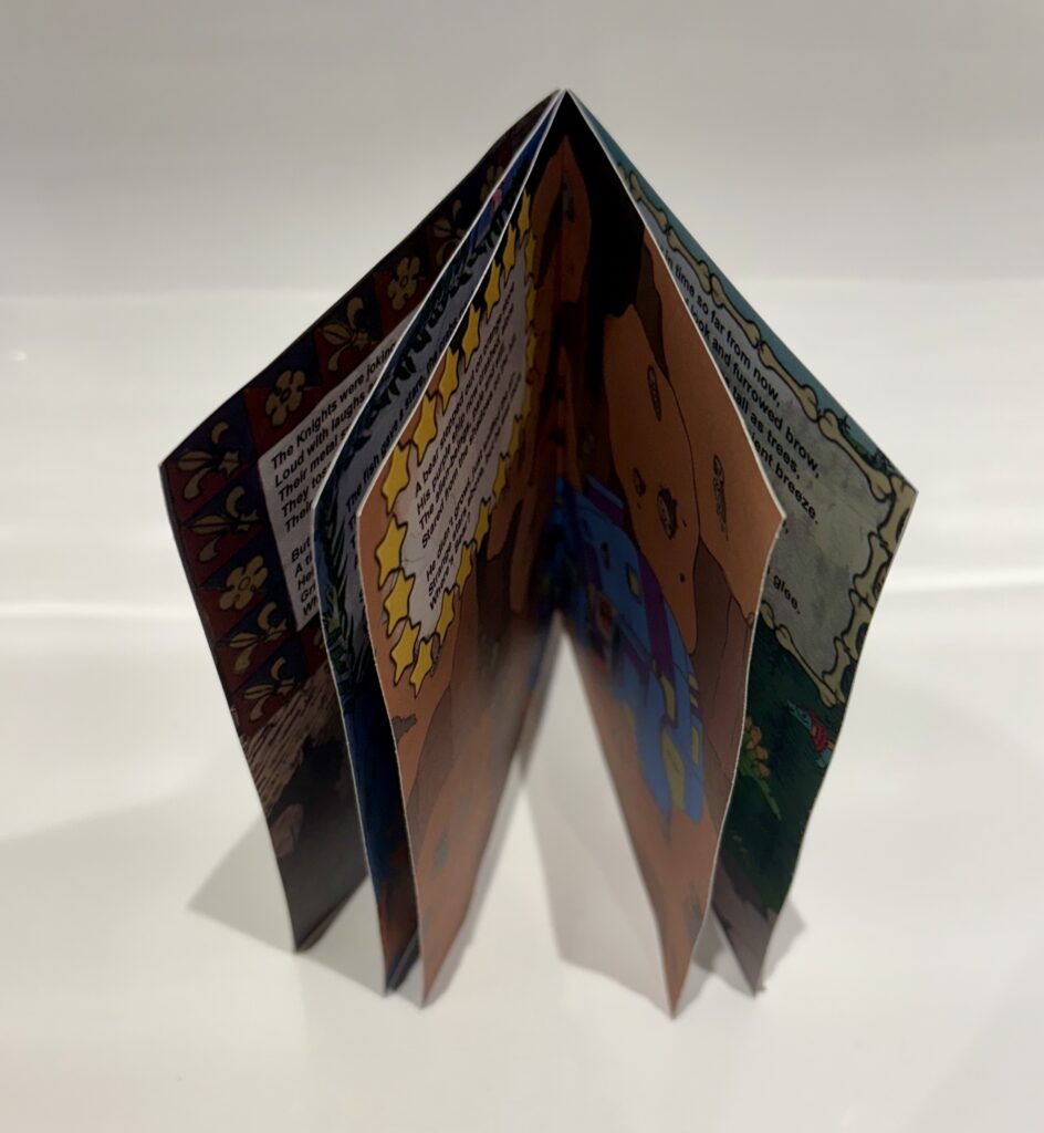
I remade my original mock-up using higher quality paper, as well as shortening the spine so that it would fit in better proportion to the pages. I think the book version gives the audience a clear representation of this project in the context it would be produced. I really enjoy being able to hold the physical version of this book, as it offers the audience a better chance to be fully invested in the pages, being able to bring the print up to their eyes and following the characters physically with their fingers. I think it definitely adds to the final pieces of this project, being the ultimate result of all my efforts.


The finished pages

Final Evaluation

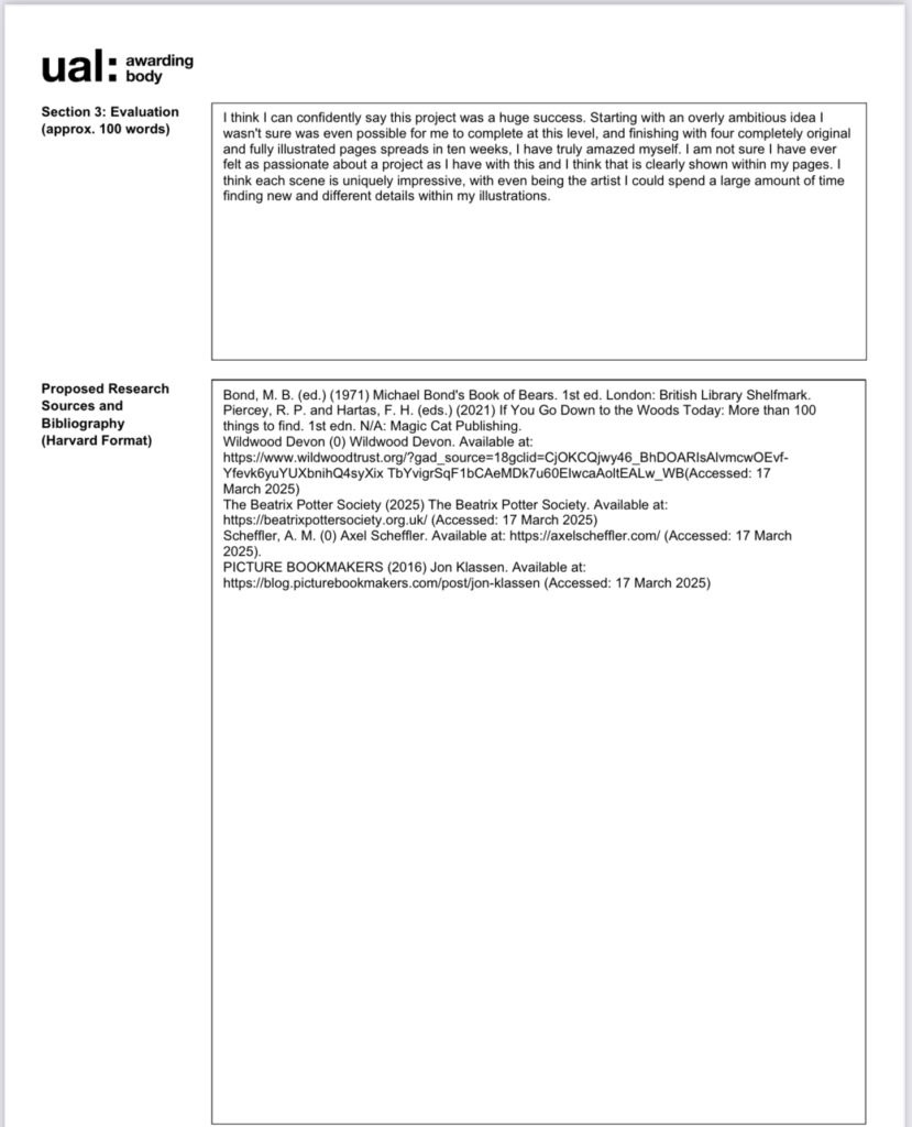
I think I can confidently say this project was a huge success. Starting with an overly ambitious idea I wasn’t sure was even possible for me to complete at this level, and finishing with four completely original and fully illustrated pages spreads in ten weeks, I have truly amazed myself. I am not sure I have ever felt as passionate about a project as I have with this and I think that is clearly shown within my pages. I think each scene is uniquely impressive, with even being the artist I could spend a large amount of time finding new and different details within my illustrations.
Throughout this project I learnt a lot about the world of children’s books, using the works of Alex Scheffler, Julia Donaldson and Beatrix Potter as inspirations. I learnt what it is about these authors that make them such icons of children’s literature, being a pinnacle part of my childhood. Working under the idea that I could potentially be making a book that would result in children being as excited about my characters and I was about The Gruffalo and Peter Rabbit was a big motivator for me as I pushed myself to learn new skills. This resulted in me being able to massively improve my skills as an illustrator, learning about new mediums such a digital colour, collage and lino. I really travelled from my comfort zone, never really having used colour in a large scale project like this. I struggled with different aspect in this project but by constantly researching, and trying new things I was able to overcome them. It was my constant list making and planning that made this a lot easier, having every aspect of this project planned out meant every day I knew what I was doing, wasting no time to get on with this book. This list making really helped me to balance, keeping an up to date blog, as well as leaving enough time for me to do the physical work I needed.
I really tried to balance my use of primary and secondary sources, visiting different locations to get the photos I needed as well as finding my love for the internet due to the fact there really is an archive for everything! I tried to break away from only using pinterest for my inspirations, instead using the work of experts in the field I was drawing from. Upon using my own references, I was able to gain a real appreciation for the area I live in, being able to stumble across medieval castles whilst driving up to wales, and only being a 30 minute drive from a zoo full of amazing creatures. Not to mention the direct access I get to my favourite animal in the world. Lucy and Mish the twin bears that are the main inspirations being this project, acting as the models and my muse for each of these pages. I relished every opportunity this project granted me to go an visit them, and draw them as many times as I would need.
In conclusion, I really feel like this project is the best demonstration of my skills as an illustrator, despite being an area I, to begin with, wasn’t very confident in, it really highlights my future career goals and what it is I want to achieve as an illustrator. If you were to ask me to show a piece of work that truly captures who I am as an artist it would be this book, I think that is a really great sentiment for how I feel this project turn out. I am very excited to see what I am able to achieve in the future with this project definity being the building block for that!